Accessibility

Introduction
In 2020, more than ever before, it is becoming increasingly urgent for digital spaces to be inclusive and accessible to all. With the ongoing pandemic making it even more difficult for folks to access services in-person and entire industries moving online, disabled people are disproportionately impacted. Additionally, the number of disabled people is rising due to the long-term effects of the pandemic.
Web accessibility is about achieving feature and information parity and giving complete access to all aspects of an interface to disabled people. A digital product or website is simply not complete if it is not usable by everyone. If it excludes certain disabled populations, this is discrimination and potentially grounds for fines and/or lawsuits.
The Web Content Accessibility Guidelines, or WCAG, is an internationally recognized set of standards that needs to be met in all websites and applications that utilize the Internet. They are not laws, but many laws point to WCAG as their basis.
These guidelines have had multiple releases over the years and the current standard is WCAG 2.1, with WCAG 2.2 currently being vetted as a working draft. Some regional laws point to WCAG 2.0 as the requirement, but as Adrian Roselli covers in his article WCAG 2.1 is the Current Standard, Not WCAG 2.0 - and WCAG 2.2 is Coming we need to be meeting WCAG 2.1 standards and considering the new criteria coming in WCAG 2.2 as well.
A dangerous trend that has seen more exposure than ever in 2020 is the use of “accessibility overlays”. These widgets promise one step accessibility compliance and more often than not introduce new barriers and make the experience for a disabled user quite challenging. It is important that digital practitioners take ownership over designing and implementing usable interfaces and not try to subvert this process with a quick fix. For more information see Lainey Feingold’s article, Honor the ADA: Avoid Web Accessibility Quick Fix Overlays.
Sadly, year over year, we and other teams conducting analysis such as the WebAIM Million are finding little–and in some cases no–improvement in these metrics. The median overall site score for all Lighthouse Accessibility audit data rose from 73% in 2019 to 80% in 2020. We hope that this 7% increase represents a shift in the right direction. However, these are automated checks and could mean that developers are doing a better job of subverting the rule engine, so we are cautiously optimistic.
Our analysis is based on automated metrics only. It is important to remember that automated testing captures only a fraction of the accessibility barriers that can be present in an interface. Qualitative analysis, including manual testing and usability testing with disabled people are needed in order to achieve an accessible site or application.
We’ve split up our most interesting insights into five categories:
- Ease of reading,
- Media on the web,
- Ease of page navigation,
- Assistive technologies on the web,
- Accessibility of form controls.
We hope that this chapter full of sobering metrics and demonstrable accessibility negligence on the Web will inspire readers to prioritize this work and change their practices, shifting towards a more inclusive and fair Internet.
Ease of reading
Making content as simple and clear to read as possible is an important aspect of web accessibility. Being unable to read the content of a page prevents a user from being able to complete tasks on websites. There are many aspects of a web page that make it easier or harder to read, including color contrast, zooming and scaling of pages, and language identification.
Color contrast
The higher the page contrast, the easier it is for people to view text-based content. People who may have difficulties viewing low contrast content include those with color vision deficiency, people with mild to moderate vision loss, and those with contextual difficulties viewing the content, such as glare on screens in bright light.
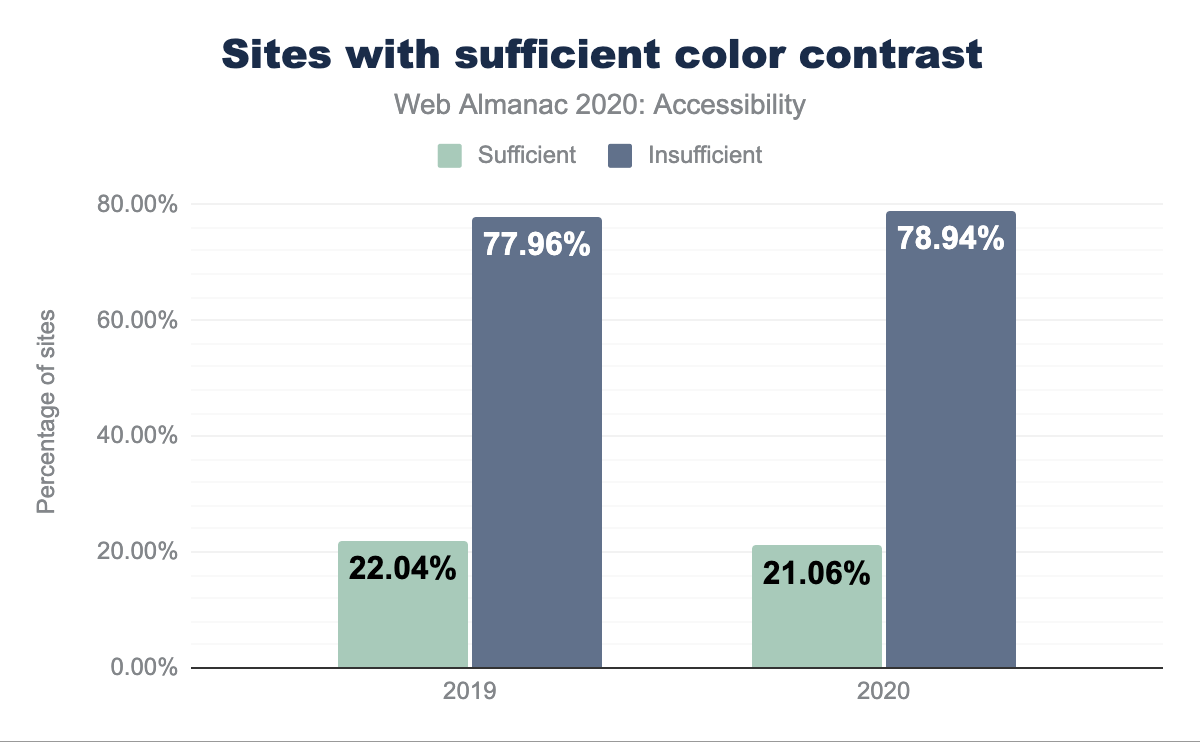
Unfortunately, only 21.06% of sites were found to have sufficient color contrast. Which is a decrease from last year’s already abysmal 22%.
Zooming and scaling
It is essential that we allow users to zoom the page or content. There are techniques that can be used to try to disable the ability to scale or zoom the browser. Some operating systems subvert this harmful pattern, but many do not, and it is an anti-pattern that needs to be avoided.
Zooming is particularly useful for users with low vision. According to the World Health Organization, “Globally, 1 billion people have a vision impairment”.
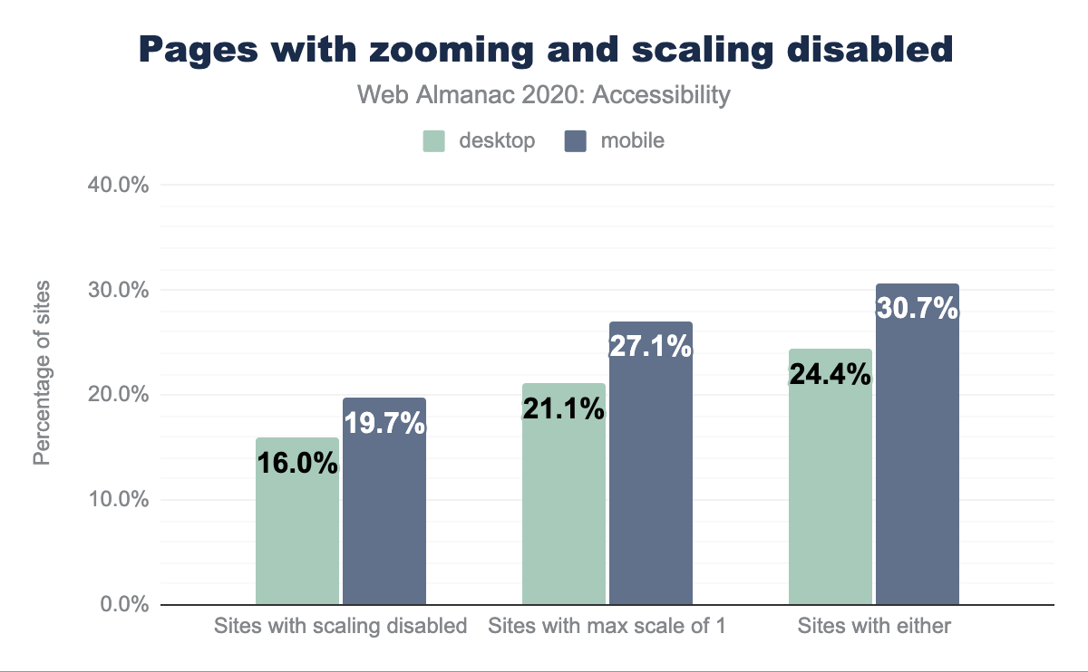
We found that 29.34% of desktop pages and 30.66% of mobile pages attempt to disable scaling by setting either maximum-scale to a value less than 1, or user-scalable 0 or none. Some operating systems no longer comply with disabled zoom and scale set in HTML. For systems that do respect it, this can render the page effectively unusable for some. For more information about why to avoid disabling browser zoom see Adrian Roselli’s article, Don’t Disable Zoom.
Language identification
lang attribute.
Setting an HTML lang attribute allows easy translation of a page and better screen reader support. The percentage of sites with a valid HTML lang attribute on mobile this year was 77.67%, with only 77.7% having a lang attribute at all.
Media on the web
Media is an essential part of the web experience. It can add an enriched context to the surrounding textual information, and not just for sighted users.
Images and their text alternatives
In 1995, HTML 2.0 introduced the alt attribute, enabling web authors to provide a text alternative for the visual information communicated in an image. A screen reader can convey its visual meaning aurally by announcing the image’s alternative text. Additionally if images are unable to load, the alternative text for a description will be displayed.
alt text” Lighthouse audit.
The 2020 Lighthouse audit data shows that only 54% of sites pass the test for images with alt text. This test looks for the presence of at least one of the alt, aria-label and aria-labelledby attributes on img elements. In most cases using the alt attribute is the best choice.
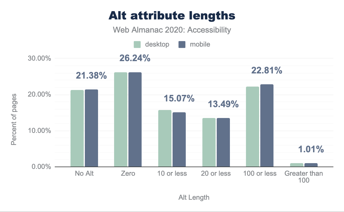
alt attribute lengths grouping by percentage of pages. 21.25% of desktop images and 21.38% off mobile images have no alt attribute, while 26.20% of desktop and 26.24% of mobile have zero length, 15.76% of desktop and 15.07% of mobile have a length of 10 or less, 13.56% of desktop and 13.49% of mobile have length of 20 or less, 22.23% of desktop and 22.81% of mobile have length of 100 or less, and 1.00% of desktop and 1.01% of mobile have a length of greater than 100.Even though the alt attributes have been around for 25 years, we also found that 21.24% of desktop images and 21.38% of mobile images are lacking alternative text. This is one of the easiest automated checks to test for using your accessibility tool of choice and should be low hanging fruit and a relatively straightforward problem to solve.
Screen reader users listen to the “aural UI” as described by Steve Faulker, an aural or sonic experience of the interface wherein the structure, semantics and relationships of the content are announced. This means that screen reader users consume a lot of textual information. For this reason it is important to assess whether or not an image might not need to be described. This is a helpful decision tree from the W3C for deciding how and whether to describe an image. If an image is truly decorative and adds nothing meaningful to the surrounding context, you can assign the alt attribute a null value, alt="". It is important to do this explicitly rather than omitting the alt attribute altogether, as omitting it could lead to assistive technology announcing the image path, which is a very confusing user experience.
We found that 26.20% of desktop pages and 26.23% of mobile pages contain alt attributes with a null/empty value. We hope this indicates that over a quarter of websites are being developed with consideration for which images are truly meaningful and not as a means of side-stepping automated checks.
When describing an image it is imperative to consider what information the user needs and omit additional information to reduce verbosity. For example, a red arrow icon button that has the action of moving to a new step in the interface could be described as “continue to step 3 of 5” rather than “red arrow png”. The first description tells the user what to expect if they activate the control, whereas the second just describes its appearance and has an unnecessary file extension, both of which are irrelevant to the meaning of the image.
Automated checks for the presence of alternative text do not assess the quality of this text. As described in the previous section, the meaning of an image needs to be considered when writing this text. One common unhelpful pattern is describing the image with the file extension name. For the previous “red arrow png” example, a screen reader user likely does not get helpful information from the image format. We found that 6.8% of desktop sites (with at least one instance of the alt attribute) had a file extension in its value.
The top 5 file extensions explicitly included in the alt text value (for sites with images that have non-empty alt values) are jpg, png, ico, gif, and jpeg. This likely comes from a CMS or another auto-generated alternative text mechanism. It is imperative that these alt attribute values be meaningful, regardless of how they are implemented.
| File extension | Desktop | Mobile |
|---|---|---|
jpg |
4.08% | 3.83% |
png |
2.99% | 2.82% |
ico |
1.35% | 1.26% |
gif |
0.34% | 0.33% |
jpeg |
0.35% | 0.31% |
Images with title attributes
The title attribute which generates a tooltip that displays text is often mistaken as another reliable way to describe images to assistive technology. However according the HTML Standard:
“Relying on the title attribute is currently discouraged as many user agents do not expose the attribute in an accessible manner as required by this specification”
Tooltips also introduce a host of other accessibility barriers such as information only being revealed on hover/mouseover, information not being properly communicated to assistive technology, lack of keyboard support, and general poor usability. The history of tooltips and their barriers are well described by Sarah Higley in her blog post Tooltips in the time of WCAG 2.1.
We found that 16.95% of all alt attributes also contain a title attribute. Of these instances 73.56% of desktop sites and 72.80% of mobile sites had matching values for both the alt and title attributes.
Other facts about alt text
alt text length.
The median length for both desktop and mobile alt text is 18 characters. With the average English word length being 4.7 characters, this means the median alt attribute value is 3-4 words long. Depending on the image, being terse can be beneficial. However it is hard to imagine 4 words being sufficient for an accurate description of an image with any complexity.
The longest alt text length found for desktop sites was 15,357,625 characters. That’s enough to fill 5 and a half “War and Peace” sized books (assuming “War and Peace” has an average word length of 4.7 characters).
Video on the web
Video and other multi-media content can enrich a Web experience, but often is not robustly supported for all users and can pose major accessibility barriers if it is not implemented with support. For more information see the W3C’s Making Audio and Video Accessible.
Captions
Captions or transcripts are needed to communicate aural information for people who are deaf or hard of hearing and are very also helpful for users who have cognitive disabilities such as audio processing difficulty. Transcripts also help low-vision and blind users by describing visuals. Video content on the web is not accessible if it does not have accompanying captions. Similar to the importance of having meaningful alternative text for images, the quality of captions is also very important.
“Captions not only include dialogue, but identify who is speaking and include non-speech information conveyed through sound, including meaningful sound effects” -WCAG, Understanding Success Criterion 1.2.2: Captions
Of sites using <video> elements, only 0.79% provide closed captions, which we assume based on the presence of the <track> element (and which are different from open / burned-in captions). Note that some websites have custom solutions for providing video and audio captions to users, and we were unable to detect these custom solutions, so the percentage of sites utilizing captions could be higher, but this figure is indicative of how under-supported captions are on web video content. We also cannot assess the quality of the captions detected and whether or not they accurately convey the full meaning of the video they describe.
Autoplaying video
It is arguably a disruptive and undesirable user experience to autoplay and loop video on a website for all users. Video can be a resource drain for device batteries as well as data. In some cases, video can contain content that is distressing for users, whether by showing disturbing imagery or being used as an attack vector against people prone to seizures.
For disabled users there are significant barriers caused by autoplaying and looping video. For screen reader users, a video that contains audio will likely disrupt the announcements and lead to confusion. For folks with cognitive disabilities such as ADHD, video can be very distracting and interrupt the user’s ability to use and understand the interface. People with vestibular conditions can be dangerously triggered by video as well.
The Web Content Accessibility Guidelines has a criteria 2.2.2 Pause, Stop, Hide that requires that any moving, blinking or scrolling content (including video) that plays for longer than 5 seconds have a mechanism to pause, stop, or hide it.
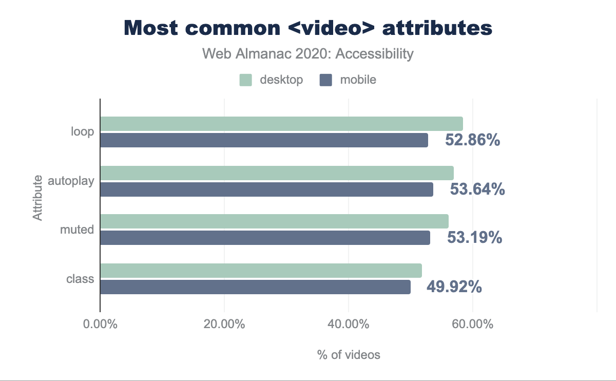
<video> element on desktop with loop on 58.43% of videos, autoplay on 56.98%, muted on 56.13%, class on 51.79%, and preload on 45.21% of videos.<video> attributes.
Of the pages with video present, we found that 56.98% of desktop pages and 53.64% of mobile pages have the autoplay attribute, meaning that videos play by default. We also found that 58.42% of desktop pages and 52.86% of mobile pages have the loop attribute, which very likely means the video plays indefinitely. Though there could be mechanisms to pause, stop or hide these videos, opting into playing video rather than needing to stop autoplaying and/or looping the video should be the default. These metrics suggest that over half of websites with video could have significant accessibility barriers.
Ease of page navigation
Pages need to be easy to navigate so users are not left feeling lost, or unable to find the content they need to do what brought them to our sites in the first place. Screen reader technology also needs to be able to differentiate between different sections, so users of this software are not left with an indecipherable wall of text.
Headings
Headings make it easier for screen readers to properly navigate a page by supplying a hierarchy that can be jumped through like a table of contents.
Our audits revealed that 58.72% of the sites checked pass the test for properly ordered headings that do not skip levels. These headings convey the semantic structure of the page. Many screen reader users navigate a page through its headings, so having them in the correct order–ascending with no jumps–means that assistive technology users will have the best experience. It is worth noting that we only check pages where these rules are more likely to be followed; home pages are more likely than interior pages to follow this rule.
Skip links
Skip links enable a user to skip through any interactive content such as a navigation system and go to another destination, typically the main content of the page. They are typically the first link on a page and can be persistent in the UI or visibly hidden until they have keyboard focus. This prevents keyboard users from needing to potentially tab through an extraneous number of elements to get to the content they are trying to access.
Skip links are considered a bypass for a block. The 2020 Lighthouse audit data revealed that 93.90% of sites pass the bypass block test, meaning they have a <header>, skip link or landmark region to allow users to skip repetitive content.
Tables
Tables are an efficient way to display data with two axes of relationships, making them useful for comparisons. Users of assistive technology rely on specific accessibility features designed to navigate properly structured tables in order to have the best experience navigating and interacting with them. Without valid semantic table markup present, these features cannot be used.
| Measurement | Desktop | Mobile |
|---|---|---|
| Tables with captions | 4.98% | 4.20% |
| Presentational tables | 0.64% | 0.49% |
Table captions
Table captions act as a label for the table supplying context for the table data. Only 4.98% of desktop sites and 4.20% of mobile sites with a table used a table caption.
Presentational tables
We are fortunate in 2020 to have so many flexible CSS methodologies that allow for fluid responsive layouts. However, many years ago before the likes of Flexbox and CSS Grid, developers often used tables for layout. Unfortunately due to some combination of legacy websites and legacy development techniques there are still sites out there where tables are used for layout.
If there is an absolute need to reach for this technique, the role of presentation should be applied to the table such that assistive technology will ignore the table semantics. We found that 0.63% of desktop and 0.49% of mobile pages had a table with a role of presentation. It’s hard to know if this is good or bad. It could indicate that there are not many tables used for presentational purposes, but it is very likely that tables used for layout are just lacking this needed role.
Document titles
Descriptive page titles are helpful for context when moving between pages, tabs and windows with assistive technology because the change in context will be announced. Our data shows 98.98% of sites have a title which is a hopeful statistic. However it stands to reason that home pages may have a higher rate of page titles than less important routes.
Tabindex
Tabindex dictates the order in which focus moves throughout the page. Interactive content such buttons, links and form controls have a natural tabindex value of 0. Similarly, custom elements and widgets that are intended to be interactive and in the keyboard focus order need an explicitly assigned tabindex="0". If a non-interactive element should be focusable but not in the keyboard tab order a tabindex value of -1 can be used allowing for focus to be programmatically set with JavaScript.
The focus order of the page should always be determined by the document flow. Setting the tabindex to a positive integer value overrides the natural order of the page and is considered bad practice. Respecting the natural order of the page generally leads to a more accessible experience. We found that 5% of desktop sites and 4.34% of mobile sites used positive integers as tab index values.
Assistive technologies on the web
People with varying disabilities use different assistive technologies to help them experience the web. The Tools and Techniques article from the Web Accessibility Initiative (WAI) of the W3C covers how users can perceive, understand and interact with the web using different assistive technologies.
Some assistive technologies for the web include:
- Screen readers
- Voice control
- Screen magnifiers
- Input devices (such as pointers and switch devices)
Screen readers present content audibly, usually by the computer speaking or announcing the content in the interface as the user navigates and interacts. This enables blind, low vision, and other disabled and non-disabled users to consume the content without needing to rely on the visual cues displayed on the screen.
Introduction to ARIA
In 2014 the WAI published Accessible Rich Internet Applications, or ARIA. They describe ARIA as:
“WAI-ARIA, the Accessible Rich Internet Applications Suite, defines a way to make web content and web applications more accessible to people with disabilities. It especially helps with dynamic content and advanced user interface controls developed with Ajax, HTML, JavaScript, and related technologies.”
Most developers think of ARIA as attributes we can add to HTML to make it more usable for screen reader users, but it was never intended to make up for improper markup and native HTML solutions. ARIA has a lot of nuances which, when misunderstood, can introduce new accessibility barriers. Furthermore different screen readers have varying limitations with respect to ARIA support.
The five rules of ARIA
There are five rules of ARIA that we need to understand before making use of this powerful toolset. This is not an official specification with required conformance, but a guide for understanding and implementing ARIA correctly.
- If you can use a native HTML element HTML 5.1 or attribute with the semantics and behavior you require already built in, instead of repurposing an element and adding an ARIA role, state or property to make it accessible, then do so.
- Do not change native semantics, unless you really have to.
- All interactive ARIA controls must be usable with the keyboard.
- Do not use
role="presentation"oraria-hidden="true"on a focusable element. - All interactive elements must have an accessible name.
ARIA roles
One of the most common ways that ARIA is used is by explicitly defining the role for an element, which communicates its purpose to assistive technology.
HTML5 introduced many new native elements, all which have implicit semantics, including roles. For example the <nav> element has an implicit role="navigation" and does not need to have this role added explicitly in order to convey its purpose information to assistive technology. Currently 64.54% of desktop pages have at least one instance of an ARIA role attribute. The median site has 2 instances of the role attribute.
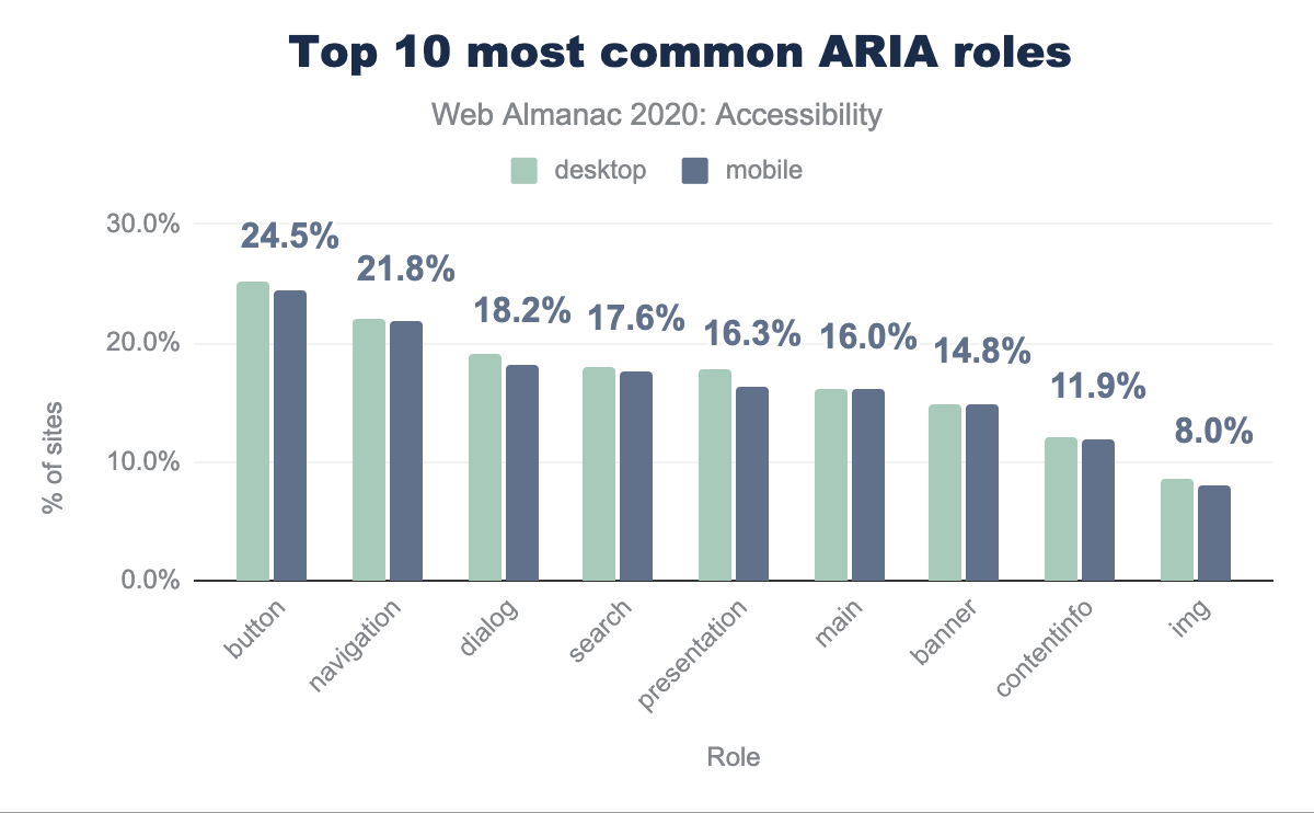
button at 25.2% for desktop and 24.5% for mobile, navigation at 22.1% and 21.8 respectively, dialog at 19.0% and 18.2%, search at 17.9% and 17.6%, presentation at 17.8% and 16.3%, main at 16.0% for both, banner at 14.8% for both, contentinfo at 12.1% and 11.9%, img at 8.5% and 8.0%, and tablist at 7.0% and 6.6%.Just use a button!
We found that 25.20% of desktop sites and 24.50% of mobile sites had home pages with at least one element with an explicitly assigned role="button". This suggests that about a quarter of websites are using the button role on elements in order to change their semantics, with the exception of buttons that have been explicitly assigned the button role, which is redundant but harmless.
If non-interactive elements such as <div>s and <span>s have been given this role, there is a significant chance one or more of the 5 rules of ARIA have been broken.
It is fairly likely that a native <button> element would be a better choice, per the first rule of ARIA. It is also possible that the role has been added but the expected keyboard support has not been supplied, which would break the third rule of ARIA and would violate WCAG 2.1.1, Keyboard.
role="button" to <div> or a <span>
We found that 8.27% of desktop pages and 8.28% of mobile pages had at least one occurrence of a <div> or a <span> element with role="button" explicitly defined. This act of adding ARIA roles, or a “role-up”, is less ideal than using the correct native HTML element.
We found that 15.50% of desktop pages and 14.62% of mobile pages contained at least one anchor element with role="button". If a role has been applied to an element that should have its implicit role respected, such as giving a role="button" to a link (which has an implicit role="link"), this would break the second rule of ARIA. It would also violate WCAG 2.1.1, Keyboard if the correct keyboard behavior has not been implemented (links are not activated with the space key, whereas buttons are).
Again, in the vast majority of these cases, a better pattern than explicitly defining role="button" on the element in question would be to leverage the native HTML <button> element as it comes with the expected semantics and behavior.
Navigation
We found that 22.06% of desktop pages and 21.76% of mobile pages have at least one element with role="navigation", which is a landmark role. Per the first rule of ARIA, rather than adding this role to an element, developers should be leveraging the HTML5 <nav> element which comes with the correct semantics implicitly. It is possible that this role has been added explicitly to the <nav> element, which would not be an accessibility issue, though it is redundant.
Dialog modals
There are many potential accessibility barriers associated with dialog modals. We recommend reading Scott O’Hara’s article Having an Open Dialog for more context.
We are pleased to report that 19.01% of desktop pages and 18.21% of mobile pages have at least one occurrence of role="dialog" which is up from about 8% in 2019. It is worth noting some of the increase is probably due to changes in how this metric was measured. This could also suggest that more developers are considering accessibility when building dialogs and potentially that frameworks and associated packages may be implementing more accessible dialog patterns as well. However, making a dialog modal accessible requires a lot more than using the dialog role. Focus management, proper keyboard support, and screen reader exposure all need to be addressed.
Tabs
Tabs are a common interface widget but present a challenge for many developers to make accessible. A common pattern for accessible implementation comes from the WAI-ARIA Authoring Practices Design Patterns. Please note that the ARIA Authoring Practices document is not a specification and is meant to show idealized ARIA constructs. They should not be used in production without testing with your users.
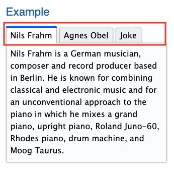
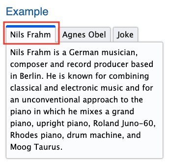
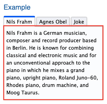
In this pattern, a parent container has a role="tablist" with children elements that have a role="tab". These tabs are associated with elements that have a role="tabpanel", and contain the content for that tab.
role="tablist") which contains three tabs. All three tabs are highlighted.tablist role (Source: W3C)
role="tab") where only one tab is highlighted.tab role. (Source: W3C)
role="tabpanel") where the content of one tab is highlighted.tabpanel role. (Source: W3C)
For desktop pages, 7.00% have at least one element with a role="tablist" whereas there only 5.79% of pages have elements with a role="tab" and 5.46% of pages have elements with a role="tabpanel". This suggests that the pattern may only be partially implemented. Even if there is dynamic rendering at play for some of the tab/tabpanel elements, the currently visible or first tab/tabpanel would theoretically be in the DOM on page load.
Presentation
When an element has been given a role="presentation" its semantics are stripped away, for both the element it is assigned to and its required children. For example, tables and lists both have required children, so if the parent has a role="presentation" this essentially cascades to the child elements, which will also have their semantics stripped. Removing an element’s semantics means that it is no longer that element in any capacity except for its visual appearance. For example, a list with a role="presentation" will no longer communicate any information to a screen reader about the list structure.
A common usage of this attribute is for <table> elements that have been used for layout rather than for tabular data. We do not recommend using tables in this way. For layout, we have powerful CSS tools today such as Flexbox and CSS Grid. In general there are very few use cases where role="presentation" is particularly helpful for assistive technology users, use this role sparingly and thoughtfully.
ARIA attributes
ARIA attributes can be assigned to HTML elements to enhance the accessibility of the interface. Respecting the first rule of ARIA, they should not be used to achieve something that can be done with native HTML.
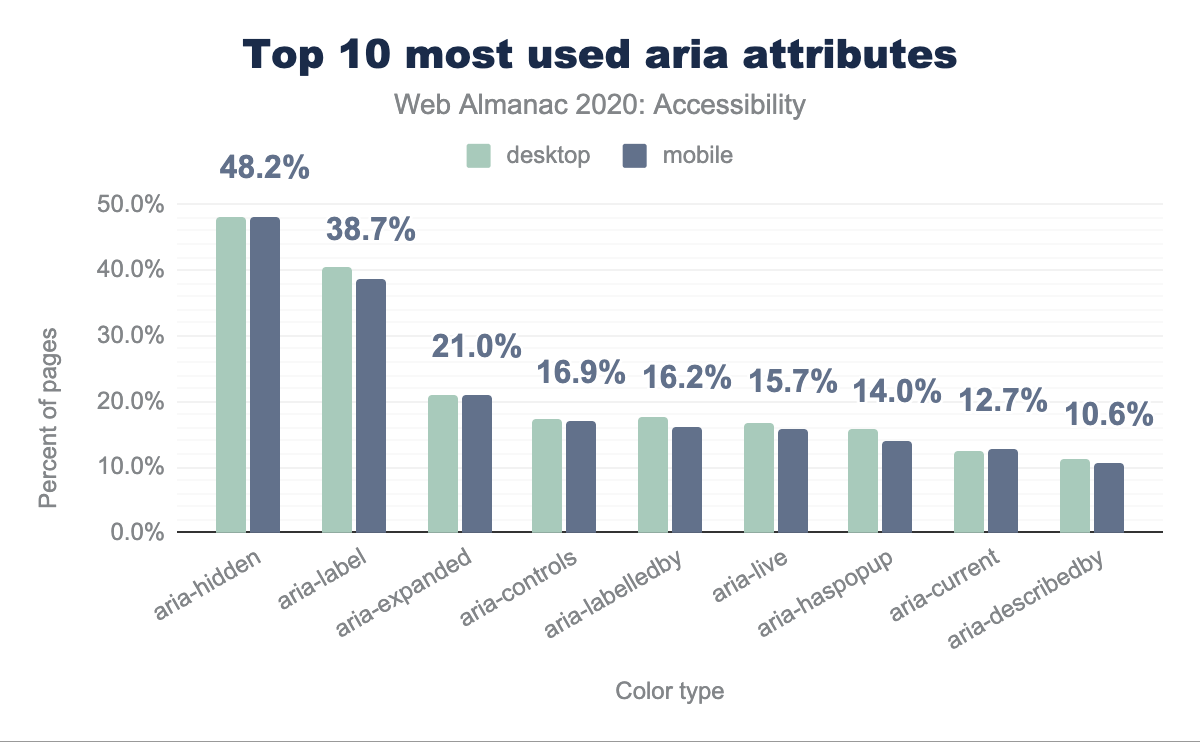
aria attributes use on desktop and mobile showing aria-hidden used by 48.1% desktop sites and 48.2% mobile sites, aria-label is used by 40.4% and 38.7% respectively, aria-expanded by 21.0% and 21.0%, aria-controls by 17.4% and 16.9%, aria-labelledby by 17.7% and 16.2%, aria-live by 16.8% and 15.7%, aria-haspopup by 15.9% and 14.0%, aria-current by 12.4% and 12.7%, and aria-describedby by 11.3% and 10.6%.aria attributes.
Labeling and describing elements with ARIA
The browser’s accessibility tree has a computation system that assigns the accessible name (if there is one) to a control, widget, group, or landmark such that it can be announced by assistive technology. There is a specificity ranking that happens to determine which value is assigned to the accessible name.
The accessible name can be derived from an element’s content (such as button text), an attribute (such as an image alt text value), or an associated element (such as a programmatically associated label for a form control). For more information about accessible names see Léonie Watson’s article, What is an accessible name?
We can also use ARIA to provide accessible names for elements. There are two ARIA attributes that accomplish this, aria-label, aria-labelledby. Either of these attributes will “win” the accessible name computation and override the natively derived accessible name, so use them with caution and be sure to test with a screen reader or look at the accessibility tree to confirm that the accessible name is what was expected. When using ARIA to name an element, it is important to ensure that the WCAG 2.5.3, Label in Name criterion has not been violated, which expects visible labels to be at least a part of its accessible name.
The aria-label element allows a developer to provide a string value and this will be used for the accessible name for the element. We found that 40.44% of desktop pages and 38.72% of mobile home pages had at least one element with the aria-label attribute, making it the most popular ARIA attribute for providing accessible names.
The aria-labelledby attribute accepts an id reference as its value, which associates it with another element in the interface to provide its accessible name. The element becomes “labelled by” this other element which supplies its accessible name. We found that 17.73% of desktop pages and 16.21% of mobile pages had at least one element with the aria-labelledby attribute.
Again, the first rule of ARIA should be respected. If the element can derive its accessible name without needing ARIA, this is preferable. For example a <button>, which is not a graphical element, should get its accessible name from its text content rather than an ARIA attribute. Form elements should derive their accessible names from properly associated <label> elements whenever possible.
The aria-describedby attribute can be used in cases where a more robust description is needed for an element. It also accepts an id reference as its value to connect with descriptive text that exists elsewhere in the interface. It does not supply the accessible name, it should be used in conjunction with an accessible name as a supplement, not a replacement. We found that 11.31% of desktop pages and 10.56% of mobile pages had at least one element with the aria-describedby attribute.
Fun fact! We found 3,200 websites with the attribute aria-labeledby, which is a misspelling of the aria-labelledby attribute! Be sure to run those automated checks to pick up these easily avoidable errors.
Hiding content
There are several ways to ensure that assistive technology will not discover content. We can leverage CSS display:none or visibility:hidden to omit the elements from the accessibility tree. If an author wishes to hide content from screen readers specifically they can use aria-hidden="true". We found that 48.09% of desktop pages and 48.23% of mobile pages had at least one instance of an element with the aria-hidden attribute.
These techniques are particularly helpful when something in the visual interface is redundant or unhelpful to assistive technology users. It should be used thoughtfully as it is essential to deliver feature parity for all users. Avoid using it to skip over content that is challenging to make accessible.
Hiding and showing content is a prevalent pattern in modern interfaces, and it can be helpful to declutter the UI for everyone. There are two ARIA attributes that are helpful additions to this disclosure pattern. The aria-expanded attribute should have a true/false value that toggles depending on whether the disclosed content is shown or not. Additionally the aria-controls attribute can be associated with an id on the disclosed content creating a programmatic relationship between the triggering control (which should be a button) and the content that gets displayed.
We found that 20.98% of desktop pages and 21.00% of mobile pages had at least one element with the aria-expanded attribute and 17.38% of desktop pages and 16.94% of mobile pages had at least one element with the aria-controls attribute. This suggests that around one fifth of websites might be implementing at least partially accessible disclosure widgets. Note that the aria-controls attribute is considered a best practice, rather than essential, for the disclosure pattern because screen reader support is not yet ideal.
Screen reader only text
A common technique that developers often employ to supply additional information for screen reader users is to use CSS to visually hide a passage of text such that it will be announced by a screen reader, but not visually present in the interface. Since display:none and visibility:hidden both prevent content from being present in the accessibility tree, there is a common “hack” involving a chunk of CSS code that will accomplish this. The most common CSS class names for this code snippet (both by convention and throughout libraries like bootstrap) are sr-only and visually-hidden. We found that 13.31% of desktop pages and 12.37% of mobile pages had one or both of these CSS class names.
Announcing dynamically rendered content
One of the biggest accessibility challenges in modern web development is handling dynamically rendered content which is everywhere in interfaces. The presence of new or updated things in the DOM often needs to be communicated to screen readers. Some thought needs to be put into which updates need to be conveyed. For example, form validation errors need to be conveyed whereas a lazy-loaded image may not. There also needs to be done in a way that is not disruptive to a task in progress.
One tool we have to help with this is ARIA live regions. Live regions allow us to listen for changes in the DOM, such that the updated content can be announced by a screen reader. Typically the aria-live attribute is placed on its own container element that is already present in the DOM rather than an element that is dynamically rendered. It is important to determine a dedicated node in the DOM that has no chance of being dynamically manipulated by other factors for the live region, ensuring that the announcements are reliable. When elements within this container dynamically render or update (for example, status updates or notification that a form was not successfully submitted) the changes will be announced.
We found that 16.84% of desktop pages and 15.67% of mobile pages have live regions. This attribute has three potential values: polite, assertive, and off. Typically the polite value is used, partly because it is the default value, but also because the announcement of the dynamic content will only happen once the user stops interacting with the page. In many cases this is the desired user experience, rather than interrupting their input. If a status update is critical enough, use assertive and it will disrupt the screen reader’s current speech queue. If it is set to off the announcement will not happen. It is important that the natural screen reader experience and flow be respected and that the assertive announcements be reserved for extreme cases, and not used for things like marketing announcements.
Accessibility of form controls
Forms are one of the most important things to get right in terms of accessibility. Successful submission of form input means users can perform core operations of websites and applications. For example if a registration flow is inaccessible, a disabled user might never be able to access the site at all.
It is important to remember that digital accessibility is a civil right and that all people have an equal right to access information and perform the same functions on the web. If a disabled user is prevented from executing core web tasks or accessing information, especially for tasks like submitting forms for government services and other essential activities, there is a clear-cut case for discrimination in both private and public sectors.
Form validation
It is very important that any form error handling be communicated to assistive technology. There are a variety of techniques for handling this depending on the validation implementation. Web AIM’s Usable and Accessible Form Validation and Error Recovery article is a great resource for learning more about various accessible form validation strategies.
If a form element is required this also needs to be communicated to assistive technology. For native HTML form elements the required attribute can be used and for customized elements the aria-required attribute may be needed. If there is an issue with a form submission, this needs to be conveyed to assistive technology.
Form labels
Form labels should be visible and persistent in the UI and descriptive of the input they are asking for. It’s a good idea to put unique requirements such as formatting or special characters in the visible label so that errors can be prevented whenever possible.
It is important to ensure that form labels have a programmatic association with their respective inputs. It is not sufficient to just display the label visually. We found that only 26.51% of sites have all of their labels properly associated with their respective inputs (achieved with a for/id relationship or inputs nested inside labels).
Groups of form controls such as a set of radio inputs or checkboxes should be nested within a <fieldset> element and given a group label via the <legend> element within the <fieldset>. The individual controls still need to be programmatically associated with their respective visible labels as well.
Placeholder text
Do not rely on placeholder text to act as the label for an input. While some screen readers now have the capability of determining the accessible name from placeholder text, users with cognitive disabilities can be negatively impacted by a reliance on placeholder text because as soon as a user begins to type in the input the placeholder disappears, and the context is gone. Voice control users need more than a placeholder value in order to reliably target an element in the DOM. Additionally placeholder text often fails color contrast requirements, which negatively impacts users with low vision.
Of the sites that have form controls with placeholder text, 73.89% of them have at least one instance where there is no <label> element programmatically associated with the control for desktop and 74.52% for mobile.
Conclusion
This chapter is fittingly included in the User Experience section of this Almanac. As accessibility advocate Billy Gregory once said, “when UX doesn’t consider ALL users, shouldn’t it be known as SOME User Experience, or SUX”. Too often accessibility work is seen as an addition, an edge case, or even comparable to technical debt and not core to the success of a website or product as it should be.
Accessibility is not the sole responsibility of developers to implement. The entire product team and organization have to have it as part of their accountabilities in order to succeed. Accessibility work needs to shift left in the product cycle, meaning it needs to be baked into the research, ideation and design stages before it is developed.
Potential accessibility responsibilities by role
This list is not exhaustive and is intended to encourage thought about how all of the roles can work together to achieve accessible websites and applications, like a relay race of accountability.
Human Resources/People Operations
- Recruiting and hiring people with accessibility skills including disabled practitioners.
- Creating an inclusive work environment where people’s disabilities are accommodated.
UX /Product designers
- Considering and talking to people with a range of disabilities in the research and ideation stages.
- Annotating wireframes with accessibility information such as intended heading hierarchy, skip links, alternative text suggestions (which could also come from copywriters/content folks) and screen reader only text.
UI designers
- Color contrast choices, font selections, spacing and line height considerations.
-
Animation considerations (determining if they are necessary, supplying static assets for
prefers-reduced-motionscenarios, designing pause/stop mechanisms).
Product managers
- Prioritizing accessibility work in the roadmap, ensuring it does not become technical debt at the end of a backlog.
- Creating processes for teams to validate their work such as including accessibility in the definition of done and acceptance criteria.
Developers
- Preferring native HTML solutions whenever possible, understanding ARIA and when to use it.
- Validating all work with automated and manual testing, evaluating colleagues’ pull requests with the same criteria.
Quality Assurance
- Including accessibility testing in their workflow.
- Advocating for accessibility considerations when contributing to the team’s quality strategy and acceptance criteria.
Leadership/C-Suite
- Giving employees bandwidth to learn and grow their accessibility skillset and hiring practitioners with expertise and lived experiences.
- Considering accessibility core to the product outcomes and viewing accessibility excellence as promotable work.
The tech industry needs to move towards inclusion-driven development. Although this requires some up-front investment, it is much easier and likely less expensive over time to build accessibility into the entire cycle such that it can be baked into the product rather than trying to retrofit sites and apps that were constructed without it in mind.
The largest investment should come in the form of education and process improvements. Once a UI designer understands the nuances of color contrast requirements, selecting an accessible color palette should be the same effort as an inaccessible palette. Once a developer deeply understands native HTML and ARIA and when to reach for certain techniques and tools, the amount of code they write should be comparable.
As an industry it is time that we acknowledge the story told by the numbers in this chapter; we are failing disabled people. We need to do better, and this has to come from a combination of top-down leadership and investment and bottom-up effort to push our practices forward and advocate for the needs, safety and inclusion of disabled people using the web.
