Performance

Introduction
No one ever complained about a fast website, but a slow-loading and sluggish website quickly frustrates users. Website speed and overall performance directly impact user experience and the success of a website. Moreover, if a website is slow, it becomes less accessible to users, which is against the fundamental goal of the web—to provide universal access to the universe of information.
In recent years, Core Web Vitals performance metrics have improved, showing positive trends across many performance metrics. However, some inconsistencies can be observed. For example, the gap between high-end and low-end devices is widening, especially in mobile web performance, as highlighted in Alex Russell’s research in The Performance Inequality Gap. Web performance is tied to what devices and networks people can afford. Fortunately, more developers are aware of these challenges and are actively working to improve performance.
In the performance chapter, we focus on Core Web Vitals, as they are key user-centric metrics for assessing web performance. However, we also analyze the web performance from a broader perspective: loading, interactivity, and visual stability, adding supportive metrics like First Contentful Paint. This allows us to explore other performance and user experience-related metrics to get a more comprehensive picture of how websites performed in 2024.
What’s new this year?
- Interaction to Next Paint (INP) has officially replaced First Input Delay (FID) as part of Core Web Vitals. INP helps to evaluate overall interactivity performance more accurately.
- Long Animation Frames (LoAF) data is available for the first time, providing new insights into the reasons for poor INP.
- As of this year, the Performance chapter also includes an analysis of the data for secondary pages in addition to home pages. This allows us to compare the home page with the secondary page performance.
Notes on data sources
The HTTP Archive contains only lab performance data. In other words, it is data from a single website load event. This is useful but limited if we want to understand how users experience performance.
Thus, in addition to the HTTP Archive data, most of this report is based on real user data from the Chrome User Experience Report (CrUX). Note that while Chrome is the most widely used browser worldwide, it doesn’t reflect performance across all browsers and all regions of the world.
CrUX is a great source of data, but it doesn’t contain certain metrics like LCP and INP sub-parts, as well as Long Animation Frames. Luckily, the performance monitoring platform RUMvision has provided us with this data for the period from 1st January to 6th October 2024. Compared to The HTTP Archive, RUMvision tests a smaller amount of websites, which is why the results for the same metrics might be slightly different.
Core Web Vitals
Core Web Vitals (CWV) are user-centric metrics designed to measure the different aspects of web performance. These include the Largest Contentful Paint (LCP), which tracks loading performance, Interaction to Next Paint (INP), which measures interactivity, and Cumulative Layout Shift (CLS), which assesses visual stability.
Starting this year, INP has officially replaced First Input Delay (FID) and became a part of the CWV. While INP measures the full delay of all interactions experienced by a user, FID only focuses on the input delay of the first interaction. This wider scope makes INP a better reflection of the full user experience.
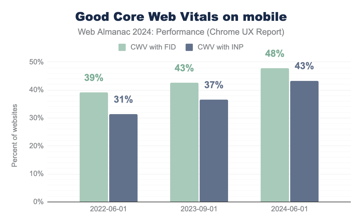
The replacement of the FID with the INP metric significantly impacted the percentage of websites with good CWV on mobile. This doesn’t mean the user experience has worsened, just that is now reflected more accurately due to the metric update. If we still used FID as a measure of interactivity, 48% of the websites would have good CWV on mobile devices. However, with the INP metric, this figure drops to 43%. Interestingly, performance on desktop devices stays the same regardless of which responsiveness metric we use at 54%.
In the period from 2020 to 2022, we saw that mobile web performance measured by CWV with FID was improving faster than desktop one, and the gap between them was closing, reaching just 5% in 2022. As CWV with INP chart shows, in 2024, the websites on the desktop performed 11% better than on mobile, so the introduction of the INP shows that the gap is much bigger.
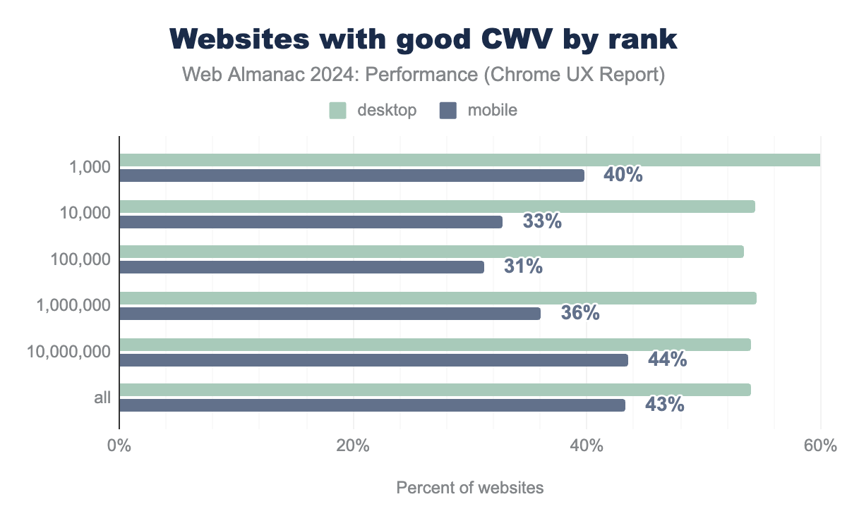
CWV with INP shows a new tendency when analyzing websites by rank. Previously, the most popular websites tended to have the best CWV experience, however, this year’s statistics show the opposite: 40% of 1000 most popular websites on mobile have good CWV which is lower than total website CWV of 43%.
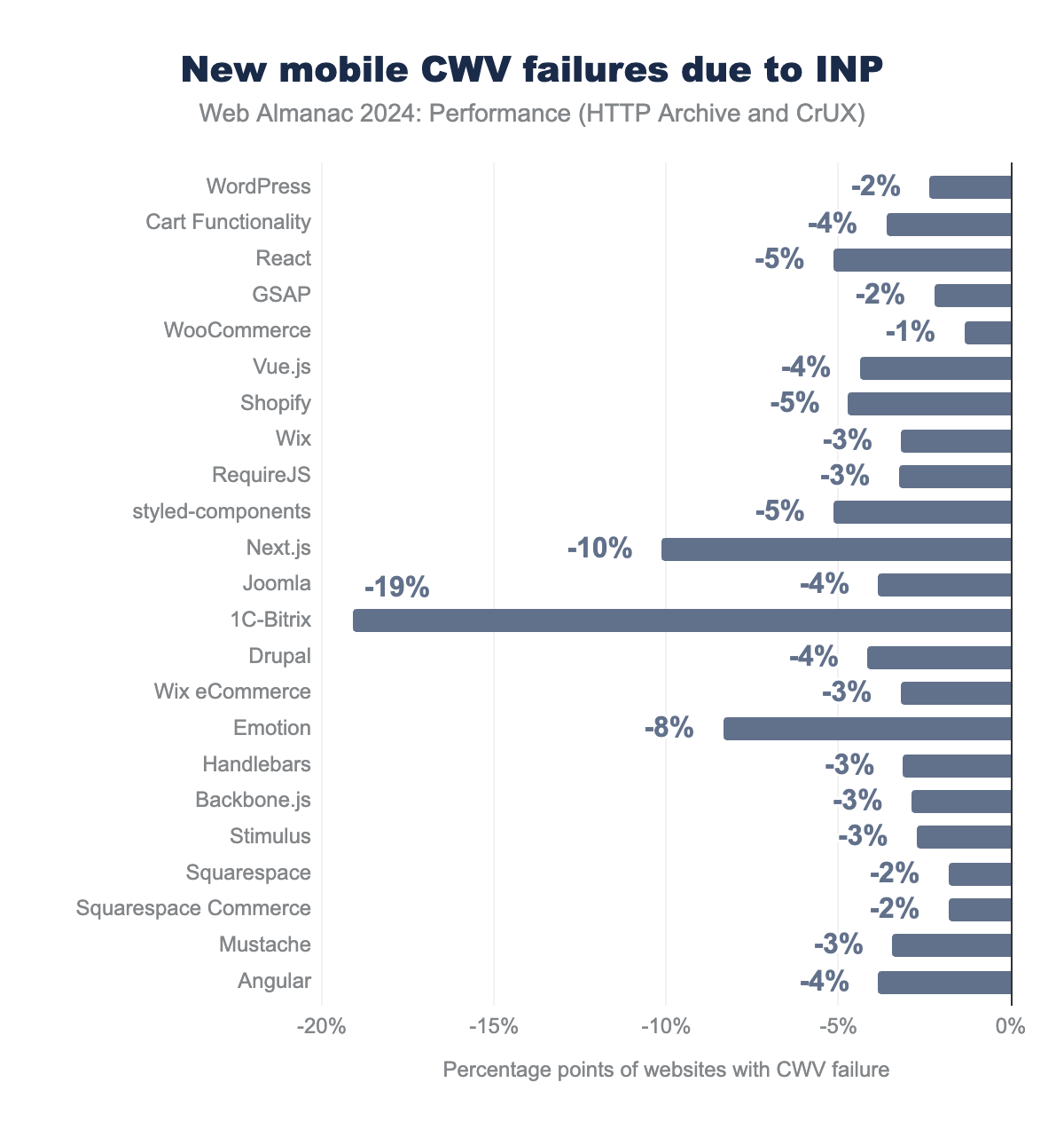
As mentioned earlier, the CWV scores have decreased due to the switch of the INP metric. We investigated how different technologies have been affected by this shift. The diagram above illustrates the percent point drop in the percentage of websites with good CWV across various technologies after the INP was introduced.
Several technologies were significantly impacted, including a 19% drop for 1C-Bitrix (a popular CMS in Central Asia), a 10% drop for Next.js (a React-based framework), and an 8% drop for Emotion (a CSS-in-JS tool). We can’t be entirely certain that the decline in CWV scores is solely due to the technology used. Next.js has server-side rendering (SSR) and static site generation (SSG) features, which should theoretically enhance INP, but it has still seen a significant decline. As Next.js is based on React, many websites rely on client-side rendering, which can negatively impact INP. This could serve as a reminder for developers to leverage the SSR and SSG capabilities of the framework they use.
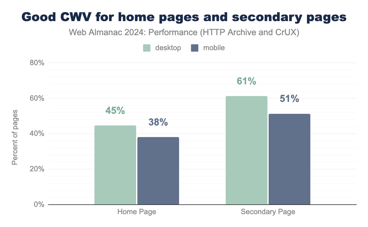
As of this year, secondary pages are available to compare with home page data.
Secondary pages demonstrate significantly better CWV results than home pages. The percentage of the desktop secondary pages with good CWV is by 14 percentage points better than for home pages. For mobile websites, the difference is 13 percentage points. By looking at CWV data only, it is hard to identify what kind of performance experience is better. We will explore these aspects—layout shift, loading, and interactivity—in the corresponding sections.
Loading speed
People often refer to website loading speed as a single metric, but in fact, the loading experience is a multi-stage process. No single metric fully captures all aspects of what makes up loading speed. Every stage has an impact on the speed of a website.
Time to First Byte (TTFB)
Time to First Byte (TTFB) measures the time from when a user initiates loading a page until the browser receives the first byte of the response. It includes phases like redirect time, DNS lookup, connection and TLS negotiation, and request processing. Reducing latency in connection and server response time can improve TTFB. 800 milliseconds is considered the threshold for good TTFB—with some caveats!
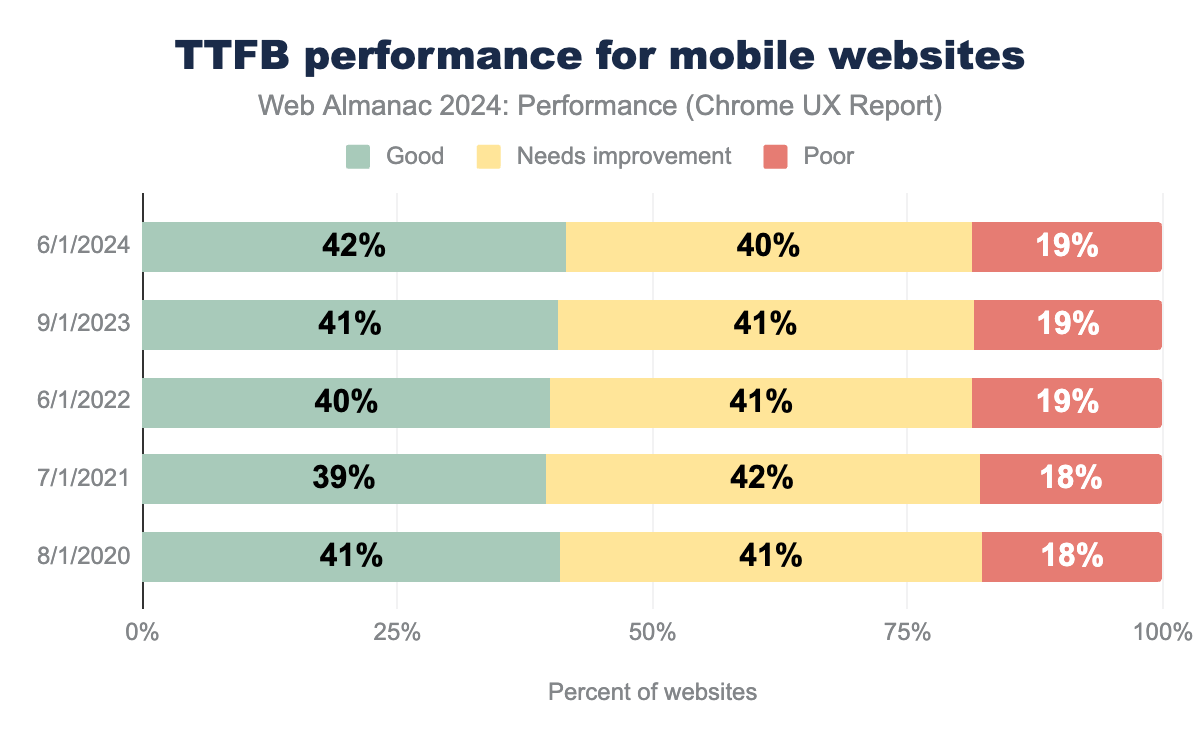
Over the past five years, the percentage of mobile web pages with good TTFB has remained stable, from 41% in 2021 to 42% in 2024. The percentage of pages that need TTFB improvements has decreased by 1%, and unfortunately, the percentage of pages with poor TTFB remains the same. Since this metric has not changed significantly, we can conclude that there have been no major improvements in connection speed or backend latency.
First Contentful Paint (FCP)
First Contentful Paint (FCP) is a performance metric that helps indicate how quickly users can start seeing content. It measures the time from when a user first requests a page until the first piece of content is rendered on the screen. A good FCP should be under 1.8 seconds.
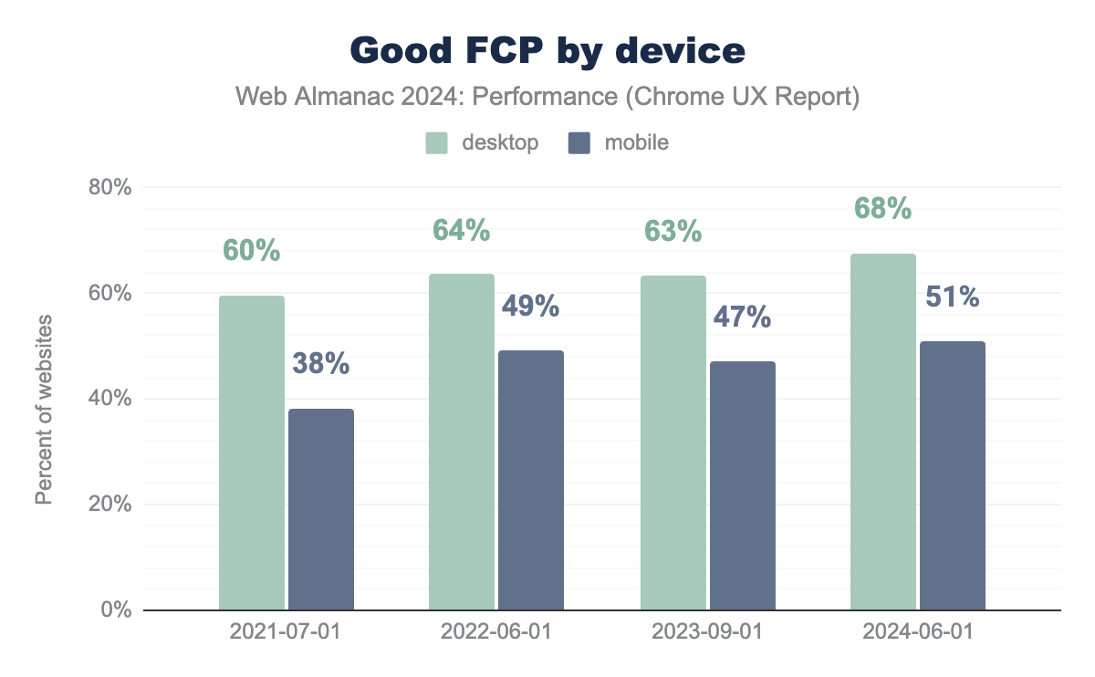
FCP has shown improvements over the past few years. Although there was a slight decline in 2023, the metric recovered in 2024, reaching 68% for desktop and 51% for mobile websites. Overall, this reflects a positive trend in how fast the first content is loaded. Taking into account that the TTFB metric remained mostly unchanged, FCP improvements might be driven by client-side rendering rather than server-side optimizations.
Interestingly, website performance is not the only factor that influences FCP. In the research How Do Chrome Extensions Impact Browser Performance? Matt Zeunert found that browser extensions can significantly affect page loading times. Many extensions start running their code as soon as a page starts loading, delaying the first contentful paint. For instance, some extensions can increase FCP from 100 milliseconds to 250 milliseconds.
Largest Contentful Paint (LCP)
Largest Contentful Paint (LCP) is an important metric as it indicates how quickly the largest element in the viewport is loaded. A best practice is to ensure the LCP resource starts loading as early as possible. A good LCP should be under 2.5 seconds.
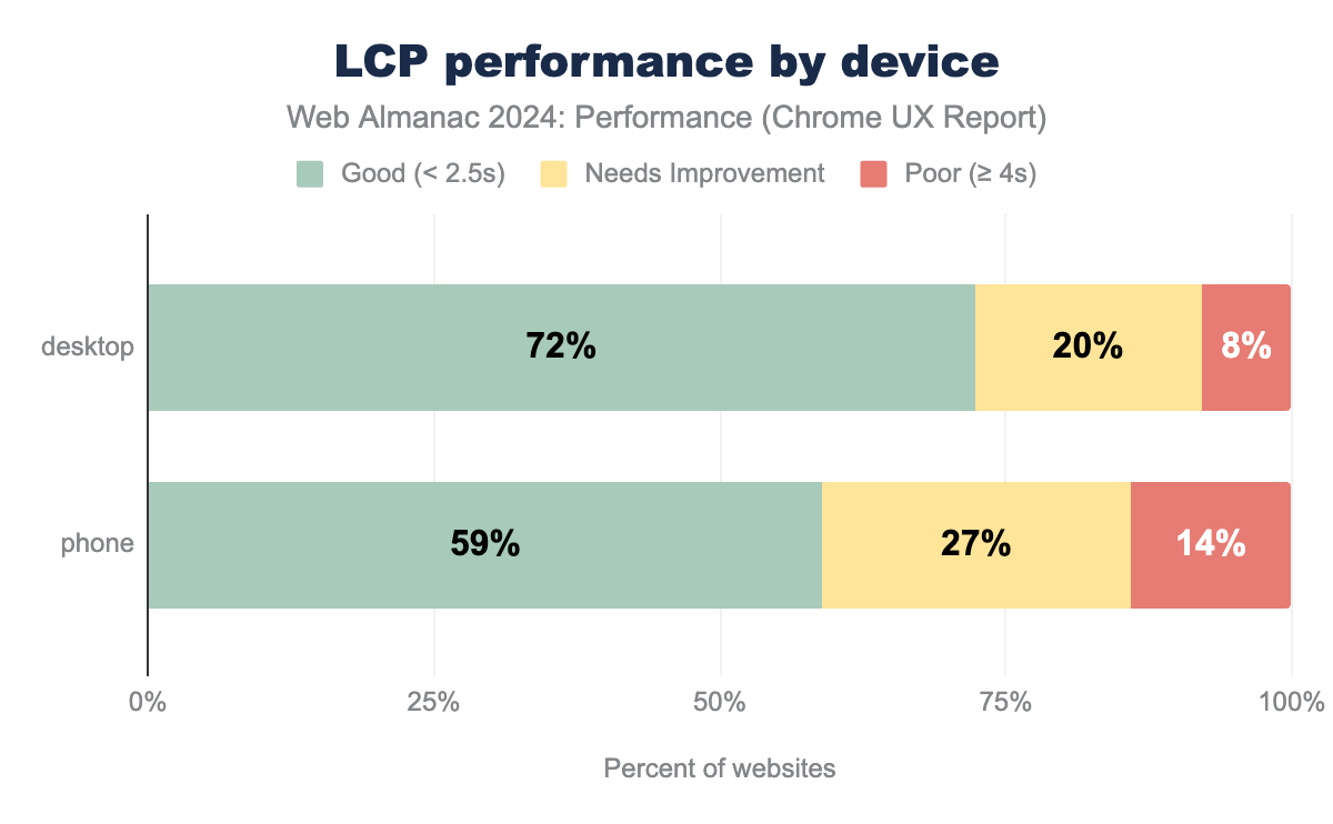
LCP has also improved in recent years (from 44% of pages with good LCP in 2022 to 54% in 2024) following the overall positive tendency in CWV. In 2024, 59% of mobile pages achieved a good LCP score. However, there is still a significant gap compared to desktop sites, where 74% have good LCP. This firmly established trend is explained by differences in device processing power and network quality. However, it also highlights that many web pages are still not optimized for mobile use.
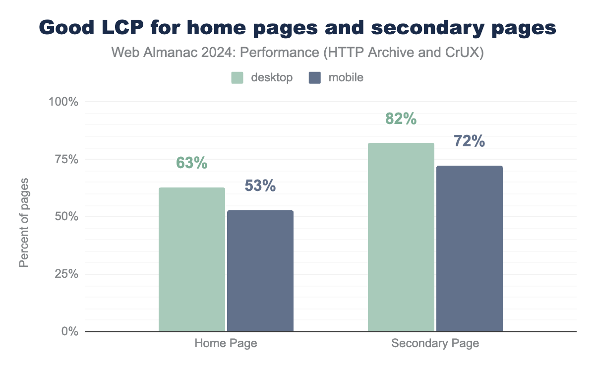
The comparison between home pages and secondary pages reveals an interesting trend: 72% of all secondary pages have good LCP, which is 20% higher than the result for home pages. This is likely because users typically navigate on the home page first, causing the initial load to happen on the home page. After they navigate to secondary pages, many of the resources are already loaded and cached, speeding up the LCP element to render. Another possible reason is that the home page often contains more media-rich content such as video and images, compared to secondary pages.
LCP content types
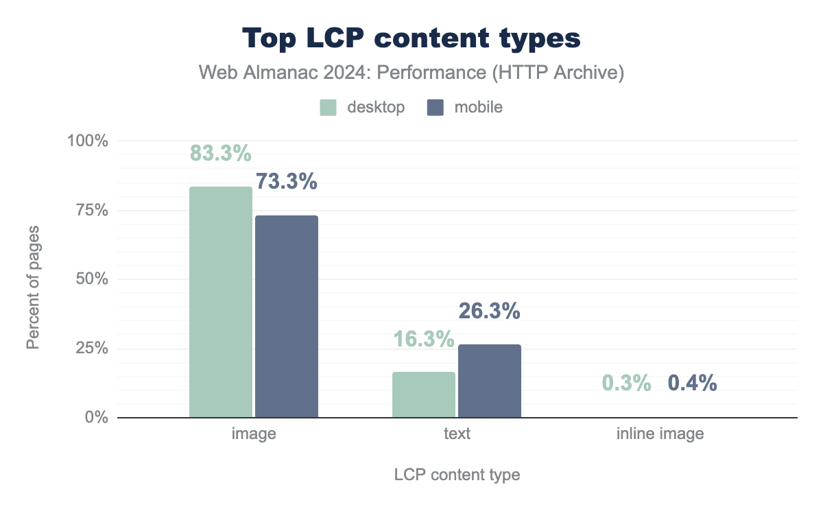
Most LCP elements, or 73% of mobile pages, are images. Interestingly, this percentage is 10% higher on desktop pages. The situation is reversed for text content. Compared to desktop, 10% more mobile webpages use text as their LCP element. This difference is likely because desktop websites can accommodate more visual content due to larger viewport sizes and generally higher performance.
LCP sub-parts
Several stages of processing must occur before the LCP element can be fully rendered:
- Time to First Byte (TTFB), which is the time it takes the server to begin responding to the initial request.
- Resource Load Delay, which is how long after TTFB the browser begins loading the LCP resource. The LCP elements that originate as inline resources, such as text-based elements or inline images (data URIs), will have a 0 millisecond load delay. Those that require another asset to be downloaded, like an external image, might experience a load delay.
- Resource Load Duration which measures how long it takes to load the LCP resource; this stage is also 0 millisecond if no resource is needed.
- Element Render Delay which is the time between when the resource finished loading and the LCP element finished rendering.
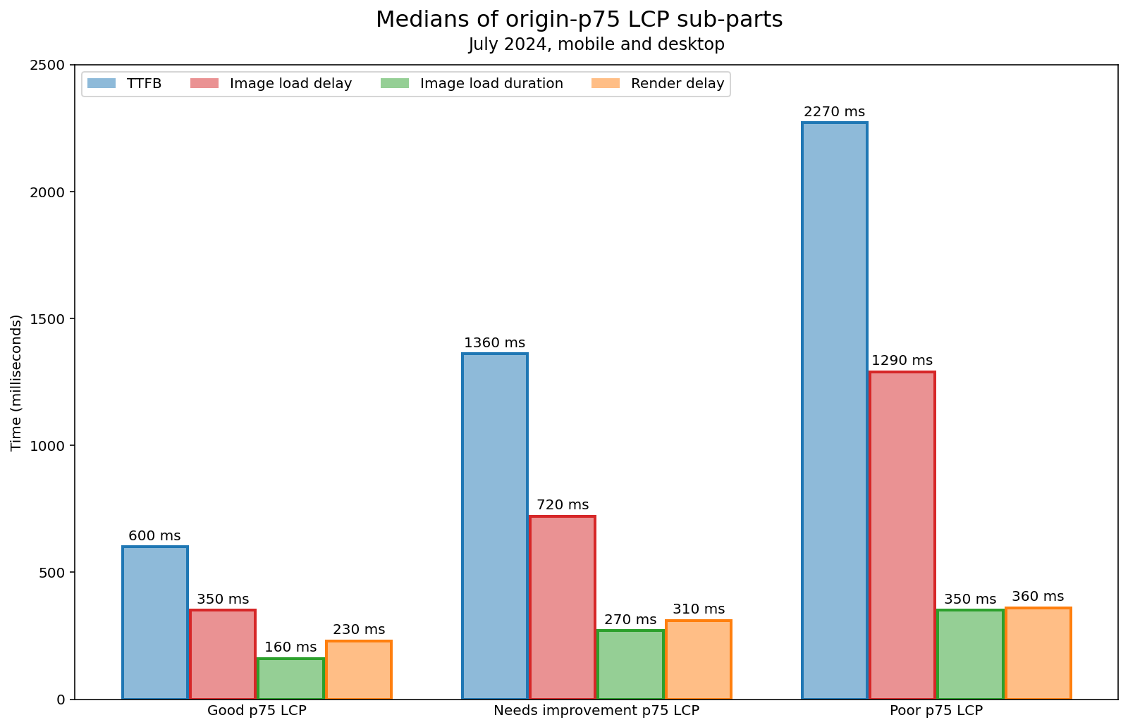
In the article Common Misconceptions About How to Optimize LCP, Brendan Kenny analyzed a breakdown of LCP sub-parts using recent CrUX data.
The study showed that image load duration has the least impact on LCP time, taking only 350 milliseconds at the 75th percentile for websites with poor LCP. Although resource load duration optimization techniques like image size reduction are often recommended, they don’t offer as much time savings as other LCP sub-parts, even for sites with poor LCP.
TTFB is the largest part among all LCP sub-parts due to the network requests for external resources. Websites with poor LCP spend 2.27 seconds on TTFB alone, which is almost as long as the threshold for a good LCP (2.5 seconds). As we saw in the TTFB section, there hasn’t been much improvement in the percentage of websites with good TTFB, indicating that this metric offers significant opportunities for LCP optimization.
Surprisingly, websites spend more time on resource load delay than on load duration, regardless of their LCP status. This makes load delay a good candidate for optimization efforts. One way to improve load delay is by ensuring that the LCP element starts loading as early as possible, which will be explored in detail in the section on LCP static discoverability.
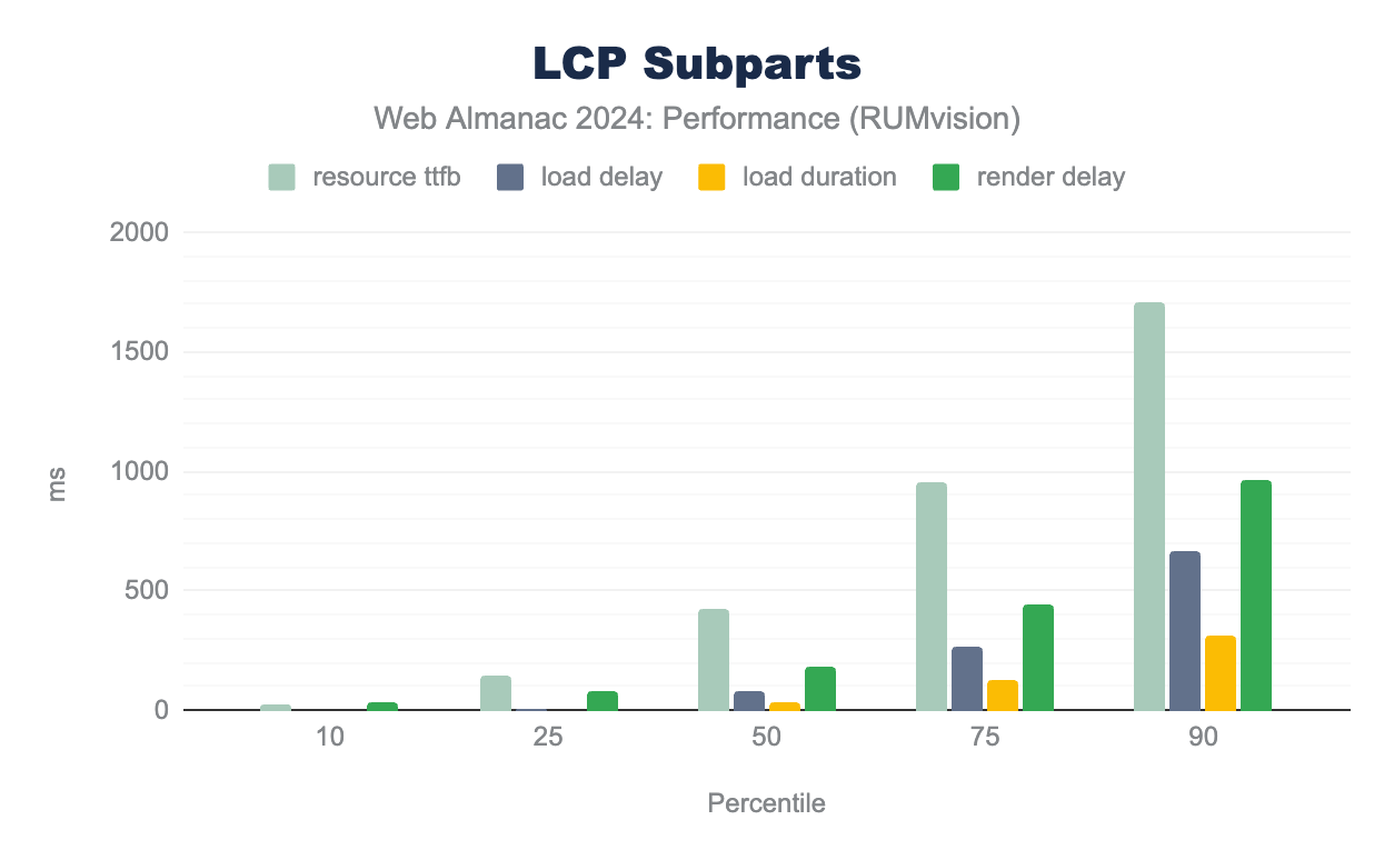
This year, we analyzed LCP sub-part data from another real user monitoring source: RUMvision. Although RUMvision has a different population of websites, it’s interesting to compare it with the larger CrUX website population. We assume that websites using performance monitoring tools like RUMvision should have more insights into performance optimization opportunities than the average website represented in CrUX. Naturally, the LCP sub-part results from two different datasets show some differences.
According to RUMvision data, TTFB is also the largest contributor to the LCP time in comparison to the other LCP sub-parts. However, the results of other sub-parts vary. Render delay is the second largest contributor to LCP, taking 184 milliseconds. At the 75th percentile, render delay grows to 443 milliseconds. This reflects a tendency that is different from the CrUX dataset, where LCP load delay is the second largest sub-part.
Typically, LCP element rendering takes a long time if the LCP element hasn’t been added to the DOM yet—a common issue with client-side generated content that we explore in the next section. Also, the main thread blocked by long tasks can contribute to the delay. In addition, render-blocking resources like stylesheets or synchronous scripts in the <head> can delay rendering.
It’s interesting to observe the different LCP challenges that websites across various datasets face. While an average website from the CrUX dataset struggles with image load delay, websites from the RUMvision dataset often face rendering delay issues. Nevertheless, all websites can benefit from using performance monitoring tools with Real User Monitoring (RUM), as these tools provide deeper insights into the performance issues experienced by real users.
LCP static discoverability
One of the most effective ways to optimize the LCP resource load delay is to ensure the resource can be discovered as early as possible. If you make the resource discoverable in the initial HTML document, it enables the LCP resource to begin downloading sooner.
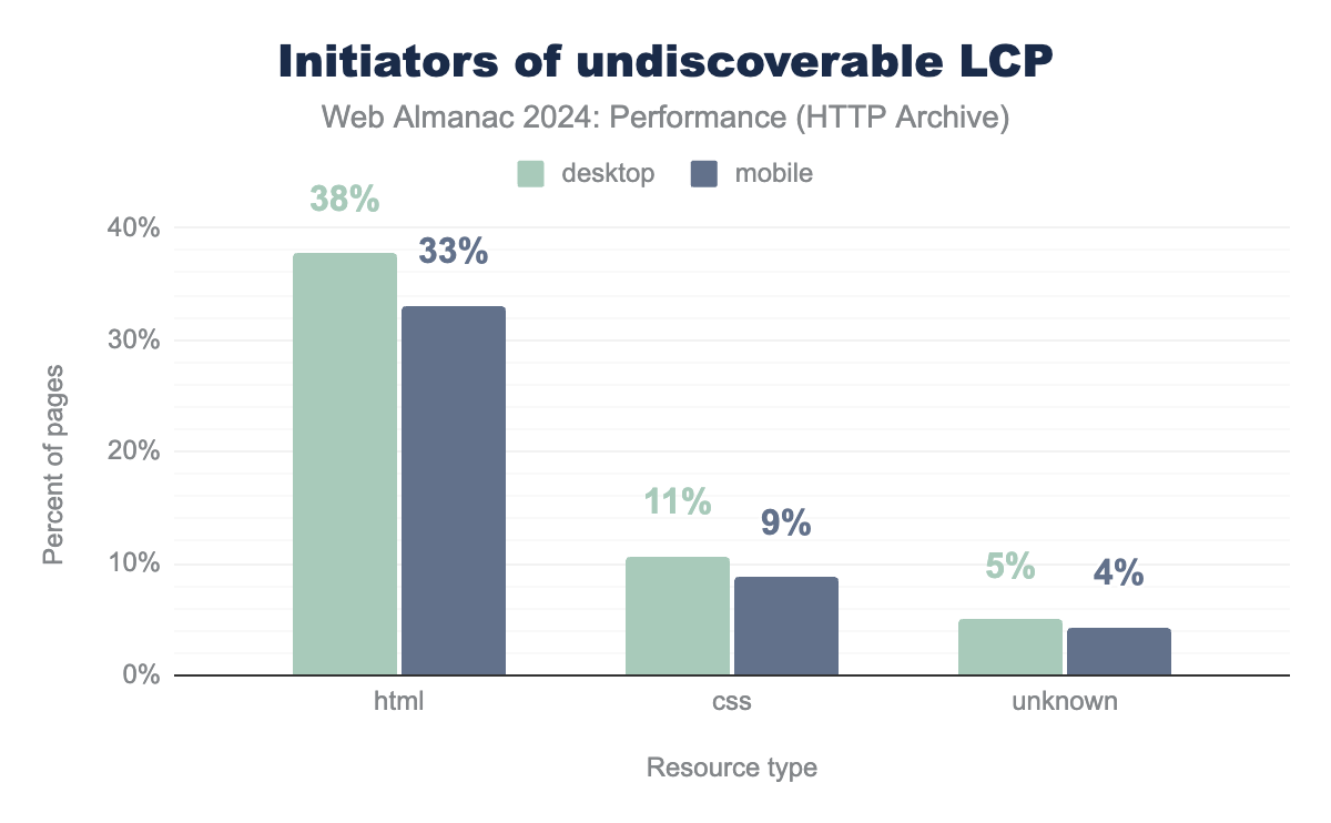
Unfortunately, 35% of mobile websites do not have an LCP element that is statically discoverable in the document. While this is a slight improvement over the 39% we saw in 2022, it’s still a significant blocker of LCP performance.
As we’ll explore in the following sections, there are three primary ways that websites prevent their LCP resources from being statically discoverable: lazy loading, CSS background images, and client-side rendering.
LCP lazy-loading
A major obstacle to LCP resource discoverability is lazy-loading of the LCP resource. Overall, lazy-loading images is a helpful performance technique that should be used to postpone loading of non-critical resources until they are near the viewport. However, using lazy-loading on the LCP image will delay the browser from loading it quickly. That is why lazy-loading should not be used on LCP elements.
The good news is that in 2024, fewer websites are using this performance anti-pattern. In 2022, 18% of mobile websites were lazy-loading their LCP images. By 2024, this decreased to 16%.
In terms of the specific lazy-loading technique used, 9.5% of mobile websites natively lazy-load their LCP images with the loading=lazy attribute. This is very similar to the 9.8% of sites we saw in 2022. However, the biggest improvement came from custom approaches. This year we see 6.7% of mobile websites using a custom approach, for example hiding the LCP image source behind the data-src attribute, which is down from 8.8% in 2022.
Note that the src attribute of an LCP image wth loading=lazy is technically set and therefore discoverable in the static HTML, so we don’t count it towards the static discoverability figure in the previous section. However, natively lazy-loaded images absolutely do contribute to resource load delays, albeit in a slightly different way than an image whose source is set by CSS or JavaScript, as we’ll explore next.
CSS background images
Also, websites that initiate LCP elements as CSS background images delay LCP static discovery until the CSS file is processed. The data shows that 9% of mobile pages initialize the LCP resource from CSS. Compared to 2022, this metric has remained unchanged.
Dynamically added images
One more common reason for non-discoverable LCP elements is dynamically added images. These images are added to the page through JavaScript after the initial HTML is loaded, making them undiscoverable during the HTML document scan.
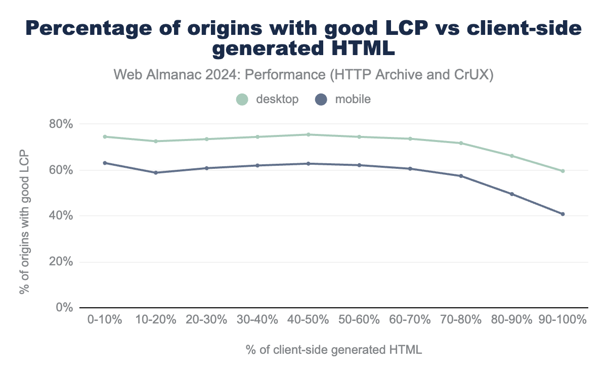
The chart below illustrates the distribution of client-side generated content. It compares the initial HTML with the final HTML (after JavaScript runs) and measures the difference. It displays how the percentage of websites with good LCP changes as the percentage of client-side generated content increases.
The percentage of pages with good LCP stays at approximately 60% for mobile devices until the amount of client-side generated content reaches 70%. After this threshold, the percentage of websites with good LCP starts to drop at a faster rate until ending at 40%. This suggests that a combination of server- and client-side generated content doesn’t significantly impact how fast the LCP element gets rendered. However, fully rendering a website on the client side has a significantly negative impact on LCP.
LCP prioritization
Another one of the most effective ways to optimize the loading delay of LCP images is to declaratively prioritize them, using the fetchpriority=high attribute. Even if the LCP resource is statically discoverable by the browser’s preload scanner, it might still not start loading immediately if there are other higher priority resources in line. Images are typically not considered high priority resources, so by providing this hint to the browser, it can adjust the LCP resource’s priority accordingly, loading it sooner and reducing its load delay phase.
fetchpriority=high on their LCP image.
Adoption of LCP image prioritization skyrocketed to 15% of mobile websites in 2024, up from just 0.03% in 2022! This massive leap is thanks in large part to WordPress implementing core support for fetchpriority in 2023.
As amazing as it is to see such rapid growth, there is still significant room for more sites to take advantage of this impactful one-line optimization.
LCP size
The CrUX and RUMvision data on LCP sub-parts showed that resource load duration is rarely the main bottleneck for a slow LCP. However, it is still valuable to analyze the key optimization factors, such as the size and format of the LCP resource.
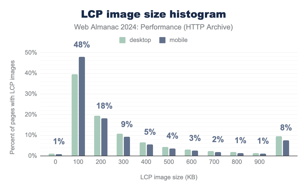
In 2024, 48% of mobile websites used an LCP image that was 100KB or less. Though, for 8% of the mobile pages the LCP element size is more than 1000KB.
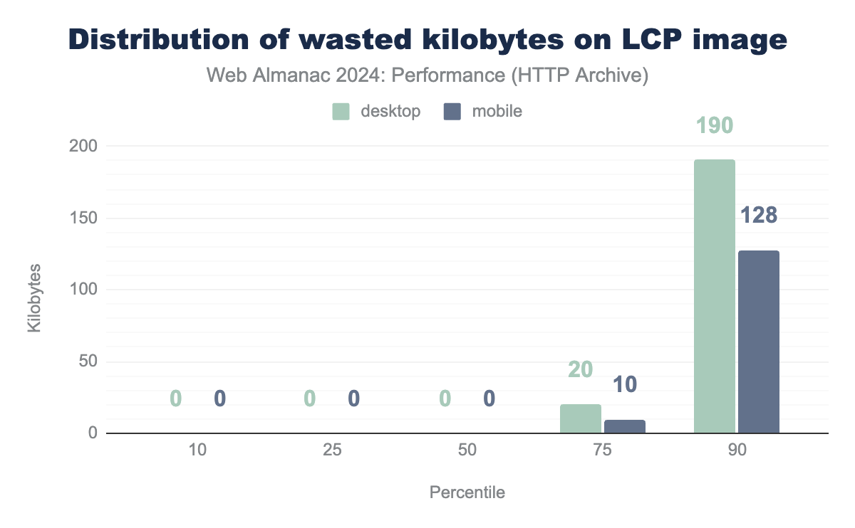
This aligns with the Lighthouse audit on unoptimized images, which also reports the amount of wasted kilobytes that could be saved by image optimization.
The audit results indicate that the median website wastes 0 KB on LCP images, i.e. serves optimized images. This leads to the conclusion that many sites are optimizing their LCP resources effectively, although some still need to improve.
You can reduce image sizes through resizing dimensions and increasing compression. Another way to reduce image sizes is by using new image formats like WebP and AVIF, which have better compression algorithms.
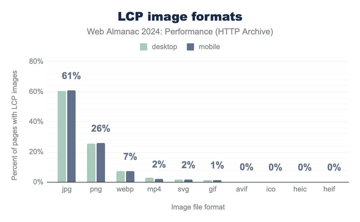
JPG and PNG still have the highest proportion of adoption at 87% combined, however WebP and AVIF formats are both increasing in adoption. In comparison to 2022, WebP image format usage increased from 4% to 7%. Also, AVIF usage increased slightly from 0.1% to 0.3%. According to Baseline, AVIF format is newly available across major browsers, so we expect to see higher adoption in the future.
Loading speed conclusions
- The percentage of websites with good FCP and LCP has improved, though TTFB showed no significant change.
- One cause for slow LCP is lazy-loading the LCP element. Usage of this antipattern has decreased, but 15% of websites still fail this test and could benefit from removing lazy-loading for their LCP elements.
- The adoption of modern image formats like AVIF and WebP is growing for LCP elements.
Interactivity
Interactivity on a website refers to the degree to which users can engage with and respond to content, features, or elements on the page. Measuring interactivity involves assessing the performance for a range of user interactions, such as clicks, taps, and scrolls, as well as more complex actions like form submissions, video plays, or drag-and-drop functions.
Interaction to Next Paint (INP)
Interaction to Next Paint (INP) is calculated by observing all the interactions made with a page during the session and reporting the worse latency (for most sites). An interaction’s latency consists of the single longest duration of a group of event handlers that drive the interaction, from the time the user begins the interaction to the moment the browser is next able to paint a frame.
For an origin to receive a “good” INP score, at least 75% of all sessions need an INP score of 200 milliseconds or less. The INP score is the slowest or near-slowest interaction time for all interactions on the page. See Details on how INP is calculated for more information.
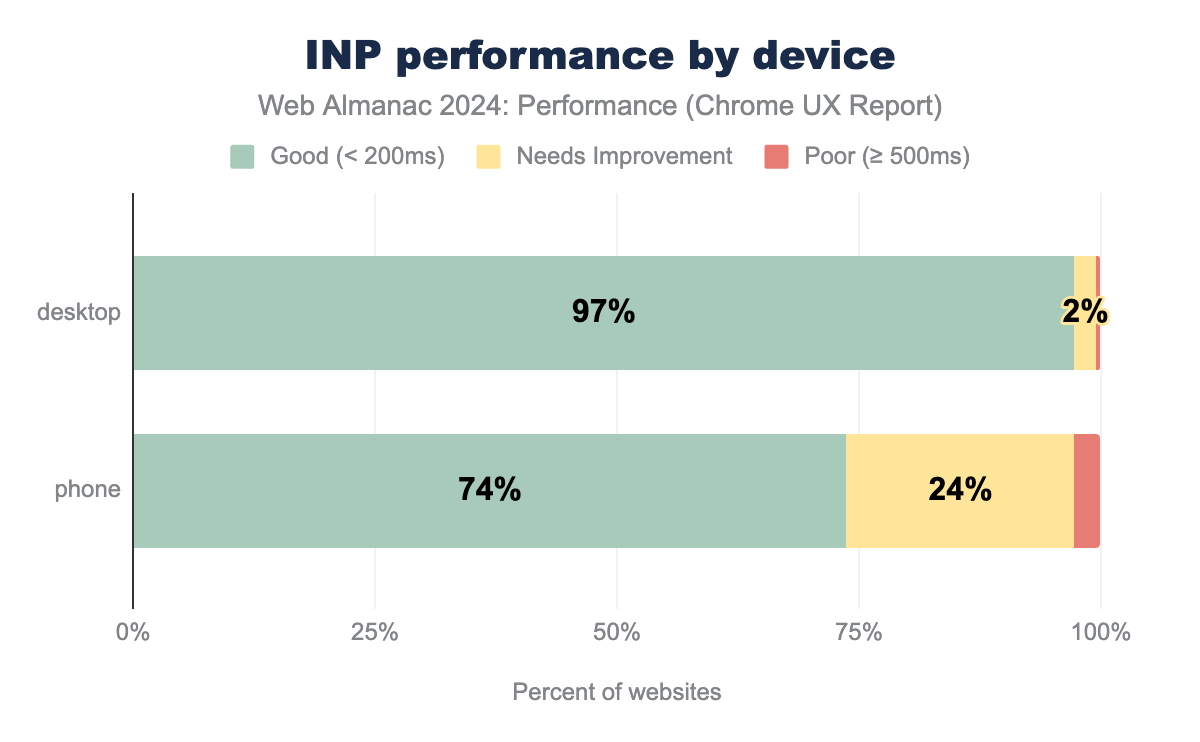
In 2024, 74% of mobile and 97% of desktop websites had good INP. Interestingly, the gap between mobile and desktop is huge, i.e. more than 20%.
The primary reason for weaker performance on mobile is its lower processing power and frequently poor network connections. Alex Russell’s article “The Performance Inequality Gap” (2023) raises the issue of the growing performance inequality gap caused by the affordance of high-end vs low-end devices. As the prices of high-end devices rise, fewer users can afford them, widening the inequality gap.
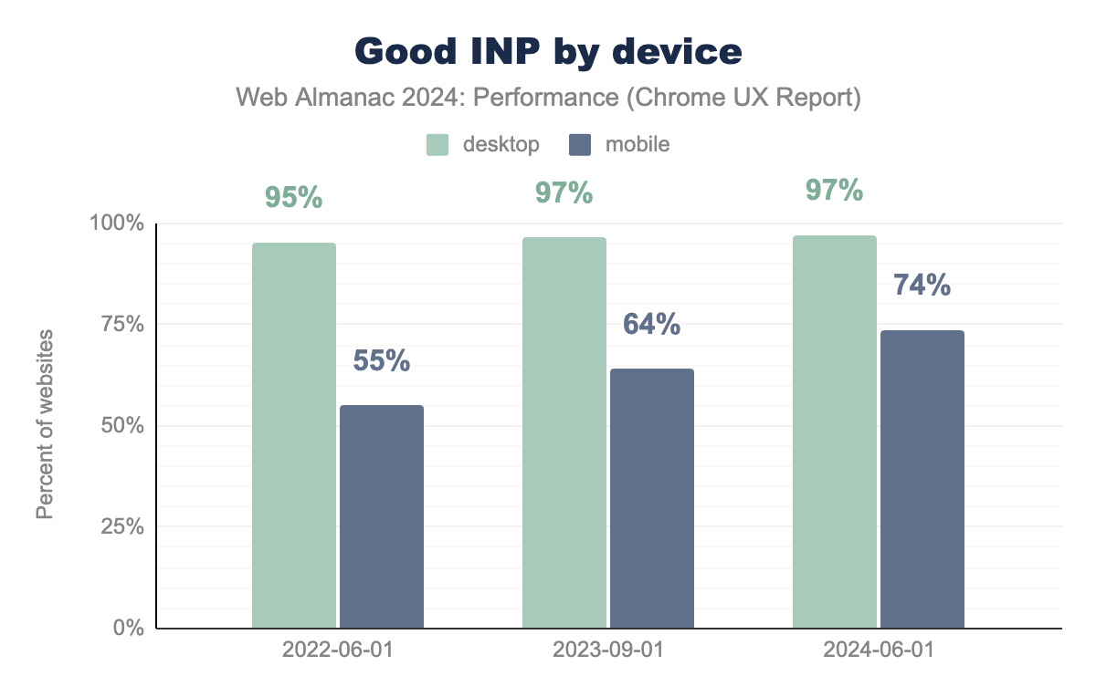
Although the INP metric displays worse results than the FID, there has been a positive tendency over the past three years. The percentage of mobile pages having good INP increased from 55% in 2022 to 74% in 2024. This is a significant increase, and even though we can’t be exactly sure what to attribute it to, we can think of a few potential drivers for this change.
The first one could be awareness. With the introduction of the INP and the announcement that it will replace FID, many teams realized the impact that could have on their overall CWV score and search ranking. That could have encouraged them to actively work towards fixing parts of the sites that contributed to low INP scores. The second driver could be just a regular advancement in technology. With the above-displayed INP data coming from real users, we can also assume that users’ devices and network connections could have slightly improved over the years, providing them with better site interactivity. The third (and perhaps biggest?) driver is improvements to browsers themselves (and in particular to Chrome, given that powers out insights). The Chrome team have made a number of improvements that impact INP over the last two years.
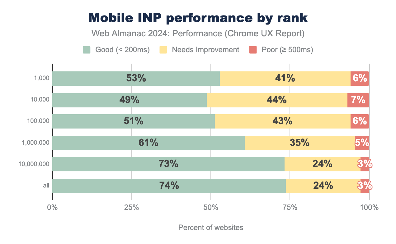
Mobile INP metric by rank reveals an interesting trend. In the 2022 chapter, we assumed that the more popular a website is, the more performance optimizations it would have, leading to better performance. However, when it comes to INP, the opposite seems to be true.
Fewer websites in the top 1,000 rank have good INP compared to the results for all websites. For example, 53% of the top 1,000 websites have a good INP score, while a much bigger percentage of all websites, i.e. 74%, meet this threshold.
This could be because the most visited websites often have more user interactions and complex functionality. Logically, the INP for an interactive e-commerce site would differ from a simple, static blog.
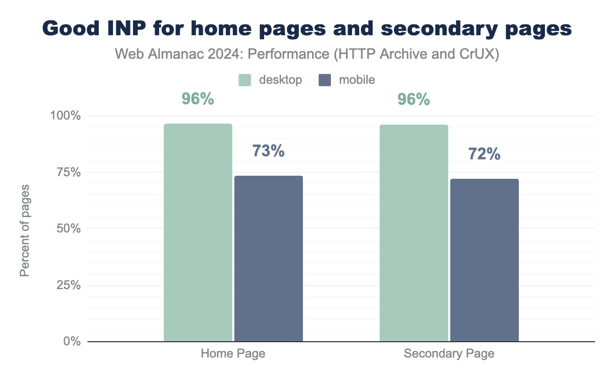
Unlike other performance metrics like FCP and LCP, the percentage of secondary pages with good INP does not differ from the home page results. This is likely because INP isn’t as impacted by caching as loading speed is.
INP sub-parts
Interaction to Next Paint metric can be broken down into three key sub-parts:
- Input Delay: the time spent to finish processing the tasks that were already in the queue at the moment of the interaction
- Processing Time: the time spent processing the event handlers attached to the element which the user interacted with
- Presentation Delay: the time spent figuring out the new layout, if changed, and painting the new pixels on the screen
To optimize your website’s interactivity, it’s important to identify the duration of every sub-part.
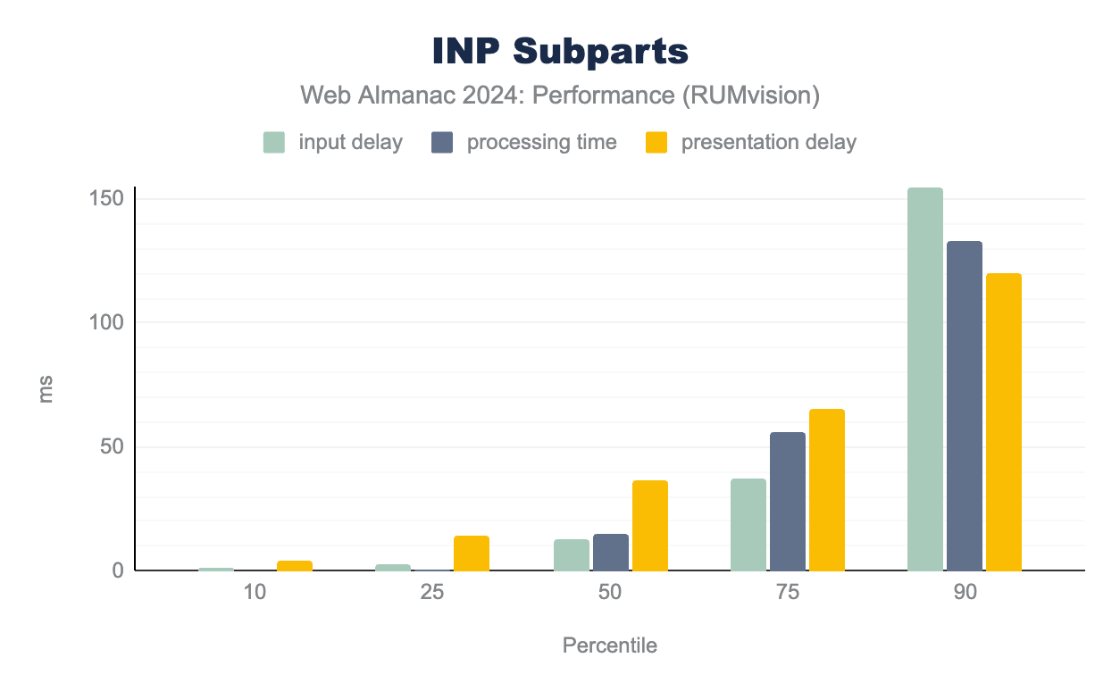
The INP sub-part duration distribution data from RUMvision shows that presentation delay (36 milliseconds) contributes the most to the median INP. As percentiles increase, input delay and processing time become longer. At the 75th percentile, input delay reaches 37 milliseconds and processing delay 56 milliseconds. By the 90th percentile, input delay jumps to 155 milliseconds, which makes it the biggest contributor to poor INP. One way to optimize input delay is by avoiding long tasks, which we explore in the Long Tasks section.
Long tasks
One of the sub-parts of INP is input delay, which can be longer than it should be due to various factors, including long tasks. A task is a discrete unit of work that the browser executes, and JavaScript is often the largest source of tasks. When a task exceeds 50 milliseconds, it is considered a long task. These long tasks can cause delays in responding to user interactions, directly affecting interactivity performance.
Due to the lack of same-source data for long tasks and INP, we decided not to correlate them. We will, however, explore the average Long Task duration using data from RUMvision.
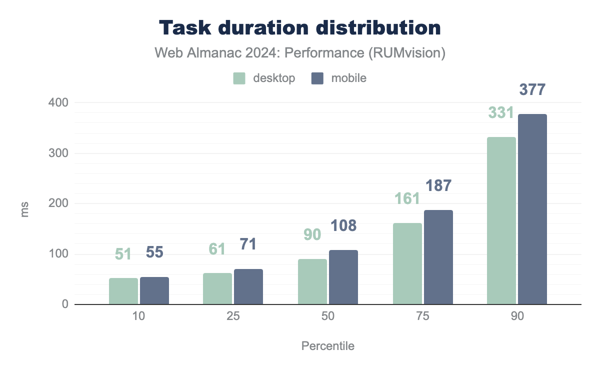
The task duration distribution shows a median task duration of 90 milliseconds for desktop and 108 milliseconds for mobile, which is twice more than the best practice recommendation of under 50 milliseconds. Less than 25% of websites have an optimal task duration below 50 milliseconds. We can also see that in every percentile, task duration on mobile sites is longer than on desktop sites, with the gap increasing as the percentile increases. On the 90th percentile, there is a 46 millisecond difference between the average task duration between device types. This correlates well with INP scores that show better results on desktop compared to mobile.
Task duration data was retrieved using the Long Tasks API, which provides some useful data about performance issues, but it has limitations when it comes to accurately measuring sluggishness. It only identifies when a long task occurs and how long it lasts. It might overlook essential tasks such as rendering. Due to these limitations, we will explore the Long Animation Frames API in the next section, which offers more detailed insights.
Long animation frames
Long Animation Frames (LoAF) are a performance timeline entry for identifying sluggishness and poor INP by tracking when work and rendering block the main thread. LoAF tracks animation frames instead of individual tasks like the Long Tasks API. A long animation frame is when a rendering update is delayed beyond 50 milliseconds (the same as the threshold for the Long Tasks API). It helps to find scripts that cause INP performance bottlenecks. This data allows us to analyze INP performance based on the categories of scripts responsible for LoAF.
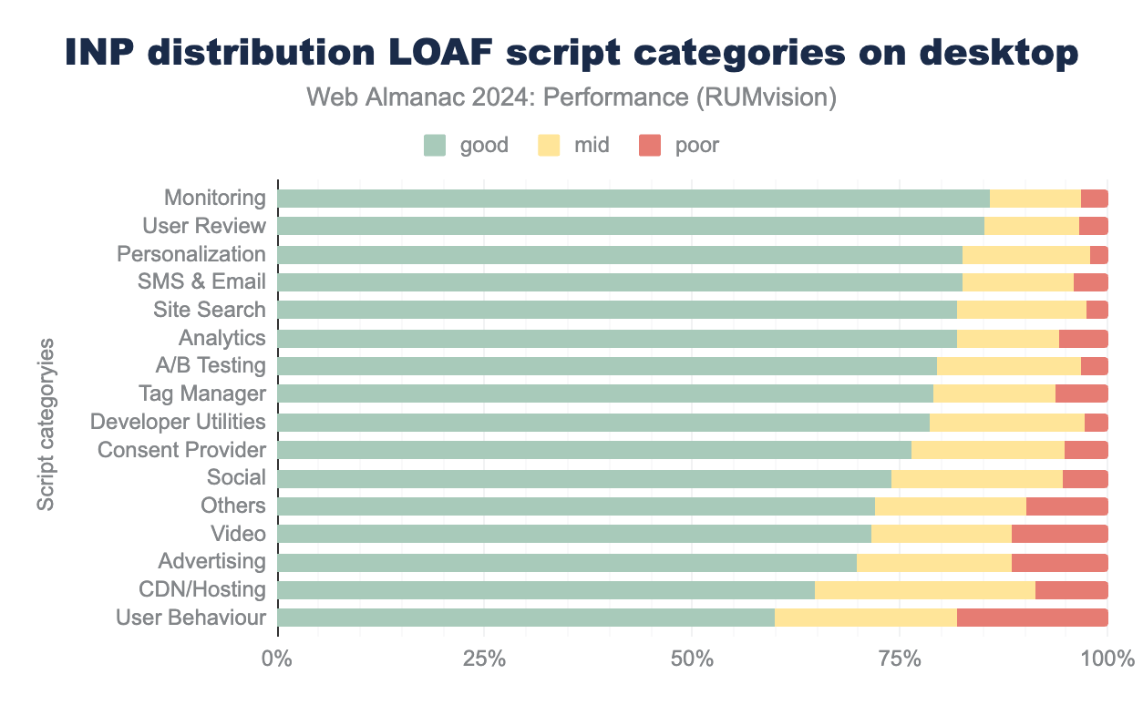
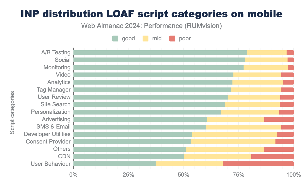
The top two categories contributing the most to slow INP scores on mobile and desktop devices are User Behavior scripts (37% of mobile and 60% of desktop pages with good INP) and CDN/Hosting (50% of mobile and 65% of desktop pages with good INP).
User Behavior scripts include scripts from hosts like script.hotjar.com, smartlook.com, newrelic.com, etc. While these tools provide valuable insights about users, our data shows that they can significantly degrade user experience by slowing down website interactions.
CDN and Hosting script category examples come from domains like cdn.jsdelivr.net, ajax.cloudflare.com, cdnjs.cloudflare.com, cdn.shopify.com, sdk.awswaf.com, cloudfront.net, s3.amazonaws.com and others. Having CDNs among the categories with the poorest INP results seems controversial because CDNs are usually recommended as a performance optimization technique that reduces server load and delivers content faster to users. However, the CDNs included in this category usually deliver first- or third-party JavaScript resources, which contribute to LoAF and negatively impact interactivity.
On mobile devices, Consent Providers seem to have a significant impact on INP, resulting in only 53% of mobile pages having good INP when using one. This category consists of providers like consentframework.com, cookiepro.com, cookiebot.com, privacy-mgmt.com, usercentrics.eu, and many others. On desktop devices, Consent Provider scripts show much better results, i.e. 76% of pages with good INP. This difference is likely due to the more powerful processors on desktop devices.
It is worth noting that the monitoring category, which also includes performance monitoring tools, has one of the least impacts on poor INP results. This is a good argument in favor of using web performance monitoring tools, as they help with valuable web performance insights without significantly affecting interactivity performance.
Total Blocking Time (TBT)
Total Blocking Time (TBT) measures the total amount of time after First Contentful Paint (FCP) where the main thread was blocked for long enough to prevent input responsiveness.
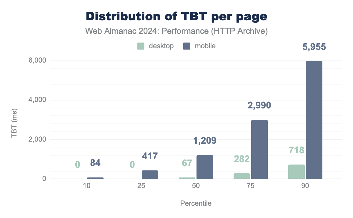
TBT is a lab metric and is often used as a proxy for field-based responsiveness metrics, such as INP, which can only be collected using real user monitoring, such as CrUX and RUMvision. Lab-based TBT and field-based INP are correlated, meaning TBT results generally reflect INP trends. A TBT below 200 milliseconds is considered good, but most mobile websites exceed this target significantly.
The median TBT on mobile is 1,209 milliseconds, which is 6 times higher than the best practice. In contrast, desktop websites show much better performance, with a median TBT of just 67 milliseconds. It is important to emphasize that the lab results use an emulated low-power device and a slow network, which may not reflect the real user data, as actual device and network conditions can vary. However, even with that in mind, these results still show that in the 90th percentile, user on mobile device will need to wait almost 6 seconds before the site becomes interactive.
With TBT being caused by long tasks it is not surprising to notice the same trend per percentiles as well as similar trend in gap between mobile and desktop in the two metrics results. It is also important to note that high TBT can be contributing to the input delay part of the INP, negatively impacting the overall INP score.
Interactivity conclusion
The main takeaways of the interactivity results are:
- Despite the improvement in INP each year, a significant gap between desktop (97% good INP) and mobile (74% good INP) performance still exists.
- The top visited websites show poorer INP results compared to less popular ones.
- INP can be divided into three sub-parts: Input Delay, Processing Time, and Presentation Delay. Presentation Delay has the biggest share of the median INP in RUMvisions’s data.
- Scripts from user behavior tracking, consent provider, and CDN categories are the main contributors to poor INP scores.
Visual stability
Visual stability on a website refers to the consistency and predictability of visual elements as the page loads and users interact with it. A visually stable website ensures that content does not unexpectedly shift, move, or change layout, which can disrupt the user experience. These shifts often happen due to assets without specified dimensions (images and videos), third-party ads, heavy fonts, etc. The primary metric for measuring visual stability is Cumulative Layout Shift (CLS).
Cumulative Layout Shift (CLS)
CLS measures the biggest burst of layout shift scores for any unexpected layout shifts that happen while a page is open. Layout shifts occur when a visible element changes its position from one place to another.
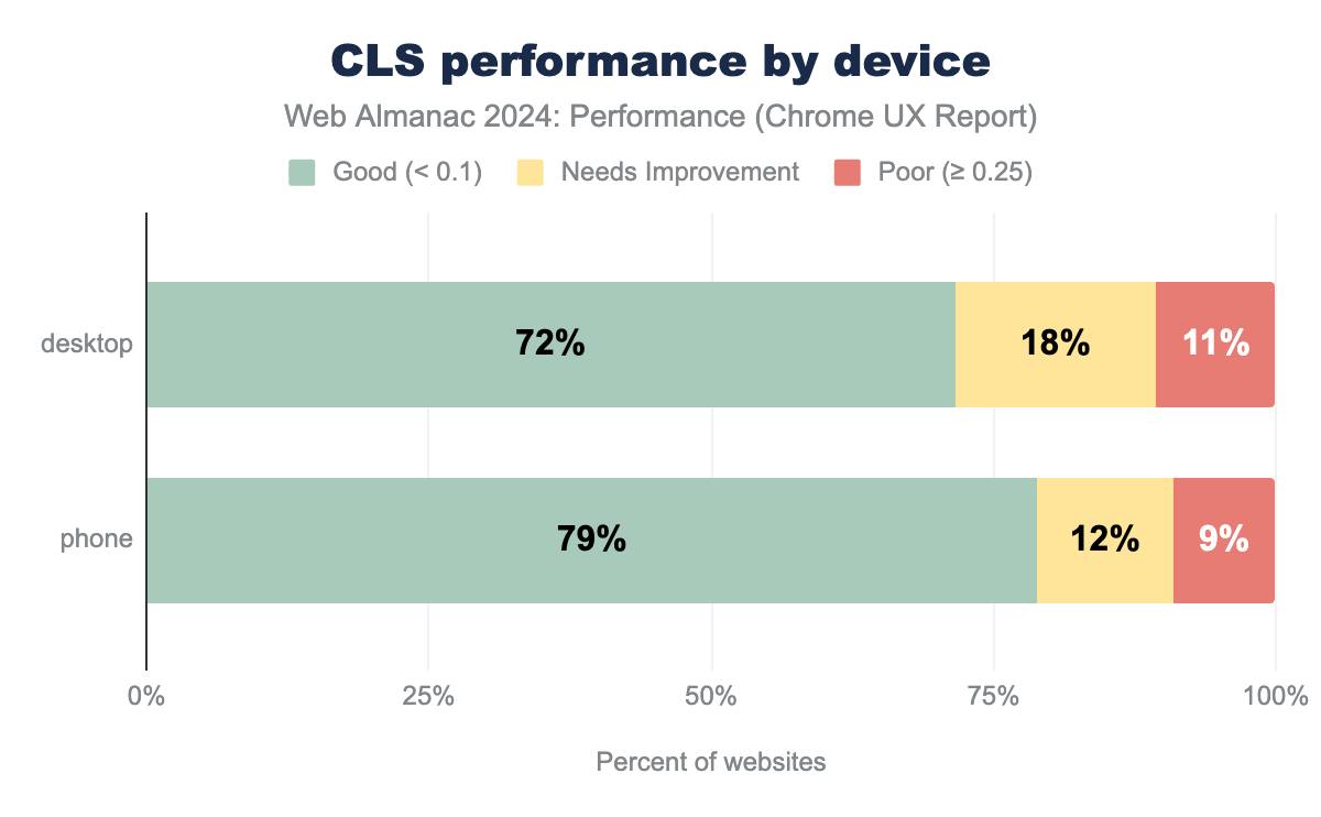
A CLS score of 0.1 or less is considered good, meaning the page offers a visually stable experience, while scores between 0.1 and 0.25 indicate the need for improvement, and scores above 0.25 are considered poor, indicating that users may experience disruptive, unexpected layout shifts.
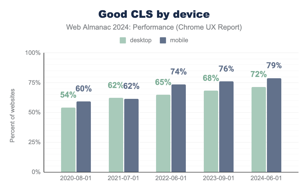
In 2024, 72% of websites achieved good CLS scores, while 11% had poor ones. We can also see that websites on mobile devices provide a better user experience when it comes to site stability than desktop sites.
Looking at the metrics over time, we can see a nice upward trend. There is an increase from 60% of websites with good visual stability in 2020 to almost 80% in 2024. A visible jump in mobile data is already addressed in detail and attributed to the introduction of bfcache in the 2022 chapter. There is still a visible difference from 2022, so we will look in detail at some of the aspects that possibly contributed to it.
Back/forward cache (bfcache)
The back/forward cache (bfcache) is a browser optimization feature that improves the speed and efficiency of navigating between web pages by caching a fully interactive snapshot of a page in memory when a user navigates away from it. However, not all sites are eligible for bfcache. With an extensive eligibility criteria, the easiest way to check if the site is eligible is to test it in Chrome DevTools.
Let’s look deeper by checking a few eligibility criteria that are quite a common cause and easily measurable using lab data.
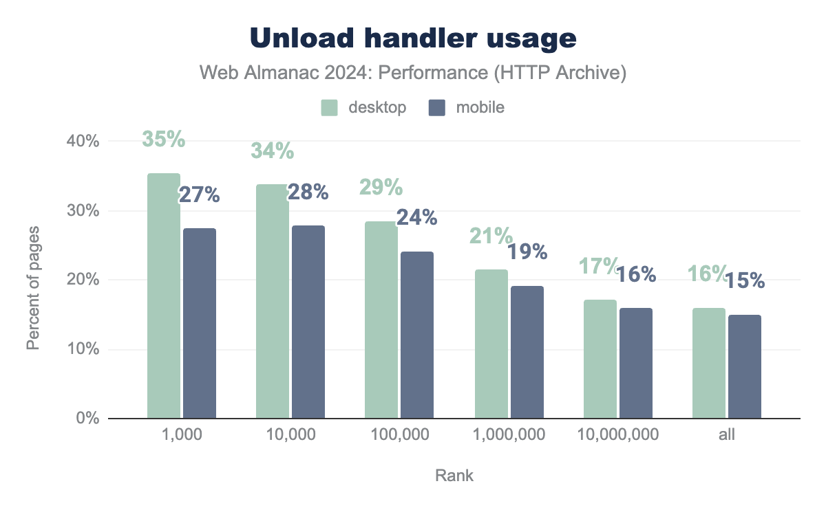
One of the “usual suspects” is the unload event that is triggered when a user navigates away from a page. Due to how bfcache preserves a page’s state, unload event makes the page ineligible for bfcache. Important to note here is that this feature is specific for browsers on desktops. Mobile browsers ignore the unload event when deciding bfcache eligibility, since it is already unreliable on those devices given how background pages are discarded more often there. This behavior could explain CLS improvement over the years and the gap between mobile and desktop numbers:
From the above chart showing unload events from pages, we can see a few interesting things. Overall event usage is quite low, 15-16%. However, it increases drastically for the top 1.000 sites, to 35% on desktop and 27% on mobile, indicating that more popular sites probably use quite some more third-party services that often use this specific event. The gap between mobile and desktop is significant as, while mobile sites using unload events are still eligible for the bfcache, they are still unreliable.
It is expected to see this decrease in the use of unload events with major browsers like Google Chrome and Firefox moving towards its deprecation since around 2020 and encouraging the use of alternative events like pagehide and visibilitychange. These events are more reliable, do not block the browser’s navigation, and are compatible with bfcache, allowing pages to be preserved in memory and restored instantly when users navigate back or forward.
Another common reason for websites to fall in the bfcache ineligibility category is the use of the cache-control: no-store directive. This cache control header instructs the browser (and any intermediate caches) not to store a copy of the resource, ensuring that the content is fetched from the server on every request.
Cache-Control: no-store.
21% of sites are using Cache-Control: no-store. That is a slight decrease from the 2022 report when this measure was about 22%.
When bfcache was first introduced, it brought noticeable improvements to Core Web Vitals. Based on that, Chrome is gradually bringing bfcache to more sites that were previously ineligible due to the use of the Cache-Control: no-store header. This change aims to further improve site performance.
Unload event, as well as Cache-Control: no-store, do not directly affect the page’s visual stability. As already mentioned, the concept of bfcache load as a side-effect has this positive impact by eliminating some potential issues affecting metrics directly, such as unsized images or dynamic content. To continue exploring the visual stability aspect of the web, let’s check some of the practices that directly impact the CLS.
CLS best practices
The following best practices allow you to reduce, or even completely avoid CLS.
Explicit dimensions
One of the most common reasons for unexpected layout shifts is not preserving space for assets or incoming dynamic content. For example, adding width and height attributes on images is one of the easiest ways to preserve space and avoid shifts.
66% of mobile pages have at least one unsized image, which is an improvement from 72% in 2022.
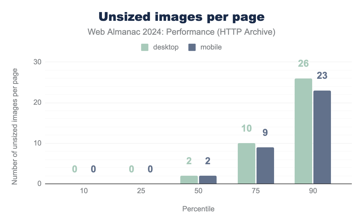
The median number of unsized images per web page is two. When we shift to the 90th percentile, that number jumps to 26 for desktop sites and 23 for mobile. Having unsized images on the page can be a risk for layout shift; however, an important aspect to look at is if images are affecting the viewport and if yes, how much.
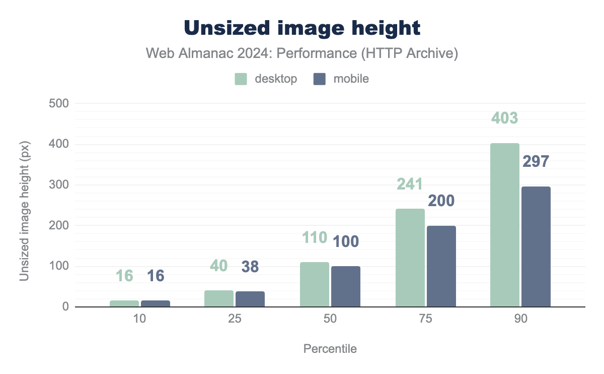
The median mobile site has unsized images of about 100 pixels in height. Our test devices have a mobile viewport height of 512 pixels, representing almost 20% of the screen width. This can potentially be shifted down when an unsized (full-width) image loads, which is not an insignificant shift.
As expected, image heights on desktop pages are larger, with the size on the median being 110px and on the 90th percentile 403 pixels.
Fonts
Fonts can directly impact CLS. When web fonts are loaded asynchronously, a delay occurs between the initial rendering of the page and the time when the custom fonts are applied. During this delay, browsers often display text using a fallback font, which can have different dimensions (width, height, letter spacing) compared to the web font. When the web font finally loads, the text may shift to accommodate the new dimensions, causing a visible layout shift and contributing to a higher CLS score.
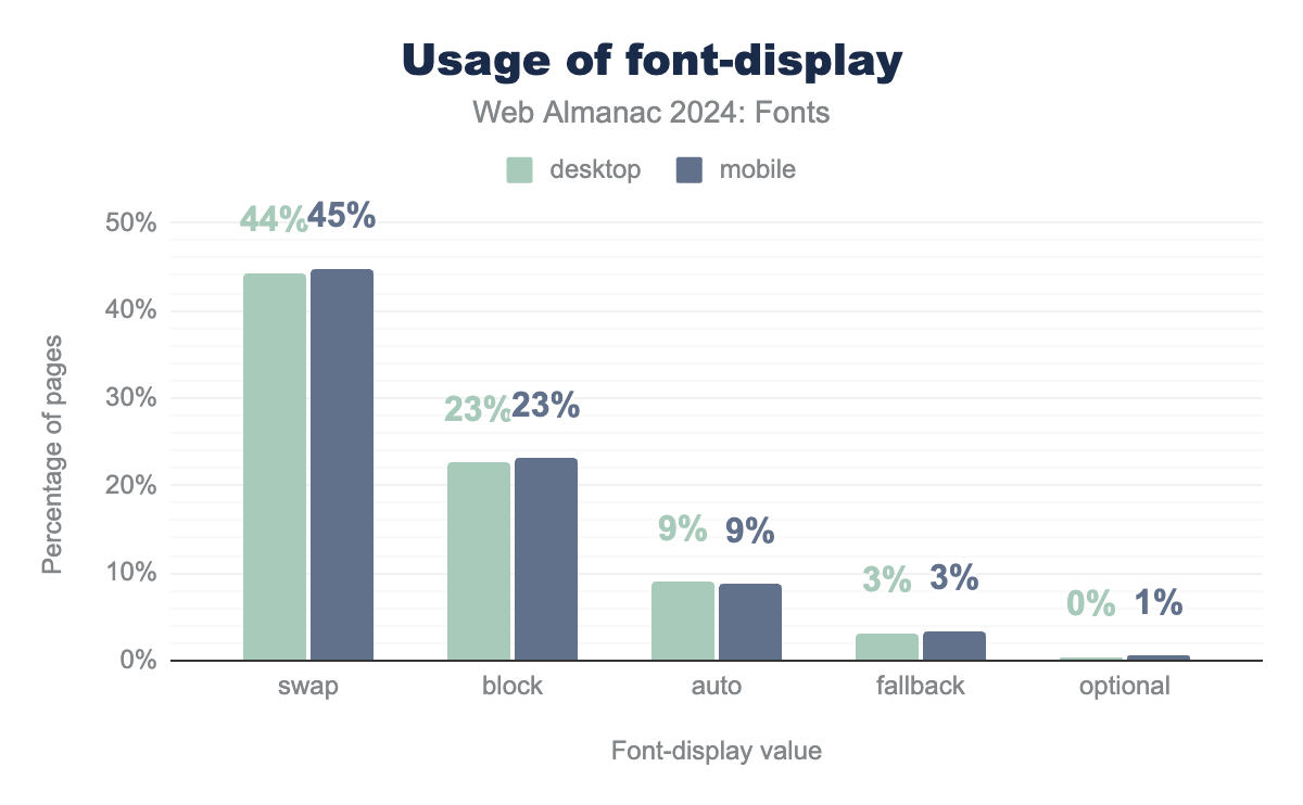
Using system fonts is one way to fix this issue. However, with 85% of mobile pages using web fonts it is not very likely that they will stop being used any time soon. A way to control the visual stability of a site that uses web fonts is to use the font-display property in CSS to control how fonts are loaded and displayed. Different font-display strategies can be used depending on the team’s decision about the tradeoff between performance and aesthetics.
From the data displayed above, we can see that around 44% of both mobile and desktop sites use font-display:swap while 23% of sites use font-display:block. 9% of sites set the font-display property to auto and 3% use the fallback property. Only around 1% of sites use the optional strategy.
Compared to the 2022 data, there is a visible increase in the use of all font-display strategies, the biggest one being on swap, whose usage on both mobile and desktop pages jumped from around 30% in 2022 to over 44%.
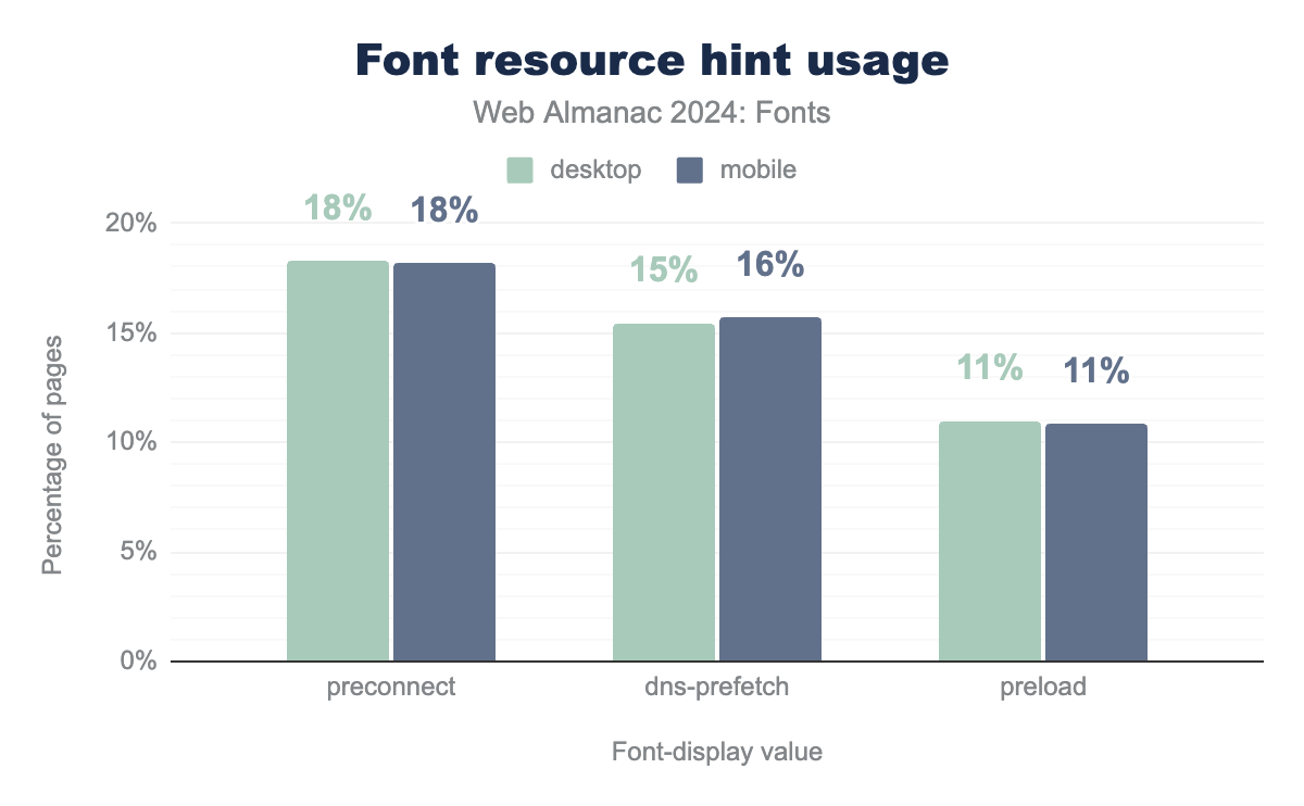
Since most font-display strategies can contribute to CLS, we need to look at other strategies for minimizing potential issues. One of those is using resource hints to ensure third-party fonts are discovered and loaded as soon as possible.
Around 11% of all tested mobile and desktop pages are preloading their web fonts, indicating to the browser that they should download these files, hopefully early enough to avoid shifts due to late font arrival. Note that using preload incorrectly can harm performance instead of helping it. To avoid this, we need to make sure that the preloaded font will be used and that we don’t preload too many assets. Preloading too many assets can end up delaying other, more important resources.
18% of sites are using preconnect to establish an early connection to a third-party origin. Like with preload it is important to use this resource hint carefully and not to overdo it.
Animations
Another cause of unexpected shifts can be non-composited CSS animations. These animations involve changes to properties that impact the layout or appearance of multiple elements, which forces the browser to go through more performance-intensive steps like recalculating styles, reflowing the document, and repainting pixels on the screen. The best practice is to use CSS properties such as transform and opacity instead.
39% of mobile pages and 42% of desktop pages still use non-composited animations, which is a very slight increase from 38% for mobile and 41% for desktop in the analysis from 2022.
Visual stability conclusion
Visual stability of the site can have a big influence on the user experience of the page. Having text shifting around while reading or a button we were just about to click disappear from the viewport can lead to user frustration. The good news is that Cumulative Layout Shift (CLS) continued to improve in 2024. That indicates that more and more website owners are adopting good practices such as sizing images and preserving space for dynamic content, as well as optimizing for bfcache eligibility to benefit from this browser feature.
Conclusion
Web performance continued to improve in 2024, with positive trends across many key metrics. We now have a more comprehensive metric to assess website interactivity—INP—which hopefully should lead to even greater performance optimizations.
However, challenges remain. For example, there is still a significant gap in INP performance between desktop and mobile. Presentation Delay is the main contributor to poor INP, mostly caused by third-party scripts for behavior tracking, consent providers, and CDNs.
Visual stability continues to improve by the adoption of best practices like proper image sizing and preserving space for dynamic content. Additionally, with recent changes in Chrome’s bfcache eligibility, more sites will benefit from faster back and forward navigation.
Overall, web performance is on a promising track, making loading times faster, interactivity smoother, and visual stability more reliable. However, the difference between mobile and desktop experiences remains large. In future Web Almanac reports, we hope to see this gap decreasing, making the web experience consistent across all devices.
