CMS

Introduction
The general term Content Management System (CMS) refers to systems enabling individuals and organizations to create, manage, and publish content. A CMS for web content, specifically, is a system aimed at creating, managing, and publishing content to be consumed and experienced via the open web.
Each CMS implements some subset of a wide range of content management capabilities and the corresponding mechanisms for users to build websites easily and effectively around their content. Such content is often stored in some type of database, providing users with the flexibility to reuse it wherever needed for their content strategy. CMSs also provide admin capabilities aimed at making it easy for users to upload and manage content as needed.
There is great variability on the type and scope of the support CMSs provide for building sites; some provide ready-to-use templates which are “hydrated” with user content, and others require much more user involvement for designing and constructing the site structure.
When we think about CMSs, we need to account for all the components that play a role in the viability of such a system for providing a platform for publishing content on the web. All of these components form an ecosystem surrounding the CMS platform, and they include hosting providers, extension developers, development agencies, site builders, etc. Thus, when we talk about a CMS, we usually refer to both the platform itself and its surrounding ecosystem.
Why do content creators use a CMS?
At the beginning of (web evolution) time, the web ecosystem was powered by a simple growth loop, where users could become creators just by viewing the source of a web page, copy-pasting according to their needs, and tailoring the new version with individual elements like images.
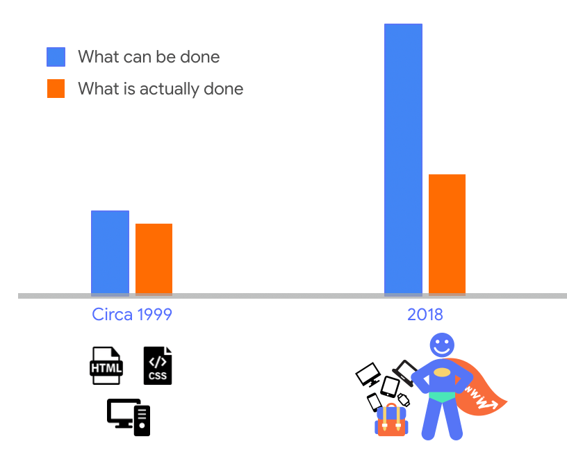
As the web evolved, it became more powerful, but also more complicated. As a consequence, that simple growth loop was broken and it was not the case anymore that any user could become a creator. For those who could pursue the content creation path, the road became arduous and hard to achieve. The usage-capability gap, that is, the difference between what can be done in the web and what is actually done, grew steadily.
Here is where a CMS plays the very important role of making it easy for users with different degrees of technical expertise to enter the web ecosystem loop as content creators. By lowering the barrier of entry for content creation, CMSs activate the growth loop of the web by turning users into creators. Hence their popularity.
The goal of this chapter
There are many interesting and important aspects to analyze and questions to answer in our quest to understand the CMS space and its role in the present and the future of the web. While we acknowledge the vastness and complexity of the CMS platforms space, and don’t claim omniscient knowledge fully covering all aspects involved on all platforms out there, we do claim our fascination for this space and we bring deep expertise on some of the major players in the space.
In this chapter, we seek to scratch the surface area of the vast CMS space, trying to shed a beam of light on our collective understanding of the status quo of CMS ecosystems, and the role they play in shaping users’ perception of how content can be consumed and experienced on the web. Our goal is not to provide an exhaustive view of the CMS landscape; instead, we will discuss a few aspects related to the CMS landscape in general, and the characteristics of web pages generated by these systems. This first edition of the Web Almanac establishes a baseline, and in the future we’ll have the benefit of comparing data against this version for trend analysis.
CMS adoption
Today, we can observe that more than 40% of the web pages are powered by some CMS platform; 40.01% for mobile and 39.61% for desktop more precisely.
There are other datasets tracking market share of CMS platforms, such as W3Techs, and they reflect higher percentages of more than 50% of web pages powered by CMS platforms. Furthermore, they observe also that CMS platforms are growing, as fast as 12% year-over-year growth in some cases! The deviation between our analysis and W3Tech’s analysis could be explained by a difference in research methodologies. You can read more about ours on the Methodology page.
In essence, this means that there are many CMS platforms available out there. The following picture shows a reduced view of the CMS landscape.
Some of them are open source (e.g. WordPress, Drupal, others) and some of them are proprietary (e.g. AEM, others). Some CMS platforms can be used on “free” hosted or self-hosted plans, and there are also advanced options for using these platforms on higher-tiered plans even at the enterprise level. The CMS space as a whole is a complex, federated universe of CMS ecosystems, all separated and at the same time intertwined in the vast fabric of the web.
It also means that there are hundreds of millions of websites powered by CMS platforms, and an order of magnitude more of users accessing the web and consuming content through these platforms. Thus, these platforms play a key role for us to succeed in our collective quest for an evergreen, healthy, and vibrant web.
The CMS landscape
A large swath of the web today is powered by one kind of CMS platform or another. There are statistics collected by different organizations that reflect this reality. Looking at the Chrome UX Report (CrUX) and HTTP Archive datasets, we get a picture that is consistent with stats published elsewhere, although quantitatively the proportions described may be different as a reflection of the specificity of the datasets.
Looking at web pages served on desktop and mobile devices, we observe an approximate 60-40 split in the percentage of such pages which were generated by some kind of CMS platform, and those that aren’t.
CMS-powered web pages are generated by a large set of available CMS platforms. There are many such platforms to choose from, and many factors that can be considered when deciding to use one vs. another, including things like:
- Core functionality
- Creation/editing workflows and experience
- Barrier of entry
- Customizability
- Community
- And many others.
The CrUX and HTTP Archive datasets contain web pages powered by a mix of around 103 CMS platforms. Most of those platforms are very small in terms of relative market share. For the sake of our analysis, we will be focusing on the top CMS platforms in terms of their footprint on the web as reflected by the data. For a full analysis, see this chapter’s results spreadsheet.
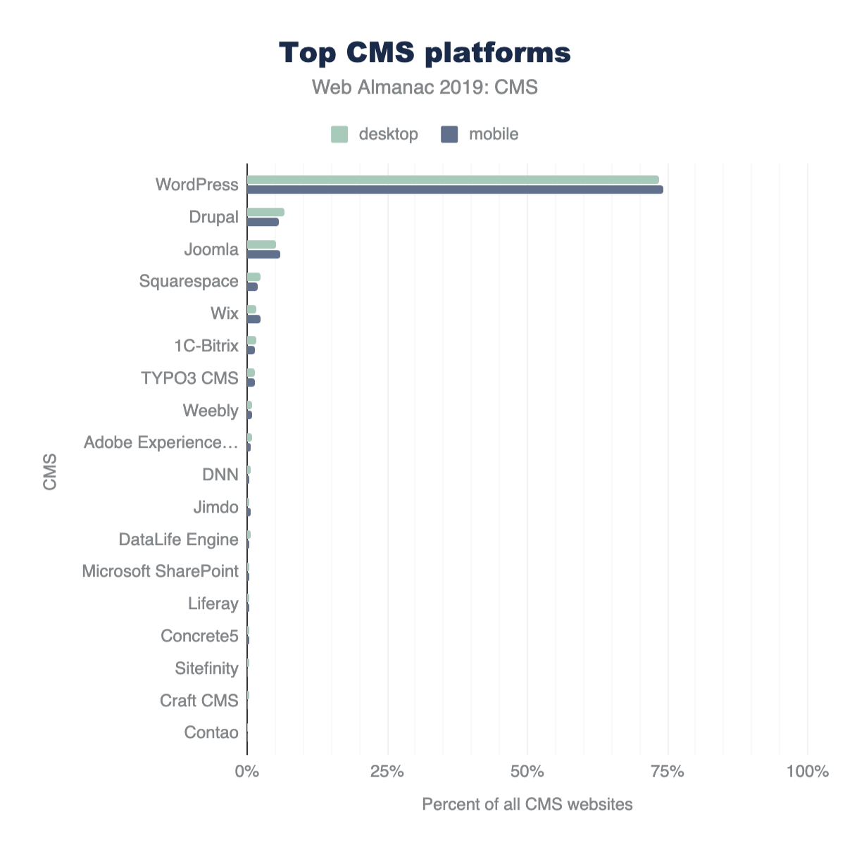
The most salient CMS platforms present in the datasets are shown above in Figure 14.5. WordPress comprises 74.19% of mobile and 73.47% of desktop CMS websites. Its dominance in the CMS landscape can be attributed to a number of factors that we’ll discuss later, but it’s a major player. Open source platforms like Drupal and Joomla, and closed SaaS offerings like Squarespace and Wix, round out the top 5 CMSs. The diversity of these platforms speak to the CMS ecosystem consisting of many platforms where user demographics and the website creation journey vary. What’s also interesting is the long tail of small scale CMS platforms in the top 20. From enterprise offerings to proprietary applications developed in-house for industry specific use, content management systems provide the customizable infrastructure for groups to manage, publish, and do business on the web.
The WordPress project defines its mission as “democratizing publishing”. Some of its main goals are ease of use and to make the software free and available for everyone to create content on the web. Another big component is the inclusive community the project fosters. In almost any major city in the world, one can find a group of people who gather regularly to connect, share, and code in an effort to understand and build on the WordPress platform. Attending local meetups and annual events as well as participating in web-based channels are some of the ways WordPress contributors, experts, businesses, and enthusiasts participate in its global community.
The low barrier of entry and resources to support users (online and in-person) with publishing on the platform and to develop extensions (plugins) and themes contribute to its popularity. There is also a thriving availability of and economy around WordPress plugins and themes that reduce the complexity of implementing sought after web design and functionality. Not only do these aspects drive its reach and adoption by newcomers, but also maintains its long-standing use over time.
The open source WordPress platform is powered and supported by volunteers, the WordPress Foundation, and major players in the web ecosystem. With these factors in mind, WordPress as the leading CMS makes sense.
How are CMS-powered sites built
Independent of the specific nuances and idiosyncrasies of different CMS platforms, the end goal for all of them is to output web pages to be served to users via the vast reach of the open web. The difference between CMS-powered and non-CMS-powered web pages is that in the former, the CMS platform makes most of the decisions of how the end result is built, while in the latter there are not such layers of abstraction and decisions are all made by developers either directly or via library configurations.
In this section we take a brief look at the status quo of the CMS space in terms of the characteristics of their output (e.g. total resources used, image statistics, etc.), and how they compare with the web ecosystem as a whole.
Total resource usage
The building blocks of any website also make a CMS website: HTML, CSS, JavaScript, and media (images and video). CMS platforms give users powerfully streamlined administrative capabilities to integrate these resources to create web experiences. While this is one of the most inclusive aspects of these applications, it could have some adverse effects on the wider web.
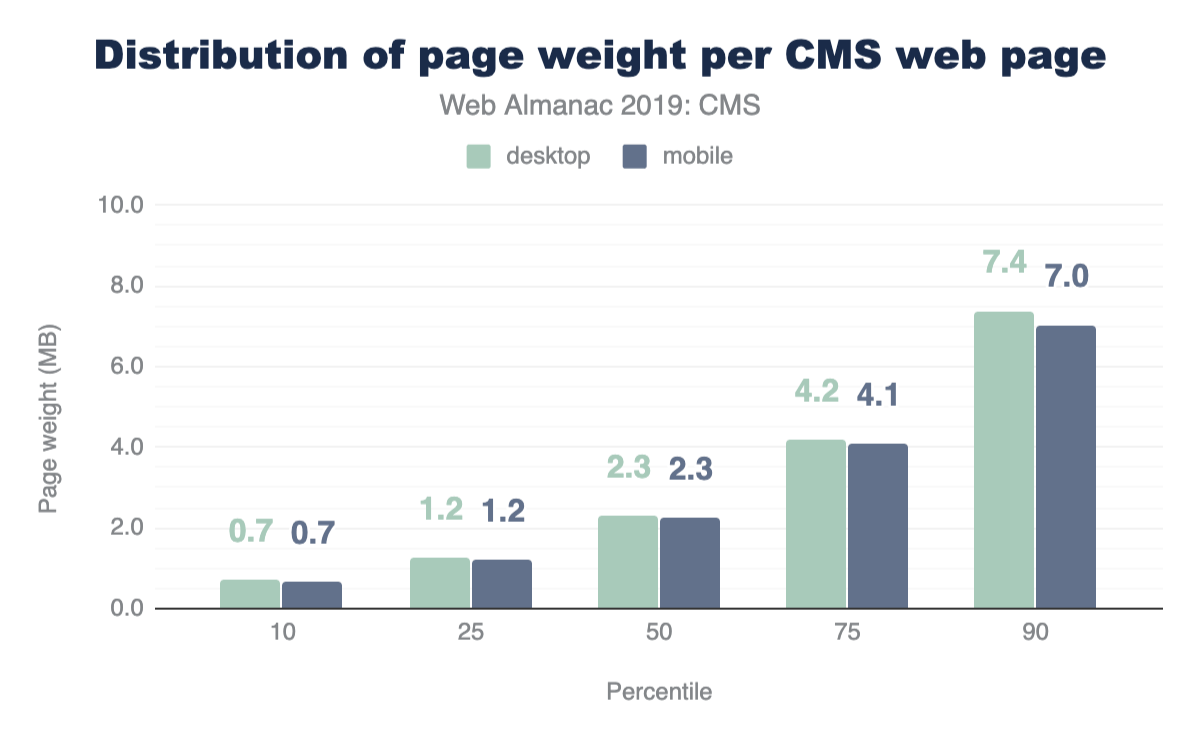
In Figures 14.6 and 14.7 above, we see the median desktop CMS page loads 86 resources and weighs 2.29 MB. Mobile page resource usage is not too far behind with 83 resources and 2.25 MB.
The median indicates the halfway point that all CMS pages either fall above or below. In short, half of all CMS pages load fewer requests and weigh less, while half load more requests and weigh more. At the 10th percentile, mobile and desktop pages have under 40 requests and 1 MB in weight, but at the 90th percentile we see pages with over 170 requests and at 7 MB, almost tripling in weight from the median.
How do CMS pages compare to pages on the web as a whole? In the Page Weight chapter, we find some telling data about resource usage. At the median, desktop pages load 74 requests and weigh 1.9 MB, and mobile pages on the web load 69 requests and weigh 1.7 MB. The median CMS page exceeds this. CMS pages also exceed resources on the web at the 90th percentile, but by a smaller margin. In short: CMS pages could be considered as some of the heaviest.
| percentile | image | video | script | font | css | audio | html |
|---|---|---|---|---|---|---|---|
| 50 | 1,233 | 1,342 | 456 | 140 | 93 | 14 | 33 |
| 75 | 2,766 | 2,735 | 784 | 223 | 174 | 97 | 66 |
| 90 | 5,699 | 5,098 | 1,199 | 342 | 310 | 287 | 120 |
| percentile | image | video | script | css | font | audio | html |
|---|---|---|---|---|---|---|---|
| 50 | 1,264 | 1,056 | 438 | 89 | 109 | 14 | 32 |
| 75 | 2,812 | 2,191 | 756 | 171 | 177 | 38 | 67 |
| 90 | 5,531 | 4,593 | 1,178 | 317 | 286 | 473 | 123 |
When we look closer at the types of resources that load on mobile or desktop CMS pages, images and video immediately stand out as primary contributors to their weight.
The impact doesn’t necessarily correlate with the number of requests, but rather how much data is associated with those individual requests. For example, in the case of video resources with only two requests made at the median, they carry more than 1 MB of associated load. Multimedia experiences also come with the use of scripts to integrate interactivity, deliver functionality and data to name a few use cases. In both mobile and desktop pages, those are the 3rd heaviest resource.
With our CMS experiences saturated with these resources, we must consider the impact this has on website visitors on the frontend- is their experience fast or slow? Additionally, when comparing mobile and desktop resource usage, the amount of requests and weight show little difference. This means that the same amount and weight of resources are powering both mobile and desktop CMS experiences. Variation in connection speed and mobile device quality adds another layer of complexity. Later in this chapter, we’ll use data from CrUX to assess user experience in the CMS space.
Third-party resources
Let’s highlight a particular subset of resources to assess their impact in the CMS landscape. Third-party resources are those from origins not belonging to the destination site’s domain name or servers. They can be images, videos, scripts, or other resource types. Sometimes these resources are packaged in combination such as with embedding an iframe for example. Our data reveals that the median amount of 3rd party resources for both desktop and mobile are close.
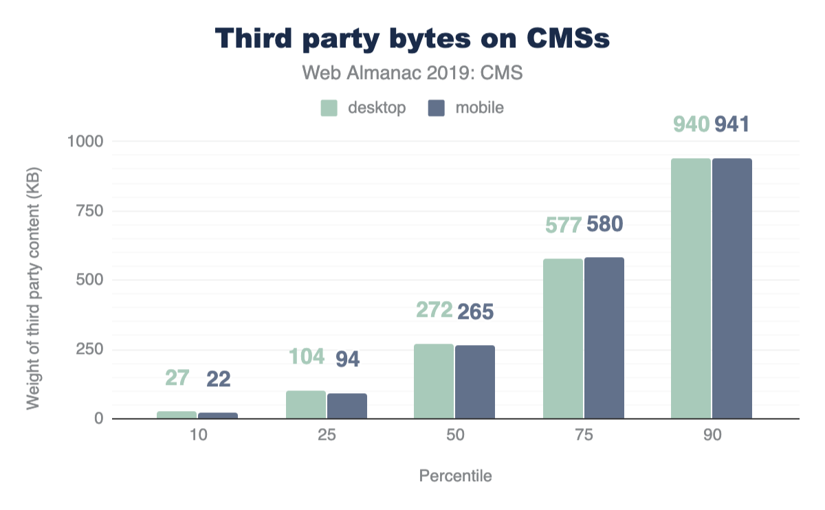
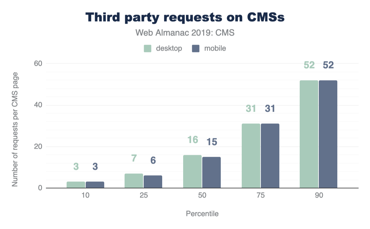
The median amount of 3rd party requests on mobile CMS pages is 15 and weigh 264.72 KB, while the median for these requests on desktop CMS pages is 16 and weigh 271.56 KB. (Note that this excludes 3P resources considered part of “hosting”).
We know the median value indicates at least half of CMS web pages are shipping with more 3rd party resources than what we report here. At the 90th percentile, CMS pages can deliver up to 52 resources at approximately 940 KB, a considerable increase.
Given that third-party resources originate from remote domains and servers, the destination site has little control over the quality and impact these resources have on its performance. This unpredictability could lead to fluctuations in speed and affect the user experience, which we’ll soon explore.
Image stats
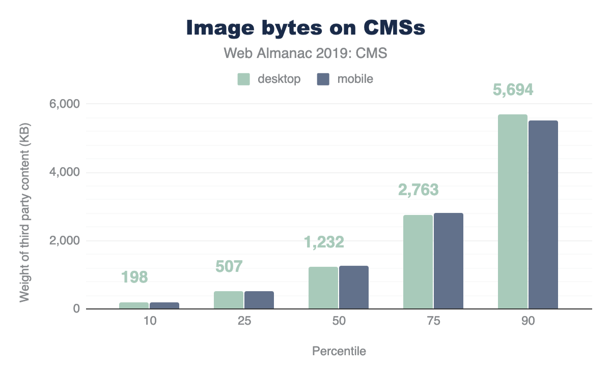
Recall from Figures 14.8 and 14.9 earlier, images are a big contributor to the total weight of CMS pages. Figures 14.12 and 14.13 above show that the median desktop CMS page has 31 images and payload of 1,232 KB, while the median mobile CMS page has 29 images and payload of 1,263 KB. Again we have very close margins for the weight of these resources for both desktop and mobile experiences. The Page Weight chapter additionally shows that image resources well exceed the median weight of pages with the same amount of images on the web as a whole, which is 983 KB and 893 KB for desktop and mobile respectively. The verdict: CMS pages ship heavy images.
Which are the common formats found on mobile and desktop CMS pages? From our data JPG images on average are the most popular image format. PNG and GIF formats follow, while formats like SVG, ICO, and WebP trail significantly comprising approximately a little over 2% and 1%.
Perhaps this segmentation isn’t surprising given the common use cases for these image types. SVGs for logos and icons are common as are JPEGs ubiquitous. WebP is still a relatively new optimized format with growing browser adoption. It will be interesting to see how this impacts its use in the CMS space in the years to come.
User experience on CMS-powered websites
Success as a web content creator is all about user experience. Factors such as resource usage and other statistics regarding how web pages are composed are important indicators of the quality of a given site in terms of the best practices followed while building it. However, we are ultimately interested in shedding some light on how are users actually experiencing the web when consuming and engaging with content generated by these platforms.
To achieve this, we turn our analysis towards some user-perceived performance metrics, which are captured in the CrUX dataset. These metrics relate in some ways to how we, as humans, perceive time.
| Duration | Perception |
|---|---|
| < 0.1 seconds | Instant |
| 0.5-1 second | Immediate |
| 2-5 seconds | Point of abandonment |
If things happen within 0.1 seconds (100 milliseconds), for all of us they are happening virtually instantly. And when things take longer than a few seconds, the likelihood we go on with our lives without waiting any longer is very high. This is very important for content creators seeking sustainable success in the web, because it tells us how fast our sites must load if we want to acquire, engage, and retain our user base.
In this section we take a look at three important dimensions which can shed light on our understanding of how users are experiencing CMS-powered web pages in the wild:
- First Contentful Paint (FCP)
- First Input Delay (FID)
- Lighthouse scores
First Contentful Paint
First Contentful Paint measures the time it takes from navigation until content such as text or an image is first displayed. A successful FCP experience, or one that can be qualified as “fast,” entails how quickly elements in the DOM are loaded to assure the user that the website is loading successfully. Although a good FCP score is not a guarantee that the corresponding site offers a good UX, a bad FCP almost certainly does guarantee the opposite.
| CMS | Fast (< 1000ms) |
Moderate | Slow (>= 3000ms) |
|---|---|---|---|
| WordPress | 24.33% | 40.24% | 35.42% |
| Drupal | 37.25% | 39.39% | 23.35% |
| Joomla | 22.66% | 46.48% | 30.86% |
| Wix | 14.25% | 62.84% | 22.91% |
| Squarespace | 26.23% | 43.79% | 29.98% |
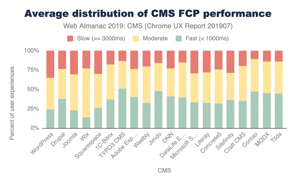
FCP in the CMS landscape trends mostly in the moderate range. The need for CMS platforms to query content from a database, send, and subsequently render it in the browser, could be a contributing factor to the delay that users experience. The resource loads we discussed in the previous sections could also play a role. In addition, some of these instances are on shared hosting or in environments that may not be optimized for performance, which could also impact the experience in the browser.
WordPress shows notably moderate and slow FCP experiences on mobile and desktop. Wix sits strongly in moderate FCP experiences on its closed platform. TYPO3, an enterprise open-source CMS platform, has consistently fast experiences on both mobile and desktop. TYPO3 advertises built-in performance and scalability features that may have a positive impact for website visitors on the frontend.
First Input Delay
First Input Delay (FID) measures the time from when a user first interacts with your site (i.e. when they click a link, tap on a button, or use a custom, JavaScript-powered control) to the time when the browser is actually able to respond to that interaction. A “fast” FID from a user’s perspective would be immediate feedback from their actions on a site rather than a stalled experience. This delay (a pain point) could correlate with interference from other aspects of the site loading when the user tries to interact with the site.
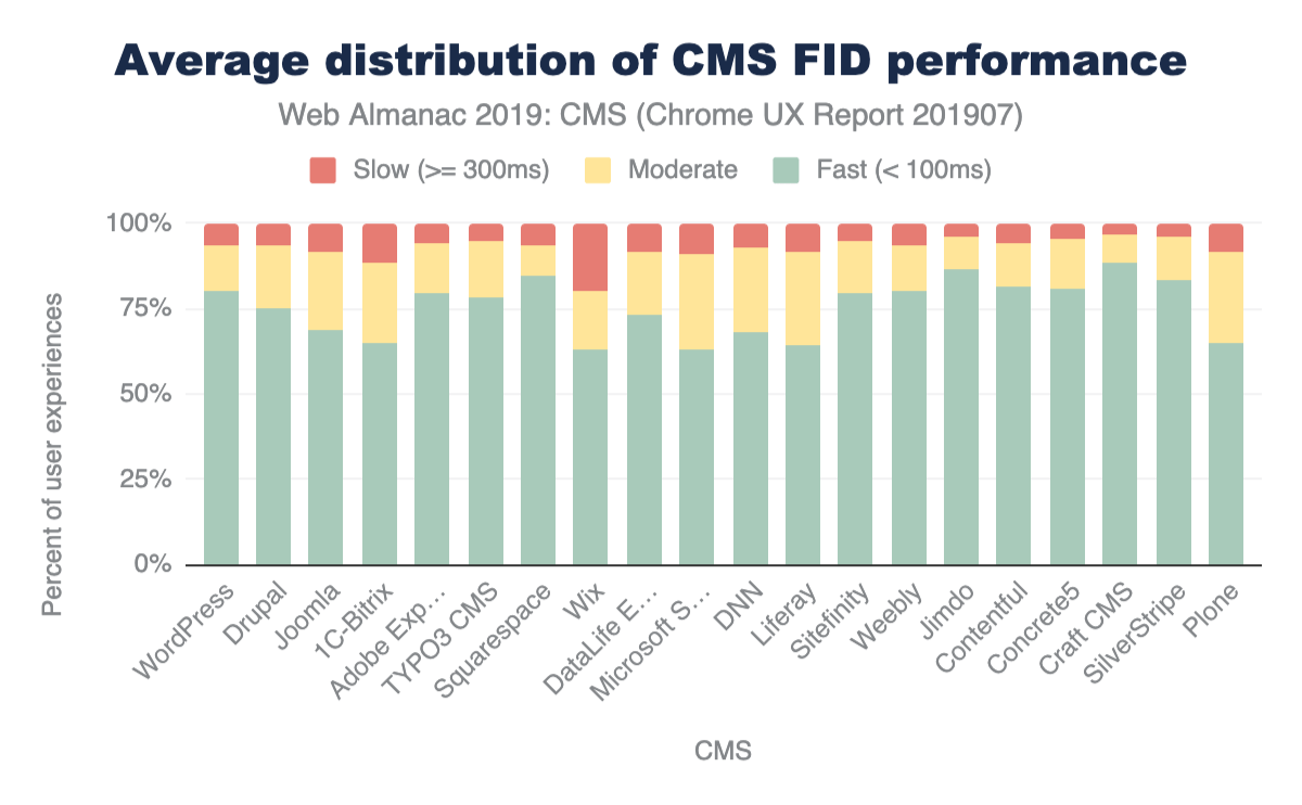
FID in the CMS space generally trends on fast experiences for both desktop and mobile on average. However, what’s notable is the significant difference between mobile and desktop experiences.
| CMS | Fast (< 100ms) |
Moderate | Slow (>= 300ms) |
|---|---|---|---|
| WordPress | 80.25% | 13.55% | 6.20% |
| Drupal | 74.88% | 18.64% | 6.48% |
| Joomla | 68.82% | 22.61% | 8.57% |
| Squarespace | 84.55% | 9.13% | 6.31% |
| Wix | 63.06% | 16.99% | 19.95% |
While this difference is present in FCP data, FID sees bigger gaps in performance. For example, the difference between mobile and desktop fast FCP experiences for Joomla is around 12.78%, for FID experiences the difference is significant: 27.76%. Mobile device and connection quality could play a role in the performance gaps that we see here. As we highlighted previously, there is a small margin of difference between the resources shipped to desktop and mobile versions of a website. Optimizing for the mobile (interactive) experience becomes more apparent with these results.
Lighthouse scores
Lighthouse is an open-source, automated tool designed to help developers assess and improve the quality of their websites. One key aspect of the tool is that it provides a set of audits to assess the status of a website in terms of performance, accessibility, progressive web apps, and more. For the purposes of this chapter, we are interested in two specific audits categories: PWA and accessibility.
PWA
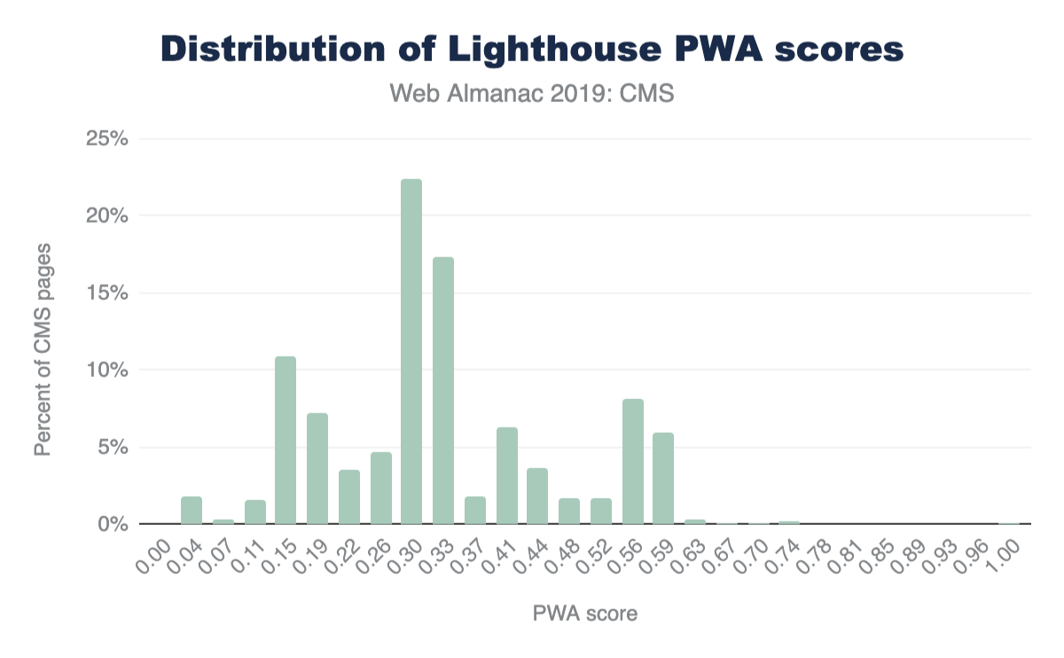
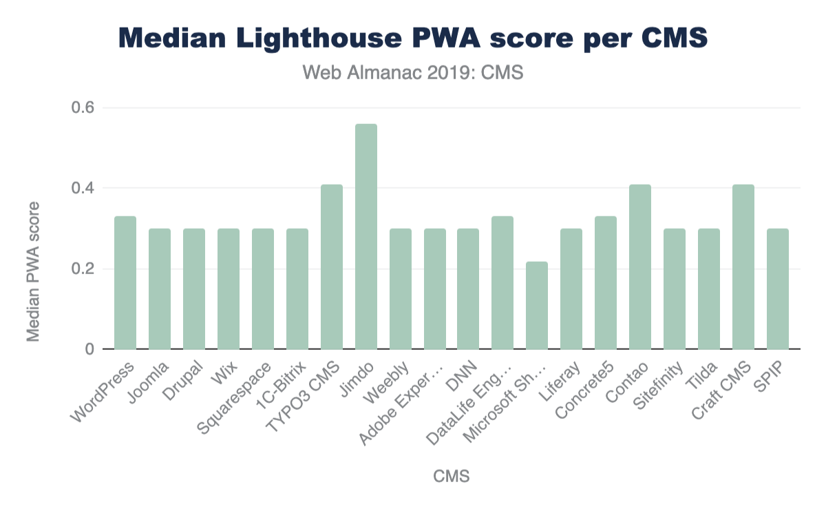
The term Progressive Web App (PWA) refers to web-based user experiences that are considered as being reliable, fast, and engaging. Lighthouse provides a set of audits which returns a PWA score between 0 (worst) and 1 (best). These audits are based on the Baseline PWA Checklist, which lists 14 requirements. Lighthouse has automated audits for 11 of the 14 requirements. The remaining 3 can only be tested manually. Each of the 11 automated PWA audits are weighted equally, so each one contributes approximately 9 points to your PWA score.
Accessibility
An accessible website is a site designed and developed so that people with disabilities can use them. Lighthouse provides a set of accessibility audits and it returns a weighted average of all of them (see Scoring Details for a full list of how each audit is weighted).
Each accessibility audit is pass or fail, but unlike other Lighthouse audits, a page doesn’t get points for partially passing an accessibility audit. For example, if some elements have screenreader-friendly names, but others don’t, that page gets a 0 for the screenreader-friendly-names audit.
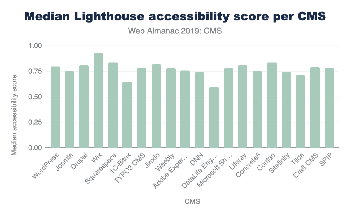
As it stands now, only 1.27% of mobile CMS home pages get a perfect score of 100%. Of the top CMSs, Wix takes the lead by having the highest median accessibility score on its mobile pages. Overall, these figures are dismal when you consider how many websites (how much of the web that is powered by CMSs) are inaccessible to a significant segment of our population. As much as digital experiences impact so many aspects of our lives, this should be a mandate to encourage us to build accessible web experiences from the start, and to continue the work of making the web an inclusive space.
CMS innovation
While we’ve taken a snapshot of the current landscape of the CMS ecosystem, the space is evolving. In efforts to address performance and user experience shortcomings, we’re seeing experimental frameworks being integrated with the CMS infrastructure in both coupled and decoupled/ headless instances. Libraries and frameworks such as React.js, its derivatives like Gatsby.js and Next.js, and Vue.js derivative Nuxt.js are making slight marks of adoption.
| CMS | React | Nuxt.js, React |
Nuxt.js | Next.js, React |
Gatsby, React |
|---|---|---|---|---|---|
| WordPress | 131,507 | 21 | 18 | ||
| Wix | 50,247 | ||||
| Joomla | 3,457 | ||||
| Drupal | 2,940 | 8 | 15 | 1 | |
| DataLife Engine | 1,137 | ||||
| Adobe Experience Manager | 723 | 7 | |||
| Contentful | 492 | 7 | 114 | 909 | 394 |
| Squarespace | 385 | ||||
| 1C-Bitrix | 340 | ||||
| TYPO3 CMS | 265 | 1 | |||
| Weebly | 263 | 1 | |||
| Jimdo | 248 | 2 | |||
| PrestaShop | 223 | 1 | |||
| SDL Tridion | 152 | ||||
| Craft CMS | 123 |
We also see hosting providers and agencies offering Digital Experience Platforms (DXP) as holistic solutions using CMSs and other integrated technologies as a toolbox for enterprise customer-focused strategies. These innovations show an effort to create turn-key, CMS-based solutions that make it possible, simple, and easy by default for the users (and their end users) to get the best UX when creating and consuming the content of these platforms. The aim: good performance by default, feature richness, and excellent hosting environments.
Conclusions
The CMS space is of paramount importance. The large portion of the web these applications power and the critical mass of users both creating and encountering its pages on a variety of devices and connections should not be trivialized. We hope this chapter and the others found here in the Web Almanac inspire more research and innovation to help make the space better. Deep investigations would provide us better context about the strengths, weaknesses, and opportunities these platforms provide the web as a whole. Content management systems can make an impact on preserving the integrity of the open web. Let’s keep moving them forward!
