Performance

Introduction
Performance is a visceral part of the user experience. For many websites, an improvement to the user experience by speeding up the page load time aligns with an improvement to conversion rates. Conversely, when performance is poor, users don’t convert as often and have even been observed to be rage clicking on the page in frustration.
There are many ways to quantify web performance. The most important thing is to measure what actually matters to users. However, events like onload or DOMContentLoaded may not necessarily reflect what users experience visually. For example, when loading an email client, it might show an interstitial progress bar while the inbox contents load asynchronously. The problem is that the onload event doesn’t wait for the inbox to asynchronously load. In this example, the loading metric that matters most to users is the “time to inbox”, and focusing on the onload event may be misleading. For that reason, this chapter will look at more modern and universally applicable paint, load, and interactivity metrics to try to capture how users are actually experiencing the page.
There are two kinds of performance data: lab and field. You may have heard these referred to as synthetic testing and real-user measurement (or RUM). Measuring performance in the lab ensures that each website is tested under common conditions and variables like browser, connection speed, physical location, cache state, etc. remain the same. This guarantee of consistency makes each website comparable with one another. On the other hand, measuring performance in the field represents how users actually experience the web in all of the infinite combinations of conditions that we could never capture in the lab. For the purposes of this chapter and understanding real-world user experiences, we’ll look at field data.
The state of performance
Almost all of the other chapters in the Web Almanac are based on data from the HTTP Archive. However, in order to capture how real users experience the web, we need a different dataset. In this section, we’re using the Chrome UX Report (CrUX), a public dataset from Google that consists of all the same websites as the HTTP Archive, and aggregates how Chrome users actually experience them. Experiences are categorized by:
-
The form factor of the users’ devices
- Desktop
- Phone
- Tablet
-
Users’ effective connection type (ECT) in mobile terms
- Offline
- Slow 2G
- 2G
- 3G
- 4G
- Users’ geographic locations
Experiences are measured monthly, including paint, load, and interactivity metrics. The first metric we’ll look at is First Contentful Paint (FCP). This is the time users spend waiting for the page to display something useful to the screen, like an image or text. Then, we’ll look at look at a loading metric, Time to First Byte (TTFB). This is a measure of how long the web page took from the time of the user’s navigation until they received the first byte of the response. And, finally, the last field metric we’ll look at is First Input Delay (FID). This is a relatively new metric and one that represents parts of the UX other than loading performance. It measures the time from a user’s first interaction with a page’s UI until the time the browser’s main thread is ready to process the event.
So let’s dive in and see what insights we can find.
First Contentful Paint
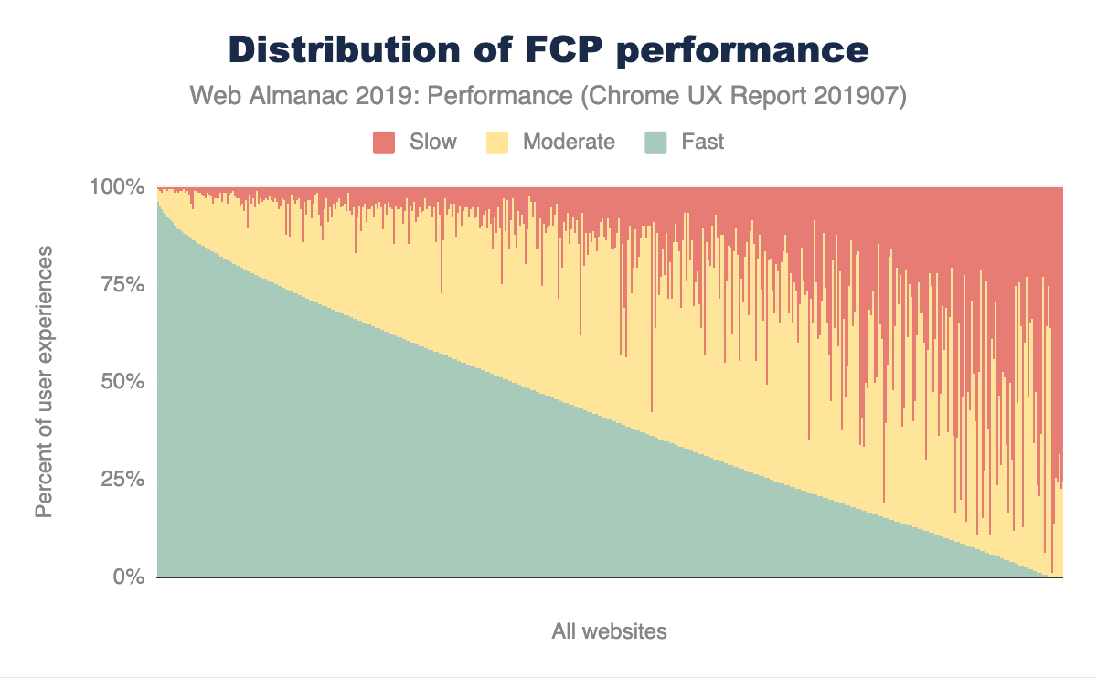
In Figure 7.1 above, you can see how FCP experiences are distributed across the web. Out of the millions of websites in the CrUX dataset, this chart compresses the distribution down to 1,000 websites, where each vertical slice represents a single website. The chart is sorted by the percent of fast FCP experiences, which are those occurring in less than 1 second. Slow experiences occur in 3 seconds or more, and moderate (formerly known as “average”) experiences are everything in between. At the extremes of the chart, there are some websites with almost 100% fast experiences and some websites with almost 100% slow experiences. In between that, websites that have a combination of fast, moderate, and slow performance seem to lean more towards fast or moderate than slow, which is good.
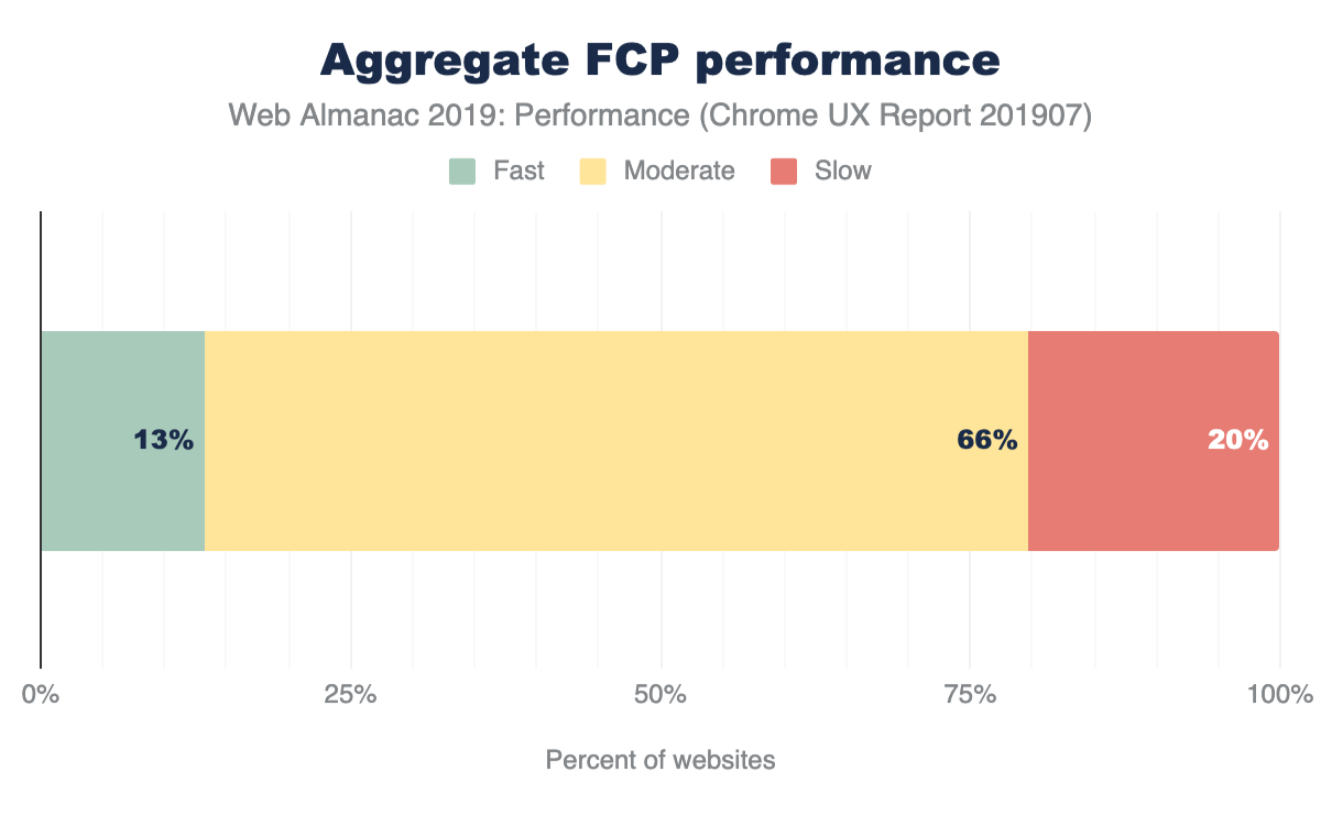
In order to categorize whether a website is sufficiently fast we will use the new PageSpeed Insights (PSI) methodology, where at least 75% of the website’s FCP experiences must be faster than 1 second. Similarly, a sufficiently slow website has 25% or more FCP experiences slower than 3 seconds. We say a website has moderate performance when it doesn’t meet either of these conditions.
The results in Figure 7.2 show that only 13% of websites are considered fast. This is a sign that there is still a lot of room for improvement, but many websites are painting meaningful content quickly and consistently. Two thirds of websites have moderate FCP experiences.
To help us understand how users experience FCP across different devices, let’s segment by form factor.
FCP by device
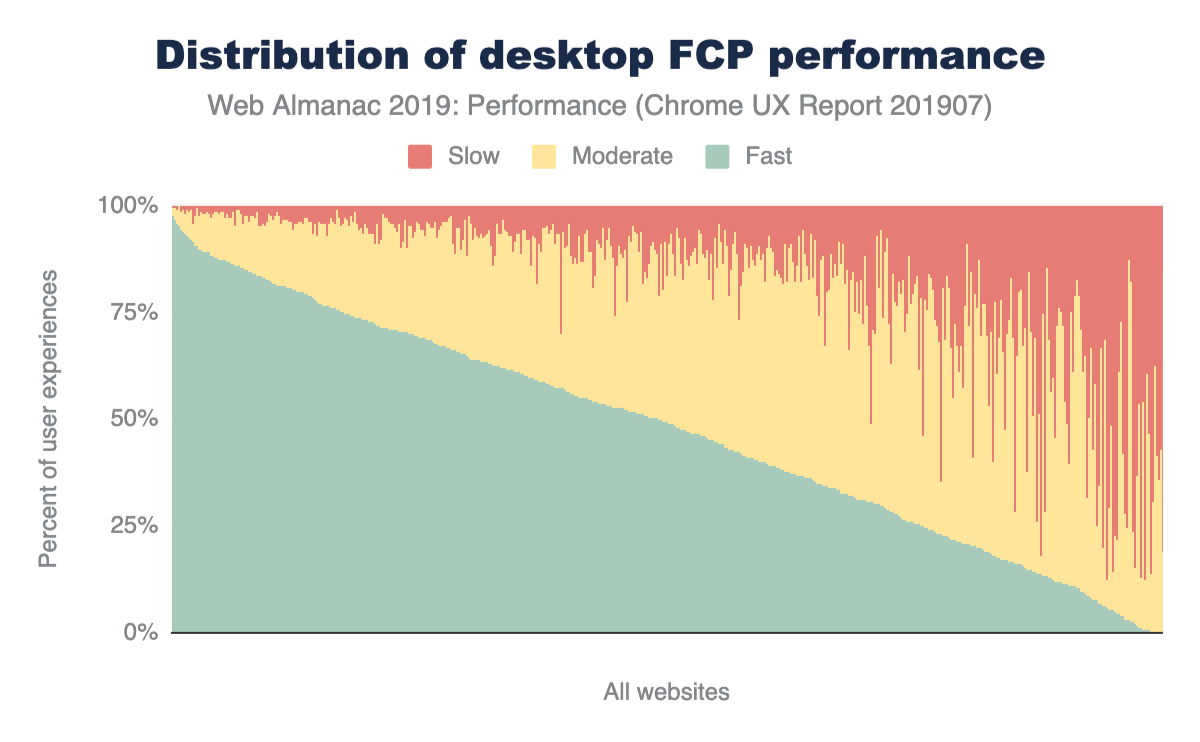
In Figures 7.3 and 7.4 above, the FCP distributions are broken down by desktop and phone. It’s subtle, but the torso of the desktop fast FCP distribution appears to be more convex than the distribution for phone users. This visual approximation suggests that desktop users experience a higher overall proportion of fast FCP. To verify this, we can apply the PSI methodology to each distribution.
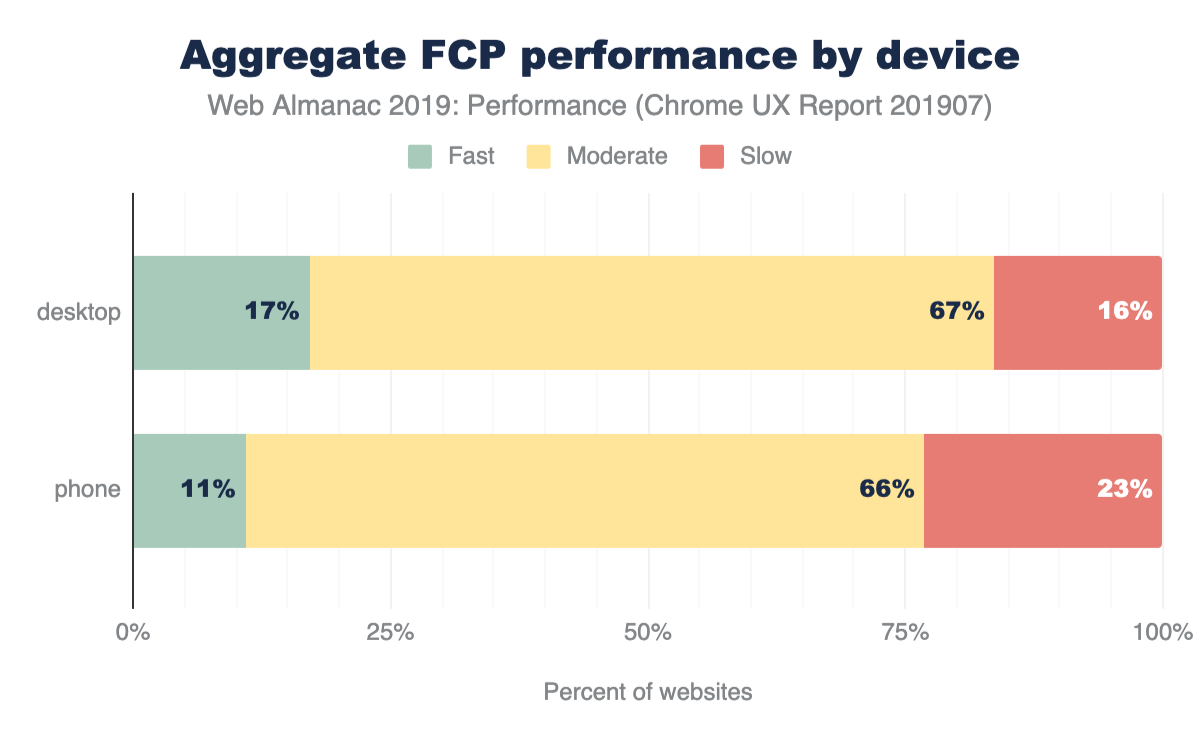
According to PSI’s classification, 17% of websites have fast FCP experiences overall for desktop users, compared to 11% for mobile users. The entire distribution is skewed to being slightly faster for desktop experiences, with fewer slow websites and more in the fast and moderate category.
Why might desktop users experience fast FCP on a higher proportion of websites than phone users? We can only speculate, after all, this dataset is meant to answer how the web is performing and not necessarily why it’s performing that way. But one guess could be that desktop users are connected to the internet on faster, more reliable networks like WiFi rather than cell towers. To help answer this question, we can also explore how user experiences vary by ECT.
FCP by effective connection type
In Figure 7.6 above, FCP experiences are grouped by the ECT of the user experience. Interestingly, there is a correlation between ECT speed and the percent of websites serving fast FCP. As the ECT speeds decrease, the proportion of fast experiences approaches zero. 14% of websites that serve users with 4G ECT have fast FCP experiences, while 19% of those websites have slow experiences. 61% of websites serve slow FCP to users with 3G ECT, 90% to 2G ECT, and 99% to slow-2G ECT. These results suggest that websites seldom serve fast FCP consistently to users on connections effectively slower than 4G.
FCP by geography
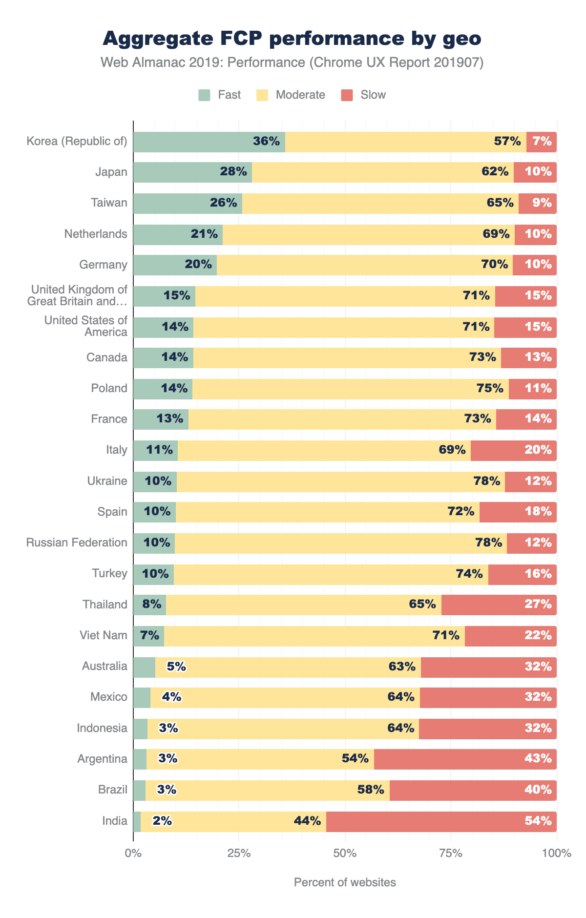
Finally, we can slice FCP by users’ geography (geo). The chart above shows the top 23 geos having the highest number of distinct websites, an indicator of overall popularity of the open web. Web users in the United States visit the most distinct websites at 1,211,002. The geos are sorted by the percent of websites having sufficiently fast FCP experiences. At the top of the list are three Asia-Pacific (APAC) geos: Korea, Taiwan, and Japan. This could be explained by the availability of extremely fast network connection speeds in these regions. Korea has 36% of websites meeting the fast FCP bar, and only 7% rated as slow FCP. Recall that the global distribution of fast/moderate/slow websites is approximately 13/66/20, making Korea a significantly positive outlier.
Other APAC geos tell a different story. Thailand, Vietnam, Indonesia, and India all have fewer than 10% of fast websites. These geos also have more than triple the proportion of slow websites than Korea.
Time to First Byte (TTFB)
Time to First Byte (TTFB) is a measure of how long the web page took from the time of the user’s navigation until they received the first byte of the response.
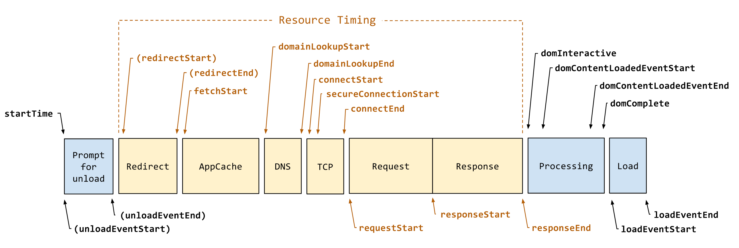
To help explain TTFB and the many factors that affect it, let’s borrow a diagram from the Navigation Timing API spec. In Figure 7.8 above, TTFB is the duration from startTime to responseStart, including everything in between: unload, redirects, AppCache, DNS, SSL, TCP, and the time the server spends handling the request. Given that context, let’s see how users are experiencing this metric.
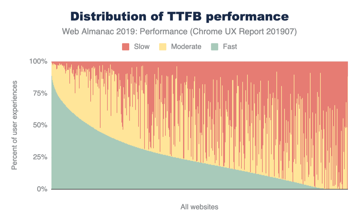
Similar to the FCP chart in Figure 7.1, this is a view of 1,000 representative samples ordered by fast TTFB. A fast TTFB is one that happens in under 0.2 seconds (200 ms), a slow TTFB happens in 1 second or more, and everything in between is moderate.
Looking at the curve of the fast proportions, the shape is quite different from that of FCP. There are very few websites that have a fast TTFB greater than 75%, while more than half are below 25%.
Let’s apply a TTFB speed label to each website, taking inspiration from the PSI methodology used above for FCP. If a website serves fast TTFB to 75% or more user experiences, it’s labeled as fast. Otherwise, if it serves slow TTFB to 25% or more user experiences, it’s slow. If neither of those conditions apply, it’s moderate.
42% of websites have slow TTFB experiences. This is significant because TTFB is a blocker for all other performance metrics to follow. By definition, a user cannot possibly experience a fast FCP if the TTFB takes more than 1 second.
TTFB by geo
Now let’s look at the percent of websites serving fast TTFB to users in different geos. APAC geos like Korea, Taiwan, and Japan are still outperforming users from the rest of the world. But no geo has more than 15% of websites with fast TTFB. India, for example, has fewer than 1% of websites with fast TTFB and 79% with slow TTFB.
First Input Delay
The last field metric we’ll look at is First Input Delay (FID). This metric represents the time from a user’s first interaction with a page’s UI until the time the browser’s main thread is ready to process the event. Note that this doesn’t include the time applications spend actually handling the input. At worst, slow FID results in a page that appears unresponsive and a frustrating user experience.
Let’s start by defining some thresholds. According to the new PSI methodology, a fast FID is one that happens in less than 100 ms. This gives the application enough time to handle the input event and provide feedback to the user in a time that feels instantaneous. A slow FID is one that happens in 300 ms or more. Everything in between is moderate.
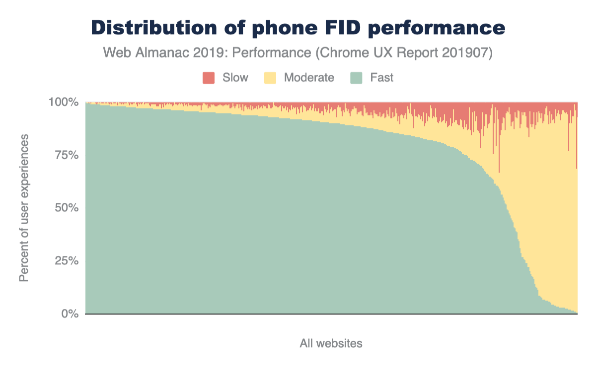
You know the drill by now. This chart shows the distribution of websites’ fast, moderate, and slow FID experiences. This is a dramatically different chart from the previous charts for FCP and TTFB. (See Figure 7.1 and Figure 7.9, respectively). The curve of fast FID very slowly descends from 100% to 75%, then takes a nosedive. The overwhelming majority of FID experiences are fast for most websites.
The PSI methodology for labeling a website as having sufficiently fast or slow FID is slightly different than that of FCP. For a site to be fast, 95% of its FID experiences must be fast. A site is slow if 5% of its FID experiences are slow. All other experiences are moderate.
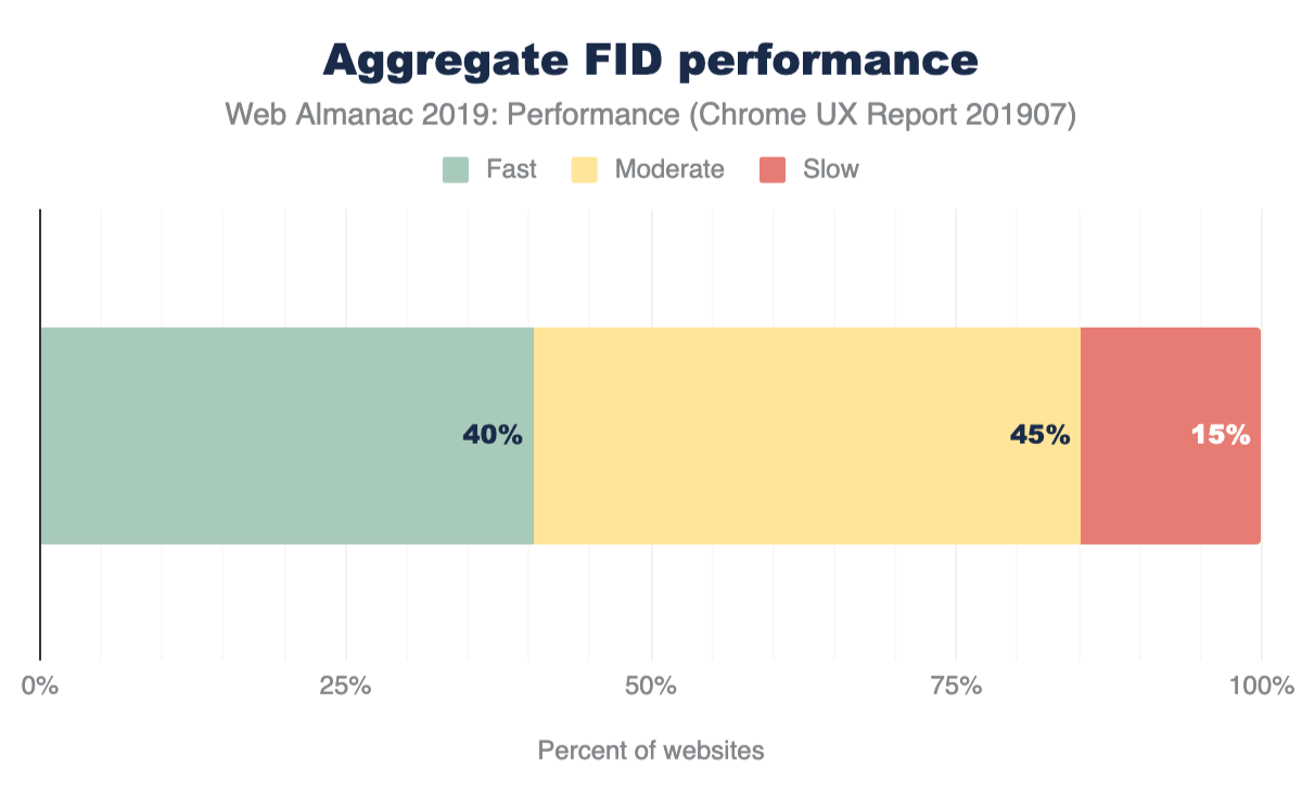
Compared to the previous metrics, the distribution of aggregate FID performance is much more skewed towards fast and moderate experiences than slow. 40% of websites have fast FID and only 15% have slow FID. The nature of FID being an interactivity metric -- as opposed to a loading metric bound by network speeds -- makes for an entirely different way to characterize performance.
FID by device
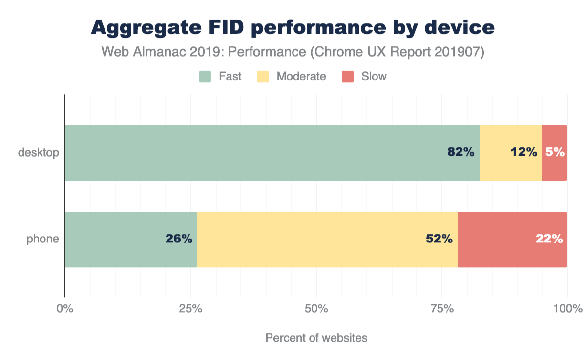
By breaking FID down by device, it becomes clear that there are two very different stories. Desktop users enjoy fast FID almost all the time. Sure, there are some websites that throw out a slow experience now and then, but the results are predominantly fast. Mobile users, on the other hand, have what seem to be one of two experiences: pretty fast (but not quite as often as desktop) and almost never fast. The latter is experienced by users on only the tail 10% of websites, but this is still a substantial difference.
When we apply the PSI labeling to desktop and phone experiences, the distinction becomes crystal clear. 82% of websites’ FID experienced by desktop users are fast compared to 5% slow. For mobile experiences, 26% of websites are fast while 22% are slow. Form factor plays a major role in the performance of interactivity metrics like FID.
FID by effective connection type
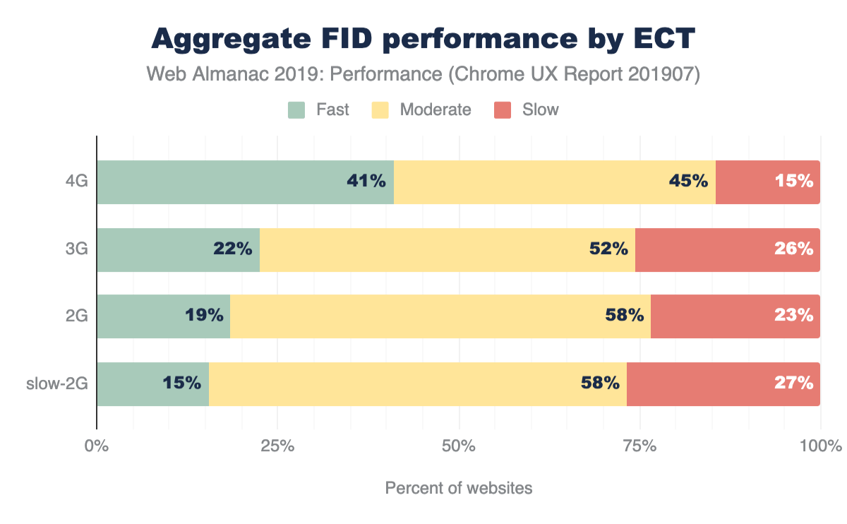
On its face, FID seems like it would be driven primarily by CPU speed. It’d be reasonable to assume that the slower the device itself is, the higher the likelihood that it will be busy when the user attempts to interact with a web page, right?
The ECT results above seem to suggest that there is a correlation between connection speed and FID performance. As users’ effective connection speed decreases, the percent of websites on which they experience fast FID also decreases: 41% of websites visited by users with a 4G ECT have fast FID, 22% with 3G, 19% with 2G, and 15% with slow 2G.
FID by geo
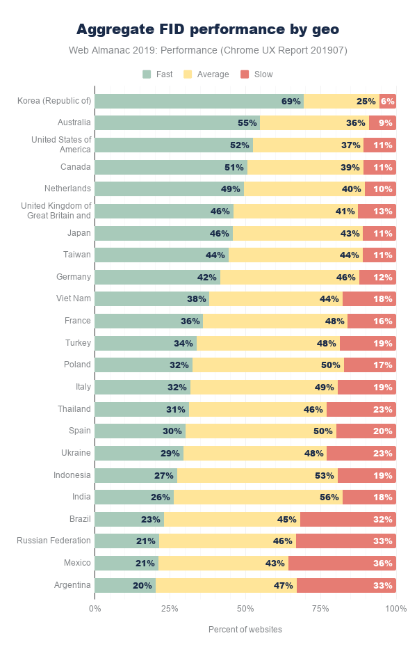
In this breakdown of FID by geographic location, Korea is out in front of everyone else again. But the top geos have some new faces: Australia, the United States, and Canada are next with more than 50% of websites having fast FID.
As with the other geo-specific results, there are so many possible factors that could be contributing to the user experience. For example, perhaps wealthier geos that are more privileged can afford faster network infrastructure also have residents with more money to spend on desktops and/or high-end mobile phones.
Conclusion
Quantifying how fast a web page loads is an imperfect science that can’t be represented by a single metric. Conventional metrics like onload can miss the mark entirely by measuring irrelevant or imperceptible parts of the user experience. User-perceived metrics like FCP and FID more faithfully convey what users see and feel. Even still, neither metric can be looked at in isolation to draw conclusions about whether the overall page load experience was fast or slow. Only by looking at many metrics holistically, can we start to understand the performance for an individual website and the state of the web.
The data presented in this chapter showed that there is still a lot of work to do to meet the goals set for fast websites. Certain form factors, effective connection types, and geos do correlate with better user experiences, but we can’t forget about the combinations of demographics with poor performance. In many cases, the web platform is used for business; making more money from improving conversion rates can be a huge motivator for speeding up a website. Ultimately, for all websites, performance is about delivering positive experiences to users in a way that doesn’t impede, frustrate, or enrage them.
As the web gets another year older and our ability to measure how users experience it improves incrementally, I’m looking forward to developers having access to metrics that capture more of the holistic user experience. FCP is very early on the timeline of showing useful content to users, and newer metrics like Largest Contentful Paint (LCP) are emerging to improve our visibility into how page loads are perceived. The Layout Instability API has also given us a novel glimpse into the frustration users experience beyond page load.
Equipped with these new metrics, the web in 2020 will become even more transparent, better understood, and give developers an advantage to make more meaningful progress to improve performance and contribute to positive user experiences.
