Media

Introduction
Despite being hypertext, the web is extremely visual. In fact, images and videos are an essential part of the web user experience. They’re also undergoing tremendous innovation, and the Web Almanac gives us a unique opportunity to survey both how far the visual web has come—as authors adopt new technologies such as AVIF, wide color, adaptive bitrate streaming, and lazy loading—and how far it still has to go: I’m looking at you, animated GIF.
Let’s dive right in.
Images
Images account for a huge portion of the typical website’s page weight. We see from the Page Weight chapter that the median website’s total weight in June of 2021 was 2,019 kilobytes (on mobile), and 881 of those kilobytes were images. That’s more than HTML (30 KB), CSS (72 KB), JavaScript (461 KB) and fonts (97 KB) combined.
Almost every page serves up some kind of an image, even if it’s just a background or favicon.
On the vast majority of pages—70% on mobile, and 80% on desktop—the most impactful resource is an image. Largest Contentful Paint (LCP) is a web performance metric that identifies the largest element above the fold. Most of the time that element has an image.
It’s hard to overstate the importance of images on the web. So, what can we say about the web’s images?
Image resources
Let’s start with the resources themselves. Bitmap images are made of pixels. How many pixels do the web’s images typically have?
A note on single-pixel images
| Client | 1x1 images |
|---|---|
| Mobile | 7.3% |
| Desktop | 7.0% |
<img> elements that contain just a single pixel.
A suspiciously large number of them are 1×1. These <img>s don’t contain any image content at all. Instead, they’re being used for two purposes: for layout (as spacer GIFs) or as tracking beacons.
Any newly authored website should use CSS for layout and the Beacon API for tracking. Lots of existing content will use tracking pixels and spacer GIFs forever, but it’s disheartening that the desktop number here is unchanged from last year, and that the mobile number has only shrunk by a tiny amount. Old habits die hard!
Wherever possible, we excluded these not-really-an-image <img>s from our analysis.
Image dimensions
Moving on to images that contain more than one pixel: Most of them are fairly small, but the majority of pages also contain at least one big image.
“Megapixels” aren’t the most intuitive measure of image size. For perspective, at a 4:3 aspect ratio, the median pixel count of 0.046MP works out to a 248×186 image.
That may seem small, but the median page includes at least one <img> that contains almost 10 times more pixels than the median <img> element.
At the aspect ratio of 4:3, 0.431MP works out to 758×569. Considering the mobile crawler has a (typical) 360px-wide viewport, it’s likely that many of these large images end up painted across almost the whole viewport and at high densities.
In short: most images are small, but most pages include at least one big image.
Image aspect ratios
What sorts of aspect ratios are common on the web?
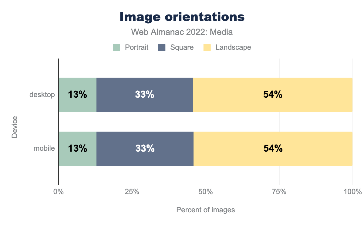
Much like last year, most images are landscape-oriented, and there is virtually no difference between the mobile and desktop numbers. Similar to 2021, this feels like a huge missed opportunity. As many-an-Instagrammer knows, portrait-oriented images render larger on mobile screens at full-width than either square or landscape-oriented images do, and drive higher engagement. Even when the source material is landscape-oriented, we can and should try to tailor images for mobile screens, using art direction.
| Aspect ratio | % of images |
|---|---|
| 1:1 | 32.92% |
| 4:3 | 3.99% |
| 3:2 | 2.74% |
| 2:1 | 1.66% |
| 16:9 | 1.62% |
| 3:4 | 1.02% |
| 2:3 | 0.72% |
| 5:3 | 0.54% |
| 6:5 | 0.48% |
| 8:5 | 0.47% |
Images’ aspect ratios were clustered around “standard” values, such as 4:3, 3:2 and, in particular, 1:1 (square). In fact, 40% of all images had one of those three aspect ratios, and the top 10 aspect ratios accounted for nearly half of all <img>s.
Image color spaces
Images are made of pixels and each pixel has a color. The range of colors that are possible within a given image is determined by that image’s color space.
The default color space on the web is sRGB. CSS colors are specified in sRGB by default and—unless they’re marked otherwise—browsers assume that the colors in images are sRGB, too.
This made sense in a world where approximately all display and capture hardware dealt in sRGB—or something close to it. But the times, they are a-changin’. In 2022, most phone cameras capture in wider-than-sRGB gamuts. Also, display hardware capable of richer, outside-of-sRGB colors is now quite common.
Every modern browser that’s painting to a wide-gamut display will happily paint vibrant, outside-of-sRGB colors, if we encode our images using wider than sRGB gamuts. But are we?
In short: No.
In order to tell a browser that an image uses a non-sRGB color space, authors must generally attach an ICC profile to it that describes the image’s color space. Those ICC profiles have names. We found a little more than 25,000 unique ICC profile names in use on the web. Here are the top 20:
| ICC profile description | sRGB-ish | Wide-gamut | % of images |
|---|---|---|---|
| Untagged | ✓ | 90.17% | |
| sRGB IEC61966-2.1 | ✓ | 3.23% | |
| c2ci | ✓ | 2.40% | |
| sRGB | ✓ | 0.88% | |
| Adobe RGB (1998) | ✓ | 0.76% | |
| uRGB | ✓ | 0.54% | |
| Display P3 | ✓ | 0.35% | |
| c2 | ✓ | 0.33% | |
| Display | 0.30% | ||
| sRGB built-in | ✓ | 0.24% | |
| GIMP built-in sRGB | ✓ | 0.22% | |
| sRGB IEC61966-2-1 black scaled | ✓ | 0.19% | |
| Generic RGB Profile | 0.06% | ||
| U.S. Web Coated (SWOP) v2 | 0.04% | ||
| sRGB MozJPEG | ✓ | 0.02% | |
| Artifex Software sRGB ICC Profile | ✓ | 0.02% | |
| Dot Gain 20% | 0.02% | ||
| Coated FOGRA39 (ISO 12647-2:2004) | 0.01% | ||
| Apple Wide Color Sharing Profile | ✓ | 0.01% | |
| sRGB v1.31 (Canon) | ✓ | 0.01% | |
| HD 709-A | ✓ | 0.01% |
Nine out of ten images on the web are untagged, meaning that if they contain RGB data, it will be interpreted as sRGB. Most of the remaining 10% are explicitly tagged with sRGB or something similar to it: “c2ci”, “uRGB”, and “c2” are all sRGB variants designed to be minimal and lightweight. Just a little more than 1% of all of the web’s images have been tagged with a wider-than-sRGB gamut. More succinctly, wide-gamut images are currently about as popular on the web as grayscale images—which account for 1.16% of the web’s images.
One caveat: AVIF and PNG allow tagging images with wide-gamut color spaces using format-specific shorthands, without using ICC profiles. We started down the path of trying to detect wide-gamut AVIFs and PNGs that don’t use ICC profiles, but accounting for the various ways they are encoded—and the ways our tooling reported on them—proved a bit too complex to tackle this year. Maybe next year!
Encoding
Now that we’ve gleaned a bit about the web’s image content, what can we say about how that content is encoded for delivery?
Format adoption
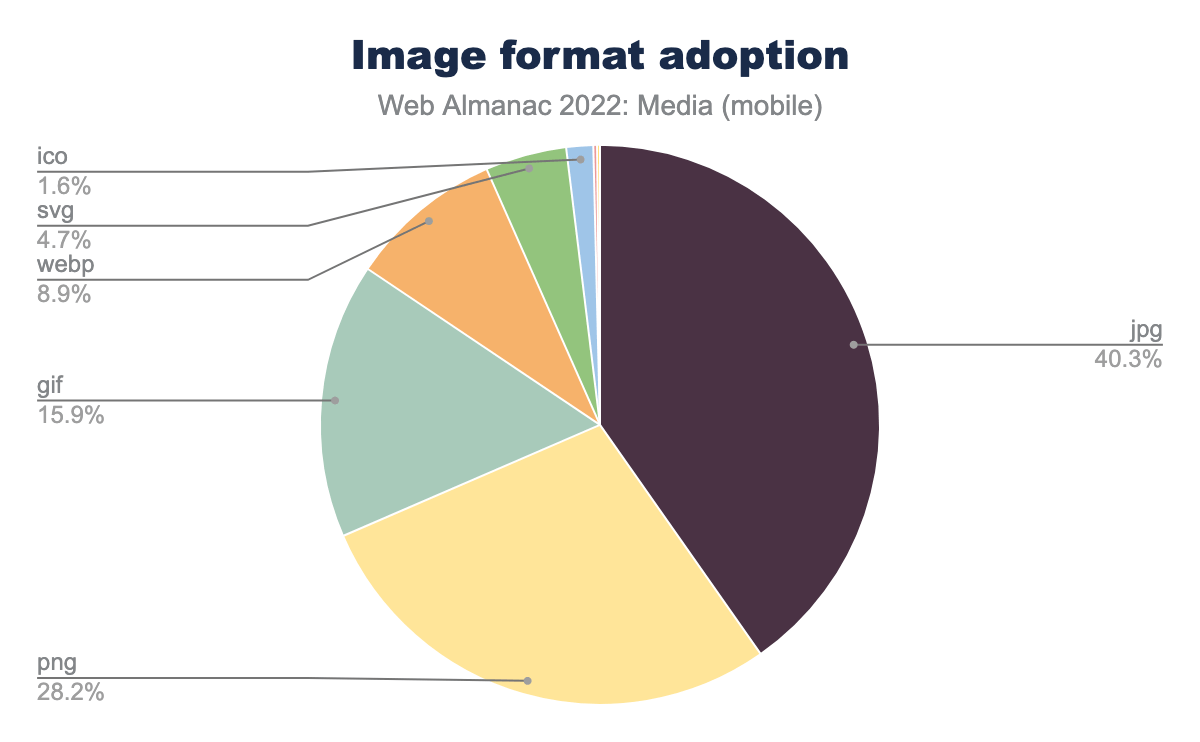
GIF, JPEG, and PNG have been the standard bitmap image file formats on the web for decades. That started to change when Chrome shipped support for WebP in 2014. Over the past couple of years that change has accelerated. Safari and Firefox have now shipped WebP support, and all three major browsers have shipped at least experimental support for AVIF.
By format, here’s every image resource the crawler saw:
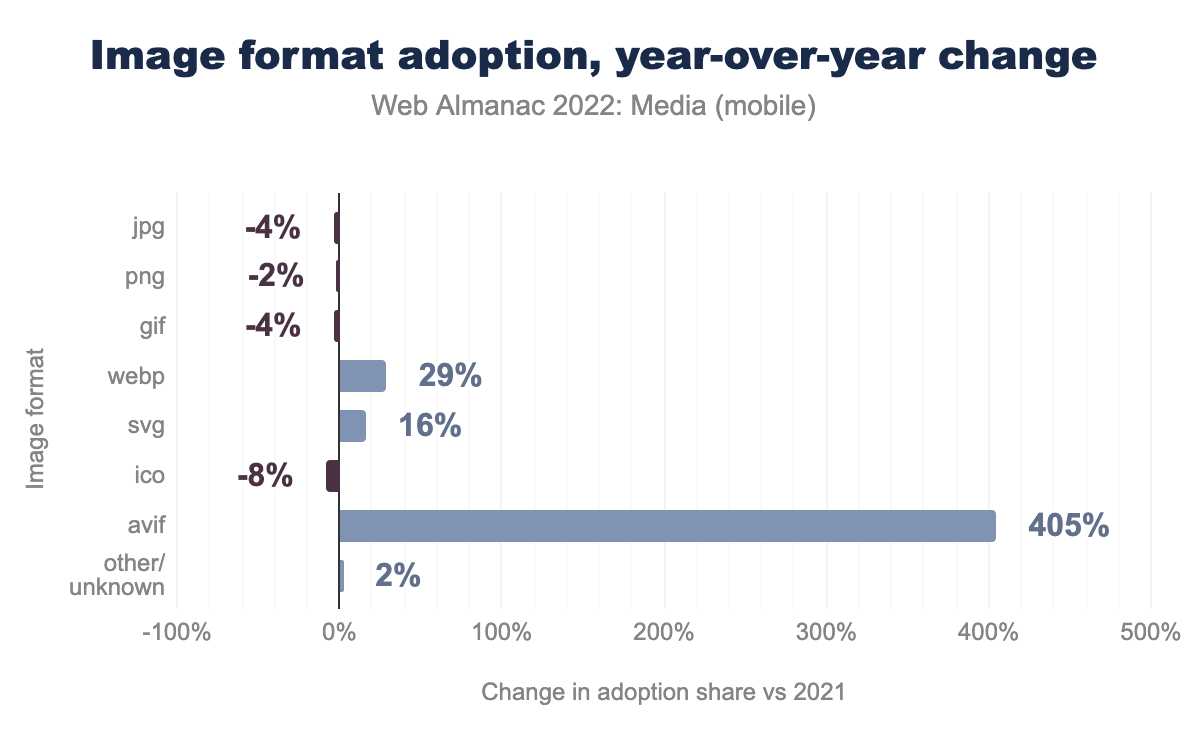
At 0.22%, AVIF’s slice of that pie is so small it’s not even labeled on the chart. And while 0.22% may not sound like a lot, compared to last year, it represents quite a bit of progress.
Slowly, the old formats are making way for the new ones. As they should! The new formats outperform the old ones by a significant margin. We’ll get a sense of that shortly.
Bytesizes
How heavy is the typical image on the web?
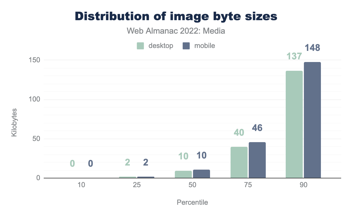
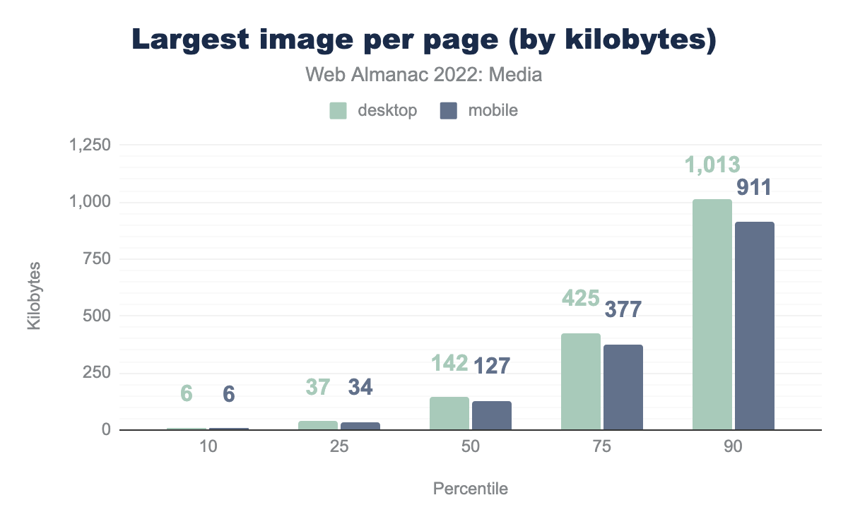
A median of 10 KB might lead one to think, “Eh, not that heavy!” But, just as when we looked at pixel counts, while there are many small images, most pages have at least one large one:
Most pages have at least one image over 100 KB, and the top 10% of pages have at least one image that weighs almost 1 MB or more.
Bits per pixel
Bytes and pixel counts are interesting on their own, but to get a sense of how compressed the web’s image data is, we need to put bytes and pixels together to calculate bits per pixel. Doing this allows us to make apples-to-apples comparisons of the information density of images, even if those images have different resolutions.
In general, bitmaps on the web decode to eight bits of information per channel, per pixel. So, if we have an RGB image with no transparency, we can expect a decoded, uncompressed image to weigh in at 24 bits per pixel. A good rule of thumb for lossless compression is that it should reduce file sizes by a 2:1 ratio (which would work out to 12 bits per pixel for our 8-bit RGB image). The rule of thumb for 1990s-era lossy compression schemes—JPEG and MP3—was a 10:1 ratio (2.4 bits per pixel). It should be noted that, depending on image content and encoding settings, these ratios vary widely, and modern JPEG encoders like MozJPEG typically outperform this 10:1 target at their default settings. To summarize:
| Type of bitmap data | Expected compression ratio | Bits per pixel |
|---|---|---|
| Uncompressed RGB | 1:1 | 24 bits/pixel |
| Losslessly compressed RGB | ~2:1 | 12 bits/pixel |
| 1990s-era lossy RGB | ~10:1 | 2.4 bits/pixel |
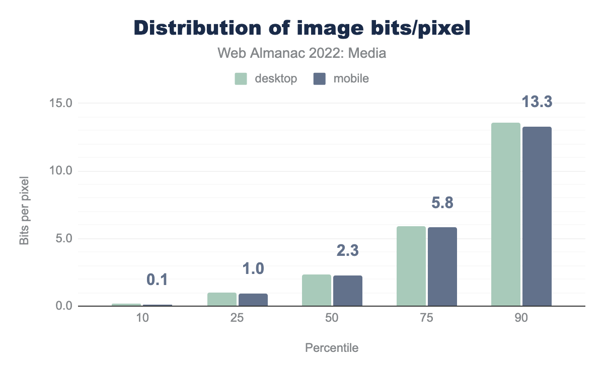
So, with all of that as context, here’s how the web’s images stack up:
At 2.3 bits per pixel, the median <img> on mobile almost hits that 10:1 compression ratio target on the nose. However, around that median, there is a tremendous spread. Let’s break things down by format in order to learn a bit more.
Bits per pixel, by format
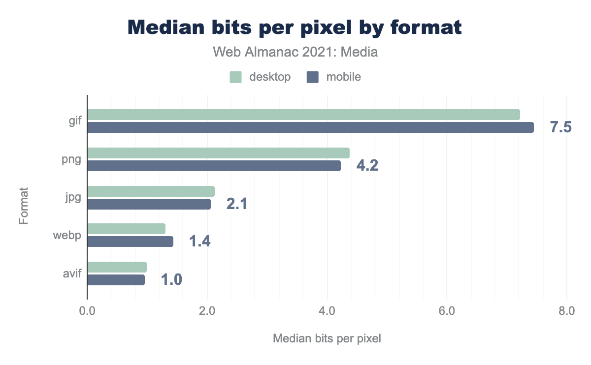
Most of these numbers are essentially unchanged from last year.
We can again see that while PNG technically employs “lossless” compression techniques (which would lead us to expect 12-16 bits per pixel, depending on whether or not we’re dealing with an alpha channel), its encoders are generally lossy. They reduce color palettes and introduce dithering patterns before “losslessly” compressing images in order to boost compression ratios.
And we again see that the typical WebP is one-third lighter, per pixel, than the typical JPEG. This is about what we would expect: Formal studies, which, vitally, use matched qualities, have estimated that WebP outperforms JPEG by about that same margin.
The only big mover, when compared to last year, is AVIF. The format dropped from 1.5 bits per pixel last year—less compressed than WebP already!—all the way down to 1.0. This is a huge reduction, but it wasn’t entirely unexpected. AVIF is a very young format whose encoders have been quickly iterating, and whose adoption is significantly broadening. I expect next year the median AVIF will be even more compressed.
Without looking at the quality side of the lossy-compression/quality tradeoff, it’s not possible to conclude from these results alone that AVIF offers the “best” compression of all of the web-compatible formats. But this year we can conclude that in real-world usage, it exhibits the most compression. Pair that conclusion with in-the-lab results, which suggest it also does a good job of preserving quality, and the picture starts looking pretty good—pun intended.
AVIF’s browser support also took a huge leap this year. All of this is to say, if you’re sending bitmap images across the web—as you may recall, 99.9% of pages do—you should at least consider sending AVIFs.
GIFs, animated and not
At the other end of the compression chart is our old friend GIF. It comes out looking particularly bad, but it’s not all the format’s fault. One of the reasons this 35-year-old format is still in common use is its ability to do animation, and we have not accounted for the number of frames when calculating the number of pixels. This raises a few interesting questions. First, how many GIFs are animated?
I found this surprisingly low. Ever since PNG achieved universal support in 2006, there hasn’t been a good reason to ship a non-animated GIF. The word “GIF” has become synonymous with its only justifiable use case: Being a portable, universal format for short, silent, autoplaying, looping animation. One wonders whether all of these non-animated GIFs are legacy content, or whether there are a significant number of new, non-animated GIFs being created and published to the web—I hope not!
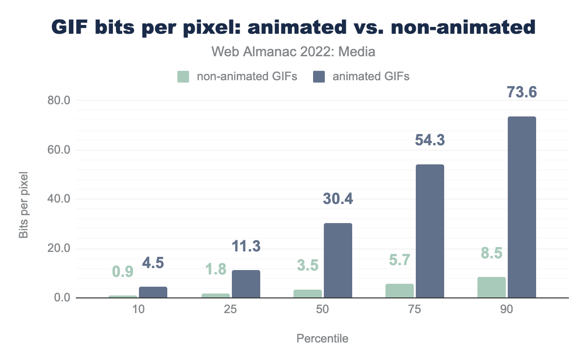
Now that we’ve separated out the animated GIFs from the non-animated ones, we can also ask: What are the compression characteristics of non-animated vs animated GIFs?
Once we remove animated GIFs from the equation, the format looks much better. At a median of 3.5 bits per pixel, GIFs are smaller, pixel-for-pixel, than PNGs. This likely reflects the kinds of content that each format is asked to compress: GIFs, by design, can only contain 256 colors and binary transparency. PNGs can contain 16.7 million colors plus a full alpha channel.
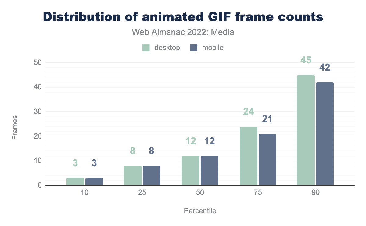
Before we move on from GIFs, I do have one more question about them: How many frames do animated GIFs typically have?
A majority of animated GIFs come in at a dozen frames or less. Incidentally, the most frames we found in a GIF was 15,341. At 30 FPS, that would work out to an eight-and-a-half-minute GIF. The mind reels.
Embedding
Now that we have a sense of how the web’s image resources have been encoded, what can we say about how they are embedded on web pages?
Lazy-loading
loading=lazy on <img>.
The biggest story last year was the rapid adoption of lazy-loading. While the pace of adoption has slowed, it’s still proceeding at a remarkable rate. Last June, 17% of pages were using lazy-loading. This year, we saw a 1.4x increase. Now 24% of pages are using lazy-loading.
Given the vast amount of legacy content on the web, going from zero adoption to just about one-quarter of crawled pages within two years is a remarkable feat, and shows just how much demand there was for native lazy-loading.
<img>s that use native lazy-loading on mobile.
And indeed, just like last year, it seems pages are using lazy-loading a bit too much.
Lazy-loading LCP elements makes LCP scores much worse. It’s an anti-pattern that makes pages slower. Seeing that one-in-ten LCP <img>s are lazy-loaded is disheartening. Seeing that this anti-pattern has gotten slightly more common since last year is even more so.
alt text
Images embedded with <img> elements are supposed to be contentful. That is to say: They’re not just decorative, and they should contain something meaningful. According to both WCAG requirements and the HTML spec, all contentful images must have alternative text, and that alternative text should usually be supplied by the alt attribute.
alt attribute.
This result means that almost half of all <img>s are obviously inaccessible. If the in-depth analysis from this year’s accessibility chapter is any indication, a large chunk of the <img>s that do have non-blank alt attributes aren’t all that accessible, either.
We can and must do better.
srcset
Prior to lazy-loading, the biggest thing to happen to <img>s on the web was a suite of features for “responsive images,” which allowed images to tailor themselves to fit within responsive designs. First shipped in 2014, the srcset attribute, sizes attribute, and the <picture> element have allowed authors to mark up adaptable resources for almost a decade now. How much and how well are we using these features?
Let’s start with the srcset attribute, which allows authors to give the browser a menu of resources to choose from, depending on context.
srcset attribute.
One-third of pages use srcset, but two-thirds don’t. Given the prevalence of fluid grids within responsive designs in 2022, I suspect there are a lot of pages that aren’t using srcset that should be.
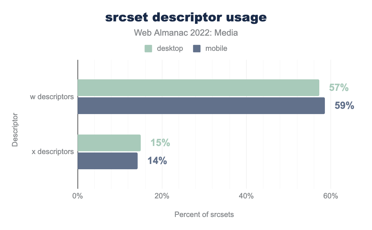
The srcset attribute allows authors to describe resources using one of two descriptors: x descriptors that specify which screen density a resource is appropriate for, and w descriptors, which instead give the browser the resource’s width in pixels. Used in conjunction with the sizes attribute, w descriptors allow browsers to select a resource appropriate for both fluid layout widths and variable screen densities.
srcsets using x descriptors and w descriptors, on both mobile and desktop. x descriptors are used on 15% of srcsets on desktop and 14% of srcsets on mobile. w descriptors are used four times more: 57% of the time on desktop, and 59% of the time on mobile.srcset descriptor usage.
The x descriptor came first, and is simpler to reason about. For years it enjoyed more popularity than the more powerful w descriptor. It warms my heart that nearly a decade in, the world has come around to w descriptors.
sizes
I mentioned earlier that w descriptors should be used in conjunction with sizes attributes. How well are we using sizes? In two words: Not very.
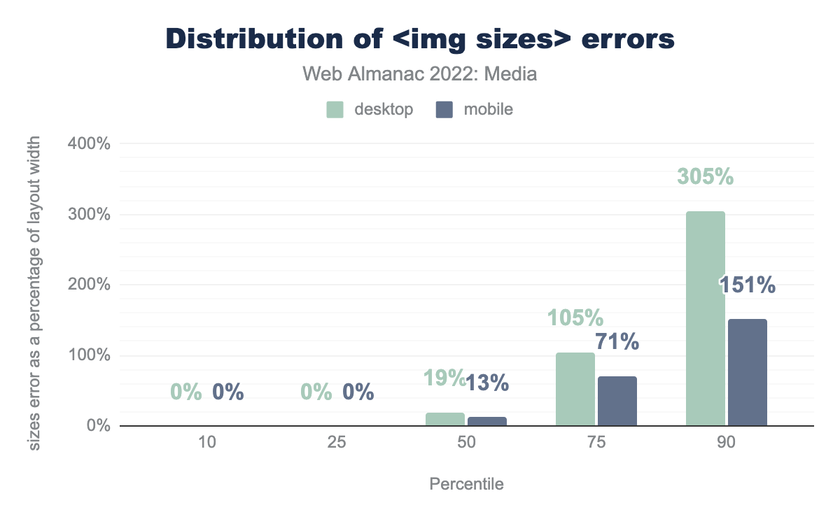
The sizes attribute is supposed to be a hint to the browser about the eventual layout size of the image, usually relative to the viewport width. There are many variables that can affect an image’s layout width. The sizes attribute is explicitly supposed to be a hint, and so a little inaccuracy is OK and even expected. But if the sizes attribute is more-than-a-little inaccurate, it can affect resource selection, causing the browser to load an image to fit the sizes width when the actual layout width of the image is significantly different.
So how accurate are our sizes?
sizes attributes on both desktop and mobile. At first, it’s all zeros: at both the 10th and 25th percentile it’s 0% on both desktop on mobile. At the 50th percentile it’s 19% on desktop and 13% on mobile, at the 75th percentile it’s 105% and 71% respectively, and finally, at the 90th percentile it’s 305% and 151%.<img sizes> errors.
While many sizes attributes are entirely accurate, the median sizes attribute is 13% too-large on mobile and 19% too-large on desktop. That might be OK, given the hint-like nature of the feature, but as you can see, the p75 and p90 numbers aren’t pretty and lead to bad outcomes.
sizes attributes that were inaccurate enough to affect srcset selection on desktop. On mobile, it’s 14%.
On desktop, where the difference between the default sizes value (100vw) and the actual layout width of the image is likely to be larger than on mobile, one-in-five sizes attributes is inaccurate enough to cause browsers to pick a suboptimal resource from the srcset. These errors add up.
sizes attributes. It starts off with a bunch of zeros. At the tenth, 25th, and 50th percentile, both mobile and desktop weigh in at zero kilobytes. At the 75th percentile, the desktop crawler saw 83 wasted kilobytes and the mobile 27; at the 90th percentile, desktop saw 536 kilobytes and mobile 283.sizes.
We estimate that one-quarter of desktop pages are loading more than 83 KB of extra image data, based purely on bad sizes attributes. That is to say: A better, smaller resource is there for the picking in the srcset, but because the sizes attribute is so erroneous, the browser doesn’t pick it. Additionally, 10% of desktop pages that use sizes load more than a half-megabyte of excess image data because of bad sizes attributes!
In the short term, individual developers can and should use RespImageLint to audit and fix their badly broken sizes attributes and prevent this kind of waste.
In the medium term, where possible, the web platform needs to provide better tooling. For many developers, authoring—and maintaining!—accurate sizes attributes has proven to be too hard. A proposal that would allow automatic sizes for lazy-loaded images is on the table. Let’s hope it progresses in 2023.
The lazysizes.js library has already proven the appetite for this sort of solution: 10% of sizes attributes currently have the value “auto” before JavaScript runs and are later rewritten to perfectly accurate values by lazysizes.js before it lazy-loads the image. Note that, because it relies on lazy-loading, this pattern is not appropriate for LCP images or any <img> elements that are above the fold. For these images, the only way forward for performant responsive loading is a well-authored sizes attribute.
<picture>
The last responsive image feature to land in 2014 was the <picture> element. While srcset hands browsers a menu of resources to choose from, the <picture> element allows authors to take charge, giving browsers an explicit set of instructions about which child <source> element to load a resource from.
The <picture> element is used far less than srcset.
<picture> element.
This is up a couple ticks from last year, but the fact that there are almost five pages that use srcset for every one page that uses <picture> suggests that either <picture>’s use cases are more niche, or it’s more difficult to deploy—or both.
What are people using <picture> for?
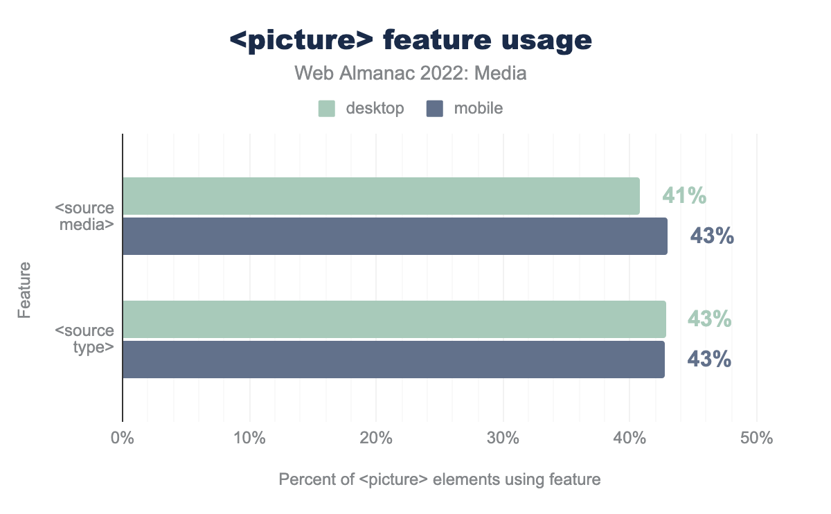
The <picture> element gives authors two ways to switch between resources. Type-switching allows authors to provide cutting-edge image formats to browsers that support them and fallback formats for everyone else. Media-switching facilitates art direction, allowing authors to switch between various <source>s based on media conditions.
media and type attributes on source elements, in conjunction with the picture element. media is used with 41% of picture elements on mobile, and 43% on desktop. type is used with 43% of picture elements on both mobile and desktop.<picture> feature usage.
Usage is split reasonably evenly. Interestingly, type-switching has closed the gap since last year. This may be related to the increasing popularity of next-generation image formats like AVIF and WebP.
Layout
Part of what makes responsive images difficult is that it asks us to think about how <img>s will be laid out, while writing HTML. Which leads us to a basic question: How are <img>s laid out?
We already saw how the web’s image resources size up. But before they can be shown to a user, embedded images must be placed within a layout and potentially squished or stretched to fit it.
Throughout this analysis it will be useful to keep in mind the crawlers’ viewports: The desktop crawler was 1376px-wide, with a DPR of 1x; the mobile crawler was 360px-wide, with a DPR of 3x.
Layout widths
The simplest question here might be: How wide do the web’s images end up when painted to the page?
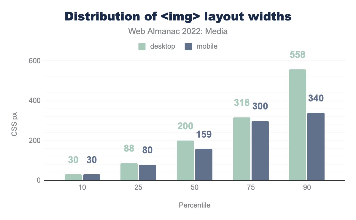
<img> layout widths, on both desktop and mobile. At the tenth percentile, both the desktop and mobile layout width was 30 CSS px. The 25th percentile widths were 88 px for desktop and 80 px for mobile. The 50th percentile numbers were 200 px and 159 px; the 75th percentile saw 318 and 300 px, and the 90th percentile saw a comparatively large 558 px on desktop and 340 px on mobile.<img> layout widths.
Just like the resources that they embed, most of the web’s images end up pretty small within layouts. Similarly, most pages have at least one fairly large image.
<img> per-age layout widths, on both desktop and mobile. At the tenth percentile, the desktop crawler saw 148 CSS px and the mobile crawler saw 107 px. The 25th percentile widths were 307 px for desktop and 278 px for mobile. The 50th percentile numbers were 640 px and 330 px; the 75th percentile saw 1,176 and 360 px, and the 90th percentile saw a towering 1,905 px on desktop and 453 px on mobile.<img> per page (layout width).
More than 75% of mobile pages have at least one image that takes up more than 75vw worth of viewport. From there, things more or less top out, rising slowly until a significant number (somewhere between 10-25%) of pages have an image that ends up wider than the viewport. That’s likely because the author has not included a viewport meta tag and the desktop-sized page is being scaled down to fit within the mobile screen.
It’s interesting to contrast this with the desktop layout widths, which don’t top out at all. They just keep growing. I find it surprising that more than 10% of pages on desktop included an image that was wider than the crawler’s 1360px viewport, presumably triggering horizontal scrollbars.
Intrinsic vs extrinsic sizing
Why do the web’s images end up at these layout sizes? There are many ways to scale an image with CSS. But how many images are being scaled with any CSS at all?
Images, like all “replaced elements”, have an intrinsic size. By default—in the absence of a srcset controlling their density or any CSS rules controlling their layout width—images on the web display at a density of 1x. Plop a 640×480 image into an <img src> and, by default, that <img> will be laid out with a width of 640 CSS pixels.
Authors may apply extrinsic sizing to an image’s height, width, or both. If an image has been extrinsically sized in one dimension (e.g., with a width: 100%; rule), but left to its intrinsic size in the other (height: auto; or no rule at all), it will scale proportionally, using its intrinsic aspect ratio.
Complicating things further, some CSS rules allow <img>s to appear at their intrinsic dimensions, unless they violate some constraint. For instance, an <img> element with a max-width: 100%; rule will be intrinsically sized, unless that intrinsic size is larger than the size of the <img> element’s container, in which case it will be extrinsically scaled down to fit.
With all of that explanation out of the way, here’s how the web’s <img> elements are sized for layout:
The majority of images have extrinsic widths; the majority of images have intrinsic heights. The “both” category for width—representing images with either a max-width or min-width sizing constraint—is also fairly popular. Leaving images to their intrinsic widths is far less popular—and slightly less popular than it was last year.
height, width, and Cumulative Layout Shifts
Any <img> whose layout size is dependent on its intrinsic width risks triggering a Cumulative Layout Shift. In essence, such images risk being laid out twice: Once when the page’s DOM and CSS have been processed, and then a second time when they finally finish loading and their intrinsic dimensions are known.
As we’ve just seen, extrinsically scaling images to fit a certain width while leaving the height (and aspect ratio) intrinsic is very common. To fight the resulting plague of layout shifts, a couple of years ago browsers decided to change the way that the height and width attributes on <img> work. These days, consistently setting the height and width attributes to reflect the aspect ratio of the resource is a universally recommended best practice, which allows authors to tell the browser the intrinsic dimensions of an image resource before it loads.
<img> elements on mobile that have both height and width attributes set.
Unfortunately, we have a long way to go before we get to universal adoption.
Delivery
Finally, let’s take a look at how images are delivered over the network.
Cross-domain image hosts
How many images are being delivered from a different domain than the document they’re embedded on? A majority of them, including 3.6 percentage points more than last year.
The fact that a growing majority of images are being delivered across domains underscores how hard images are to get right, and the benefits of enlisting an image CDN to handle your media for you.
And now let’s turn our attention to <img>’s younger and more dynamic sibling: <video>.
Video
The <video> element shipped in 2010, and has been the best and—since the demise of plugins like Flash and Silverlight—only way to embed video content on websites.
Over the last few years, I have had the sense that web content is shifting. Whereas still images (Flickr, Instagram) once ruled, I’m increasingly seeing moving ones (TikTok) dominate. Is this sense borne out in the Web Almanac’s dataset? How are we using <video> on the web?
Video adoption
Usage of the <video> element continues to rise:
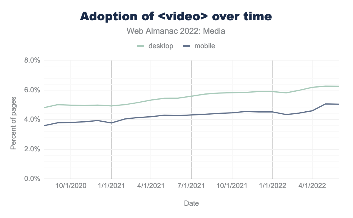
<video> elements over time. The mobile numbers are regularly a percentage point under the desktop numbers. In the fall of 2010, the lines start out at just under 4% on mobile and just under 5% on desktop, in the fall of 2020. They rise, pretty much linearly, until the end of the chart in June 2022, where mobile is at 5% and desktop is at just over 6%.<video> over time.
On mobile, <video> usage has risen from 4.3% of pages in June 2021 to 5% of pages in June 2022. One in 20 pages now include a <video> element, representing an increase of 18% year-over-year. I don’t expect the web to contain as many <video>s as <img>s anytime soon, but there are an increasing number of <video>s every year!
Video durations
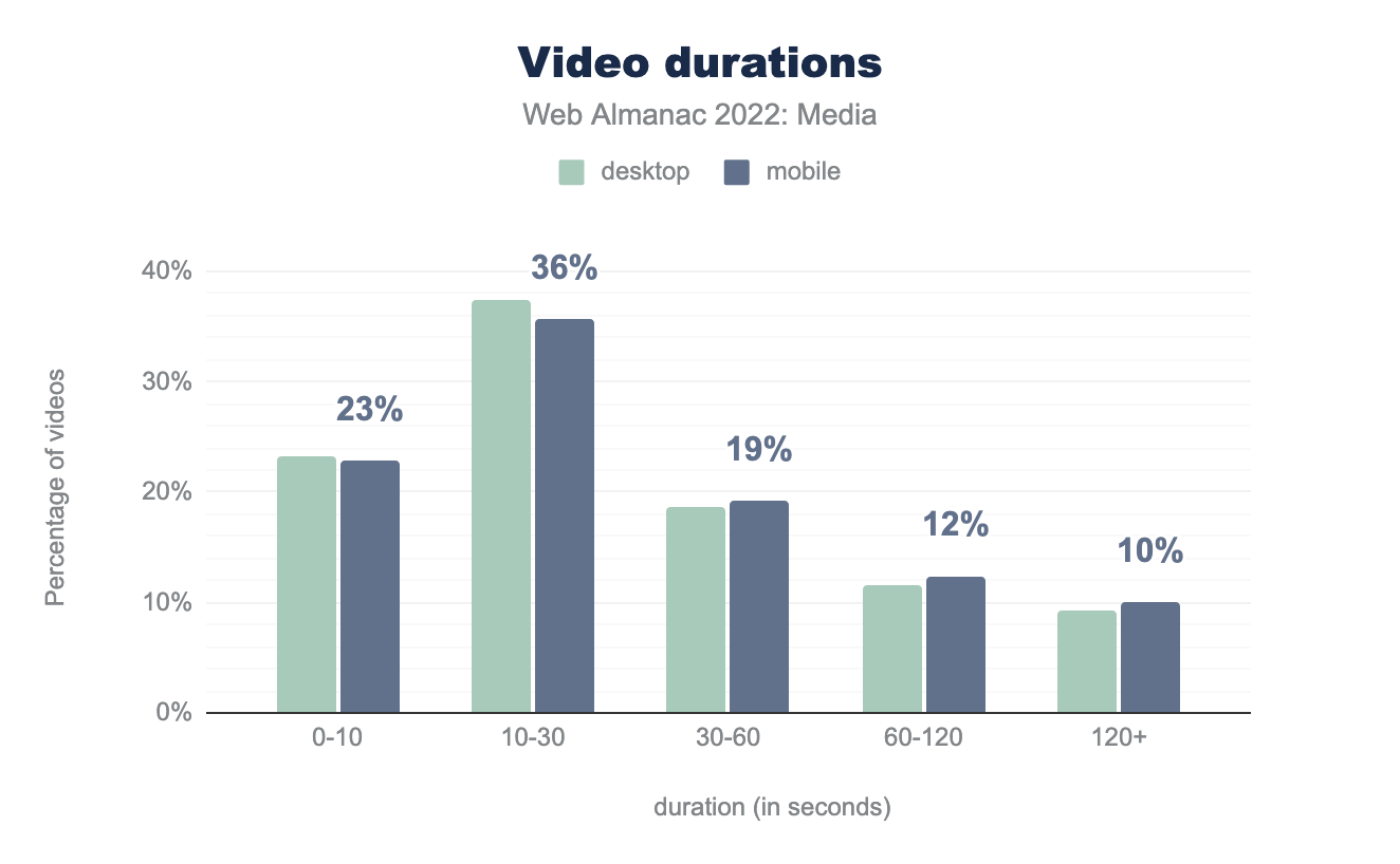
How long are those videos? Not very!
Nine out of ten videos are less than two minutes long. And more than half are under 30 seconds. Almost a quarter of videos are under 10 seconds. Perhaps these are GIFs in <video> clothing?
Format adoption
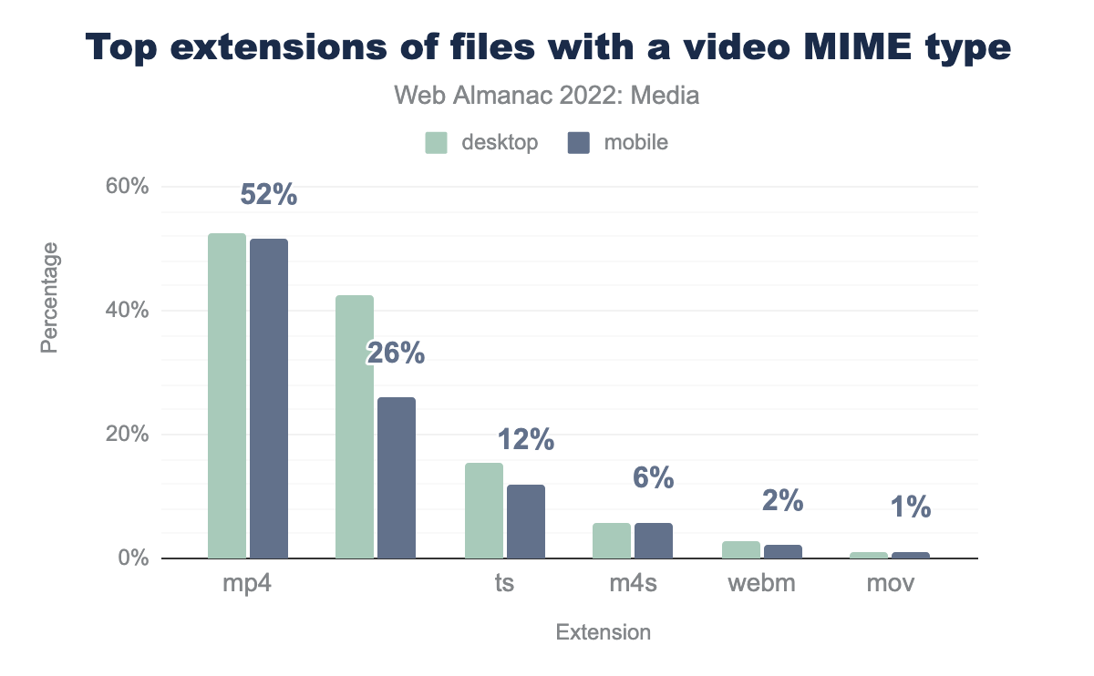
What formats are sites delivering in 2022? MP4, with its universal support story, is king:
But MP4’s numbers are a couple ticks down from last year, and we continue to see files with blank extensions, .ts files, and .m4s files gaining ground. These files are delivered when a <video> employs adaptive bitrate streaming using either HLS or MPEG-DASH.
It’s encouraging to see responsive video delivery using adaptive streaming on the rise. At the same time, we look forward to the web platform offering a simple, declarative solution to adaptive videos that doesn’t rely on JavaScript.
Embedding
The <video> element offers a number of attributes that allow authors to control how the video will be loaded and presented on the page. Here they are, ranked by usage:
<video> attribute usage.
There are a number of things to unpack here.
First, autoplay overtook preload to become the most popular attribute this year. We also see playsinline, muted, and loop increasing in popularity. Perhaps an increasing number of people are using the <video> element to replace animated GIFs? If so, good!
The fact that only 12% of <video>s have width attributes and just 0.4% (!) have height attributes means that most <video> elements are susceptible to the same kinds of CLS problems we saw with <img> elements which lack these attributes. Help the browser help you and add these attributes!
Additionally, the fact that fewer than one-in-ten <video> elements has a controls attribute suggests a significant number of people are using players that provide their own user interface for interacting with the video.
Usage of preload deserves some more investigation.
preload
The preload attribute has seen declining usage over the past couple of years.
<video preload> attribute value usage.
Why? I like to think it is authors getting out of the browser’s way.
Different browsers do different things when it comes to deciding when to load video data. The preload attribute is a way for authors to step in and have more control over that process. That could include explicitly asking the browser not to preload anything with none; asking the browser to preload just the metadata; or asking the browser to preload, using either the auto or empty values. It’s interesting, and perhaps heartening, to see authors exert less control over video loading during the past three years. Browsers know the most about their users’ contexts; not including the preload attribute at all lets them do what they think is best.
src and <source>
The src attribute is only present on 8-9% of <video> elements. Many of the rest use multiple <source> children, allowing authors to instead supply multiple alternate video resources in alternate formats.
source elements per video element. The most common number of source elements per video is one: 51.25% of mobile videos contain this many sources. The second most common number of source children is 0: 38.49% of mobile videos have no source children. 7.63% contain 2, 2.44% contain 3, and 0.18% of video elements on both desktop and mobile contain 4 elements. 0.02% of elements contain 5 children.<source>s per <video>.
How many <source> children do <video> elements have? Most have just one, and very few use multiple.
Conclusion
So there you have it, a snapshot of the state of media on the web in 2022. We’ve seen just how pervasive images and – increasingly – videos are on the web, and have gained some insight into how the web’s images and videos are encoded and embedded. The most exciting developments this year are the accelerating adoption of AVIF and the ever-increasing adoption of both lazy-loading and adaptive bitrate streaming.
There were, however, some frustrating aspects, including the almost complete lack of wide-gamut color spaces; the undying zombie format that is GIF (in both its animated and, more surprisingly, non-animated forms); and the way that both the sizes attribute and lazy-loading – two features designed for performance – are (through improper use) hurting performance on a significant number of pages.
Here’s to more effective visual communication on the web in 2023!


